
|
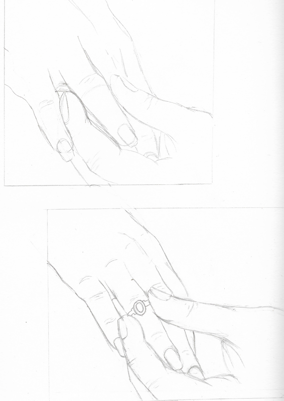
For this project we were tasked with illustrating an eight page book to one of six songs. I decided to go with interpreting the song 'Ring of Fire' written by June Carter and preformed by Johnny Cash. To begin with, I began by deciding what ideas I wanted to go with, a literal interpretation or a metaphorical. Researching the song, and the metaphorical meaning for desire and passion, I decided to interpret the song as something more melancholy due to the contrasting connotations with fire, as could be interpreted as passions, or equally danger. Going forwards with the idea of danger, I too went in the opposite direction of the intended meaning of the song, using secrecy as a starting point for my initial idea as contrasted the openness of the song's initial meaning. It was here that I got the idea for focus on witch trials, as a metaphor for the dangers of love.  To begin developing my ideas, I first did some research into clothing from the 17th Century, as would be the setting of the book. From there forth, with basic designs down, I worked with colour until I got the set designs down, focusing of making the clothing dull to contrast the eventual flames. Then I got to work on creating thumbnails for the rough pacing of the book, deciding that I would sketch the pages traditionally and then paint digitally to develop my digital skills particularly due to the lack of traditional mediums I was able to get my hands on. I quickly realised that due to the pacing of the song, for it to make sense in my book, I had to cut out some of the repeating lyrics, and additionally add an extra two pages to ensure it conveyed what I wanted it to convey.
Continuing the process of sketching and refining ideas for pages, with some taking a few attempts to get correct, such as the forth page in which the viewpoint was switched around and positioning of the characters changed, it was then a case of applying colours and making colour schemes that reflected the darker and more sombre mood as the book progressed. It was for this reason, I decided to begin with lighter and brighter colours, with a softer style if shading to represent the dream like state and the happiness that had begun with the young love. But as the dangers set in, switched the shading techniques to something more eerie and less blended. My next challenge was tackling the fire that I wanted to put into the pages, and ended up redoing the first page in which the flames appeared as they looked too simple in shape, and complicated in colour. Layering the varying colours and brightening the layers was key, even if I did lose quite a bit of the form beneath the flames.
For the majority of the book after this point, it was a case of replicating the colour schemes, though effecting them with a varying degree of flames, as the book went along increasing in intensity until the end. Overall from this project, I learnt that I didn't need to be so reliant on digitally sketching as I get very caught up on moving things around to make them look perfect, though usually makes them look stiff. I learnt how to combine both traditional and digital mediums in a way that worked to my advantage, and created a more paint like and eerie style that worked well and contrasted the vibrant, blended and layered colours of the flames. I also had to learn what worked well and quickly given the short time frame we had to create the book, made more difficult by the additional pages I needed to added, but, was still able to be organised, and complete the task on time.
0 Comments
Leave a Reply. |
AuthorAmy Farrell. Archives
December 2020
Categories |


 RSS Feed