
Final Outcomes
For my final outcome, I stuck with the monotone colour scheme, as well as made the combination of letters and punctuation feel more like a family, integrating them together. Although I do like the way the white on black looks as is interesting for smaller pieces of text, I prefer the black on white as is easier to read, and easier to see details. I decided to call my alphabet 'Cattitude' due to the unusual and dynamic attitude of the shapes of the alphabet, as well as the obvious pun.
All in all, I am happy with the way my final alphabet turned out, looking interesting with unusual shapes, yet at the same time, is still readable. If I were to do this again, I would experiment with more poses as for some letters I found it more difficult to come up with a solution than others. With that said, I am pleased with the result, and my have begun to display them as individual letters ready for the next task.
0 Comments
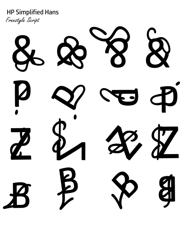
Final Development Following on from last week I began refining my alphabet and lining them up into a composition I liked the look of. Having the Z on it's own would come in handy later on as I wanted to find a way around including the punctuation without it appearing so structured and linear. However, one thing I decided early on was that I wanted to keep my poster in black and white, as adding colour to the background would take away from the silhouettes and the stamp like quality to the individual letters. As for the numbers, these were something that I had to get more creative with, as numbers such as four and five were ones that required more dynamic poses to ensure that they were easily readable, and too hold the cat's silhouette. These numbers turned out thicker than the letters, and yet I think they work well together as a family, whist still being in different groups. With exceptions of the number eight, I only tidied up the numbers, happy with the way they turned out and their unusual shapes.  Tackling punctuation was something I had to think about for a while, as trying to include cats in the smaller pieces of punctuation such as speech marks and hyphens wouldn't work well due to their small size. Instead I decided to think away from cats, and instead to things associated with them to make up the smaller details to create a contrast between the size of the cats and the accessories. I believe this worked well, as it created some variation, but kept the theme cohesive and the simplicity of the punctuation worked well against the more complex shapes of the majority of the letters and numbers.  Two become OneFor this weeks lesson task, we were asked to create different combinations with typefaces, using opposites as a starting point. I generally found this task to be interesting and creative despite the simplicity of the brief, and once I ended up getting into it properly, began to make outcomes I was both proud of and found interesting.
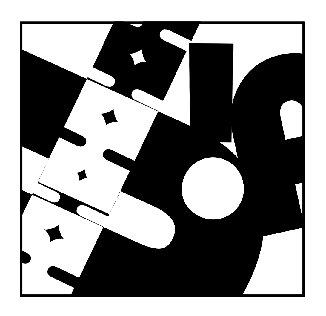
For the second part of today's task, we were tasked with making nine composition squares using different typefaces to create patterns and designs. I enjoyed doing this task, as the outcomes were unusual, and impactful due to the different fonts and the simplicity of the monotone colours and the repeating patterns. Some were more impactful than others, for example, I really like the Bauhaus 93 squares due to the negative space used to slice up the bulkier letters and punctuation.
For this week's development, I decided to develop my Sewing Kit alphabet. I decided to try and make all the letters of the alphabet, as I have done for my draw cat alphabet last week. For the most part, I was able to make all the letters as well as make them visually different. Some of the more interesting letters were those that were able to be made up using scissors, or basic thread and needles. Buttons proved to come in handy for letters that were curvaceous.      Overall, I think this Alphabet worked well together, conveying the theme of the Sewing Kit strongly. However, I wish I had a little more to work with as the buttons got a little repetitive, and so I had to think of other ways around it. Removing the background would help it feel more cohesive. I am unsure whether I will go ahead with this alphabet as I do much prefer the drawn ones, as they are more flexible to work with.  Following my feedback session this week, it was clear that the Alphabet I should begin to refine was that of my cat alphabet due to the cohesiveness of is, as well as the playfulness of the shapes as a whole. Coming away from the feedback session I began by redrawing the initial alphabet so I could begin to polish things up, as well as tweak ideas of some of the letters to make sure they looked better as a whole group as opposed to individuals.
Fixed letters (B) and tweaking  Sizing proved to be a little bit of an issue when it came to placing the letters side by side, as although they were the same height, some of the cats' shadows made them look larger or smaller than others. This is something I will fix at the end when I save each file individually, as it would be easier to see them side by side, and more so when I begin to spell things out. From here forth, I repeated the process for each letter, attempting to work out what was best, as some cats had larger and bolder features and some smaller and lighter to make the most of the letter shape and ensure every letter was readable. Having pinned down most of the alphabet, I decided to try and tackle numbers this week too, as was something else I wasn't quite sure how it would turn out. More so, I didn't want numbers to feel too similar to the letters as would grow confusing. For this problem, I attempted to make my numbers a little thicker, and feel more weighted as opposed to the slim letters. This would separate the two groups enough that they looked different and readable, but still part of one family. Additionally, the shapes or the numbers were more odd, and flexible so made for some unusual poses unlike the alphabet that could be easily repeated.  |
AuthorWrite something about yourself. No need to be fancy, just an overview. ArchivesCategories |


 RSS Feed