
Huge HeteronymsOne of our smaller task to complete was to translate, Heteronyms into type without stretching or squashing the typefaces. I decided to chose the pairs wound and wound and lead and lead.
For the wound and wound outcomes I decided to go with Ariel Black for both words, using scale and Upper/Lower case to put emphasis on the different words. For this pair, using red to separate wound (as in a cut) was effective as led me to use punctuation to replicate dripping blood. My favourite outcome of the two is the wind up toy one, where I created the wind up out of punctuation and negative space. As for lead and lead, I stuck with Ariel Black for the metal lead, to emphasise the weighing down of the letters. For lead as in leader, I used Times New Roman as it felt more authoritative. Out of these two outcomes, I think I prefer the one where the L's overlap, making the most of the letters cutting off the page. |

|


|


|
Type Talk

|
For the second part of our Type module, we were tasked with translating a script into typography using our DIY alphabets and the fonts Helvetica (or Ariel), and Baskerville (or Times New Roman). Out of all the scripts I decided to go with the Friends one, as would be the easiest for me to think about assigning characters with certain typefaces.
Below is a layout of my grid for my type work as I am unable to get only vertical lines on my software. 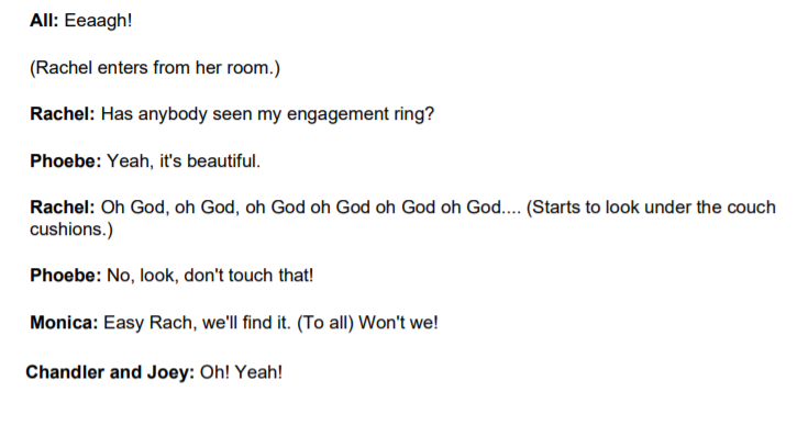
|

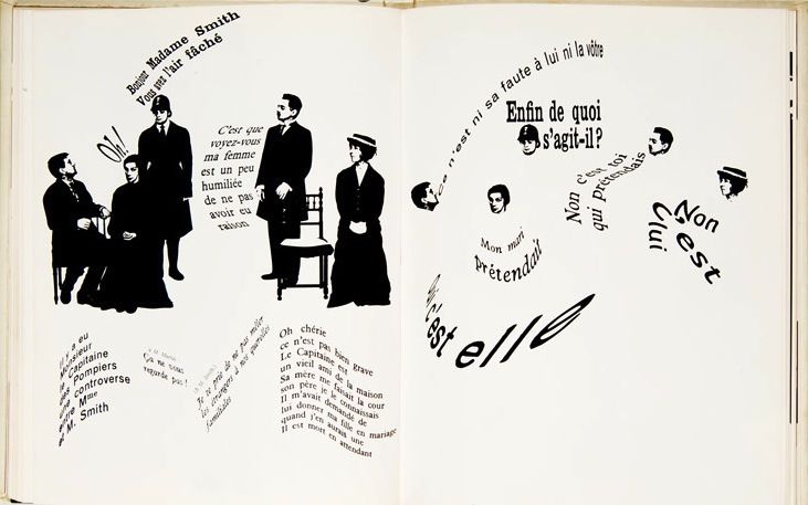
Robert Massin
One of the Artist's we were shown examples of was Robert Massin, and although his work is more illustrative then is wanted for this project, was a good starting point when it came to sketching out compositions and looking at the way different lines of text could interact with one another. This also helped me think about the use of only black and white as it was something I was initially worried about.
|

|

|

|

|

|
Thumbnails
To begin with I began by sketching out rough thumbails, working out where I wanted text to go, and how I wanted it to be presented on the page for different characters.
It was here I began thinking about having the text move in different ways for different characters. For example, Chandler's text would be far more blunt and methodical, whereas a character like Phoebe would have text that felt lighter and airier and more free moving. Additionally, when making my thumbnail sketches I thought about the build up to where all the characters would be present, wanting that to be more messy and gradually build up to that point instead of the text being messy from the beginning.
It was here I began thinking about having the text move in different ways for different characters. For example, Chandler's text would be far more blunt and methodical, whereas a character like Phoebe would have text that felt lighter and airier and more free moving. Additionally, when making my thumbnail sketches I thought about the build up to where all the characters would be present, wanting that to be more messy and gradually build up to that point instead of the text being messy from the beginning.

|

|
I continued to refine my Thumbnails, trying to imagine how other text could play a part, such as in the background to create patterns etc.

|

|
From here I began to build up my thumbnails digitally, using different texts to see how they would look and how well they would interact with one another, especially as I didn't have access to all the DIY fonts at this time.
I began by experimenting with Chandler and Phoebe's first lines, and deciding on what typefaces worked and didn't work. For the time being, Ariel Nova Light was the best fit for Phoebe, feeling lighter and more free than other fonts. As for Chandler I tested out three fonts, Ariel, Times New Roman and Sarah's DIY Alphabet. Out of all of them I liked the look of Sarah's typeface and Ariel but when partnering it with the typeface I used for Phoebe's text, made it look too similar in comparison and undermined the effect I wanted for that contrast. Given Chandler's appearance throughout the whole script, using Ariel or Times New Roman may drown his words out and get muddled up with other characters.
For the second page I started to play about with what typeface I wanted to use for Monica being another main part of this script and played about with Ariel Black and Ariel Condensed as well as Jasmine's DIY Alphabet.


|


|
Having completed alL the thumbnails for my pages, I decided to go with the following typefaces for each character;
Chandler- Sarah's DIY Typeface - Chaotic, bold and blunt - busier pages.
Phoebe - Manisha's DIY Typeface - Curvy, whimsical - light but can be chaotic, make the most of both Uppercase and Lowercase.
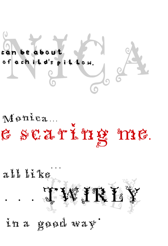
Monica - Ayeisha's DIY Typeface - Authoritative, angular, judgmental, make the most of Uppercase and Lowercase
Racheal - Jasmine's DIY Typeface - Commanding, bold, frantic - easy to manipulate, only Uppercase.
Joey - Times New Roman - Differentiate from other characters, least amount of lines, simple.
Chandler- Sarah's DIY Typeface - Chaotic, bold and blunt - busier pages.
Phoebe - Manisha's DIY Typeface - Curvy, whimsical - light but can be chaotic, make the most of both Uppercase and Lowercase.
Monica - Ayeisha's DIY Typeface - Authoritative, angular, judgmental, make the most of Uppercase and Lowercase
Racheal - Jasmine's DIY Typeface - Commanding, bold, frantic - easy to manipulate, only Uppercase.
Joey - Times New Roman - Differentiate from other characters, least amount of lines, simple.
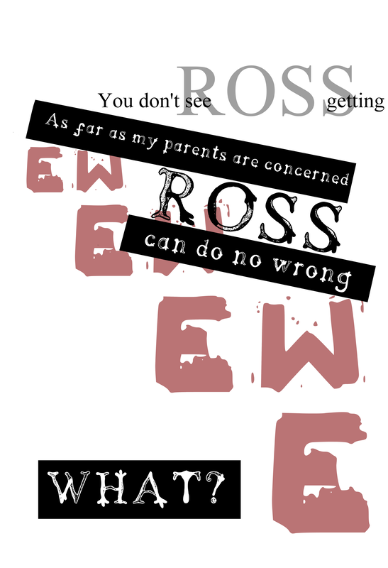
Front Cover and Back Cover Thumbnails


|
Out of all the thumbnails and refined thumbnails, I will be using this outcome as my front cover, as it conveys my interpretation of the script far better than the minimalistic ones.
I decided to stick with the typeface I used for Monica's own speech as it was the one that fit the best, as well as convey how much of a main part of the script Monica was - with her being the one to interact with the most characters, and everyone calling for her in this part of the script. Additionally, the typeface worked well on the black, giving it a printed like quality, and making the page more interesting. Refining my ideas, I decided to keep the lines in the mid section, as it made the piece feel more complete and less empty |

|

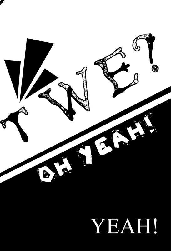
For my back cover, I wanted something simple to bring an end to my script. Having a completely black page helped to differentiate from the main body of the text and the end of the script. I decided having it be minimalistic worked to my advantage, as unlike the front page it wouldn't be seen.
I experimented with the different layouts, but all felt a little empty with the singular word. From there I decided to add a fade out of the text to make it a little more interesting, but not too busy. |

|
Refining Layouts
Front Cover

Pages One and Two


|

|
Pages Two and Three


|

|
Pages Four and Five


|

|
Pages Six and Seven

|

|
Pages Eight and Nine

|
|
Pages Ten and Eleven

|

|
Pages Fourteen and Fifteen


|

|
Pages Twelve and Thirteen


|

|
Pages Sixteen and Seventeen


|
|
Back Cover

Final ISSUU Script - View Here

All in all I am fairly pleased with my final outcome, and the choices I made for each characters chosen typeface. I ended up enjoying this project more than I thought I would as I hadn't really played around with type before, and enjoyed figuring out compositions and placements for the type. Additionally, thinking about how I wanted my script to be paced proved to be effective and gave variation to the pages and meaning of the extracted script. If I were to do this project again, I would have liked to have experimented with more coloured aspects, as well as more imagery to see if I could push my work further.