
Part 1 - Weeks 1-4
Drawing with Ink
The first task we were given as part of this module was to draw self portraits with ink; whether it be dip pen, fine liners or alternate ways of making brushes to use with Ink. Going into this task I wanted to try and make these drawings less planned and lifeless than the usual way of working. For this reason I decided I was just going to use the marks made by the ink and not sketch with pencil before hand - allowing room for more mistakes and having to work with them.

|
Looking into different artists work and different ways of using ink, it becomes apparent just how broad this medium is. Out of all the different examples, this is seen in Lucinda Rogers' work, who uses different line weights to achieve an effective look to her pieces. These line weighs don't always follow what is seen in the real world, but create more interesting art pieces. I particularly like the way Rogers' is able to capture the life within the settings she draws - accomplished through imperfect perspective, and imperfect lines. With that said she is still able to communicate clearly what he work is meant to be and represent. |
|
Similarly Robert Stewart Sherriffs uses expressive mark making to keep his pieces life like. Unlike Lucinda Rogers however, Sherriffs uses brush pens to create his marks. The use of line weight here is also effective, along with the use of solid black for certain parts of the piece. Going into this task, I knew this was going to be difficult as my way of drawing is usually tentative and built up over a sketch. For this reason I decided to focus on how the different pens and ink could be used to create more expressive pieces when drawing my own self portrait. |

|
Self Portraits
Fine Liner and Brush Pen
|
Starting this task, I decided to use fine liners as it was a medium I am used to. That way I was able to tackle the tentativeness of my way of drawing. This did help, but I didn't like my first portrait as it got messy very quickly. Using the brush pens also proved difficult as I needed to make my lines expressive and doing that I had to put them down confidently and quickly. If I got better at using the pen, I think it would be an effective tool to use in creating livelier lines and in turn less lifeless pieces. I think my attempt turned out better than the line liner attempt however, as looking back, my first attempt was messy and ill proportioned. |
|
Moving on, I tried to use my dip pen and ink as I knew this was something that I wasn't confident in using - having not used them in a while. But it proved to be easier to work with, and easier to get different line weights into my portrait.
In the second attempt on this page I attempted to use some shading and patterning as is seen in Sherriffs' work. It was easier to work with the patterning with the dip pen as I had more control. Having struggled with noses and fine liner in my first attempt, I decided to try and isolate some features and work on them that way. I was far happier with these attempt sat using fine liners. |

Dip pen and ink portraits, fine liner features
|
Room drawings
|
The second part of this weeks task was to draw a room in our house and incorporate different shading techniques. Before I even attempting the room drawing I attempted to draw out some parts of the studio and attempt to use cross hatching and other shading techniques. What I found difficult was building up the cross hatching. Going in one direction was fine, though layering another set of lines on top of that proved difficult to work with as things could get really messy really quick.


|


Initially I decided to do the drawing a room task in dip pen and ink, but struggled with trying to get detail into the drawing due to the lack of control I had over the pen. I attempted it again and was a little more successful, but I was still unhappy with the results. After attempting to use the ink pen twice, I decided to try fine liner to see if I could get more detail into the drawing that way, and I did. This final attempt was far better than the previous two, and allowed me to try out crosshatching. In some places the effect was a lot more successful than others. Perspective in all three is a little off, but improved with each one.
|


|
As well as the room task, I also used fine liners to draw an observational view from my window. This was good practice for both the first semester one modules, as developed my observational skills, as well as cross hatching and shading practise.
In doing all these tasks I have come to realise that my weaknesses are in ink and dip pen, as I find it difficult to control the pen and line width effectively. Fine liners on the other hand are far easier to control. and still allow a variety of line widths. |
Part 1 - Weeks 1-4
Experimental Image Making

|
For this weeks task we were asked to make cats and dogs out of recyclable materials. The aim was to convey the different characteristics of each animal.
Starting off, I decided to go simple, using toilet roll rolls to make a dog that was short and stubby, like smaller breeds of dogs. This was difficult to tackle as the materials weren't what I would have usually used and conveying a dog through recycled materials was difficult. I think this dog in particular was a weaker outcome as it looks stiff and void of a personality in comparison to later attempts. For my second attempt, I decided to use something that was more forgiving. |
For my second dog I decided to make a larger breed and attempt to convey their powerful stance. Making this model out of masking tape allowed me to build up the limbs and frame of the dog and allow me to move things around easily. Although the dog is small in person, when photographed it looks much better than if it was larger.

|

|

|

|
I moved onto cats after that as the shapes would be easier to work with - rounder and softer. For this cat I used a bottle and then built up the sides, back, head and tail with paper mache. This was effective but time consuming when it came to waiting for the layers to dry. Aside from the unlevel surface of the head I think this came out fairly well, especially for the limited materials used.
Whilst I was making this one, I decided to make another cat while waiting for the layers to dry. Again, I used paper mache and tinfoil for the frame underneath. |
This attempt worked a lot better in conveying the personality and posture of a startled cat, but took significantly longer due to the small parts of the sculpture and waiting for layers to dry. When put side by side with the smaller dog I think they work well together.

|

|
Mask making
In addition to the cats and dogs, making masks was the next part of the brief. For this, I made sure to not spend too long on the different masks, and instead create something quickly, but efficiently. Cardboard was my choice of material as it was easy to work with and build up, but also something that was easily found.

|

|

|

|
For my second mask, I wanted to do something a little bit different. Instead, I took inspiration from traditional yokai masks- with simpler shapes and animal features. For my mask however, I wanted to also make the most of the cardboard's sharp edges and dimension that could be created by raising up pieces of the material instead of stacking. When creating this mask, keeping things simple was key. Although it is far from perfect, the effects were successful and could be refined and recreated if I had more time to do so. |

|

|

|
Part 1 - Weeks 1-4
Paint (Making an impression)
Watercolour
Out of all the watercolour artists, the ones that I was drawn the most too were Arthur Melville and Eric Ravilious, too very different artists with one using vibrant colours and one using softer. I attempted to use this to make up my own attempts, as I knew I was going to struggle with using watercolour.

Arthur Melville

For my second attempt (above) I used more vibrant colours, and applied wet on wet watercolour to blend them easier. For this attempt I wanted to try and incorporate the vibrant colours found in Arthur Melville's work. I was particularly drawn to the use of strong and vibrant colours in Melville's work, as my usual way of working is far softer. I did like this attempt more than the other two as it wasn't too blended nor too messy.
My final attempt was instead an experiment, attempting to do the opposite of what I had done in the past two pieces. My previous water colour attempts were watered down or wet-on-wet blending which meant the vibrant colours were lost. For this piece I attempted to use dryer paints. Although this attempt wasn't perfect it proved that I was able to get more vibrant colours and be able to build them up if I wasn't so tentative about applying the watercolours. |

Eric Ravilious
Starting off this part of the task, I decided to just play around with the watercolour, attempting to try different techniques - from wet blending to building up dryer colours on top of one another. The building up of soft colours was something that I liked about Eric Ravilious' pieces, looking soft but detailed at the same time. This was something that I struggled to replicate, with some areas being more successful than other.
In my first attempt the colours were muted and pale, making them difficult to build up due to tentativeness in using watercolours. Although the grass wasn't a complete failure, I decided to leave it where it was in fears of making it look worse, and spending too much time on this one attempt. But, from this attempt I learnt not to water down the watercolours as much, as layering pale colours was getting me no where and soon became messy. 

|
I found using watercolours was more difficult than acrylic as it was unforgiving. In attempting to get vibrant colours, paint was either too watered down or too dry, and I couldn't seem to get the right middle ground between the too.

AcrylicWhen it came to acrylic, I decided to start with portraits as using acrylic for them would be easier than with watercolour. I also wanted to try and build up skin tones and textures using unblended brush stokes as this was something I had struggled with doing when using watercolour.
Starting off painting with acrylic, I decided to try and attempt to build up colours, especially in the skin tones like Lotte Laserstein does in her paintings. This technique started off looking like a mess, but when different shades and tones were added, started to come together. I actually like the way the strokes look from afar, blending the tones without over blending as was done in the watercolour attempts.
In hindsight, I could have gone further with my first attempt as it looked watered down in comparison to Laserstein's work. Using thicker paint may have helped me build up colours easier. But I was fairly please with the way this attempt turned out, especially after my watercolour pieces.
|

Lotte Laserstein
|

I attempted to do another portrait, but making sure the paint was thicker this time. For this attempt I liked the way the hair turned out, having built up strokes to convey the different shades and texture. The skin was harder to work with however, due to it getting too dark too quickly and becoming difficult to fix.
|


|

|
After struggling with mixing the thicker paint in my portraits, I moved onto still life. I wanted to try and achieve blending of colours without watering them down as well as having the things in the foreground be more detailed than those in the background. Looking at George Clausen's still life paintings, specifically his flowers, I attempted to create my own still life flower painting. Although unfinished, this attempt of working with thicker acrylic came out much better than my previous attempt. |

George Clausen
|

|
Part 2 - Weeks 5-8
Photoshop - Band Poster
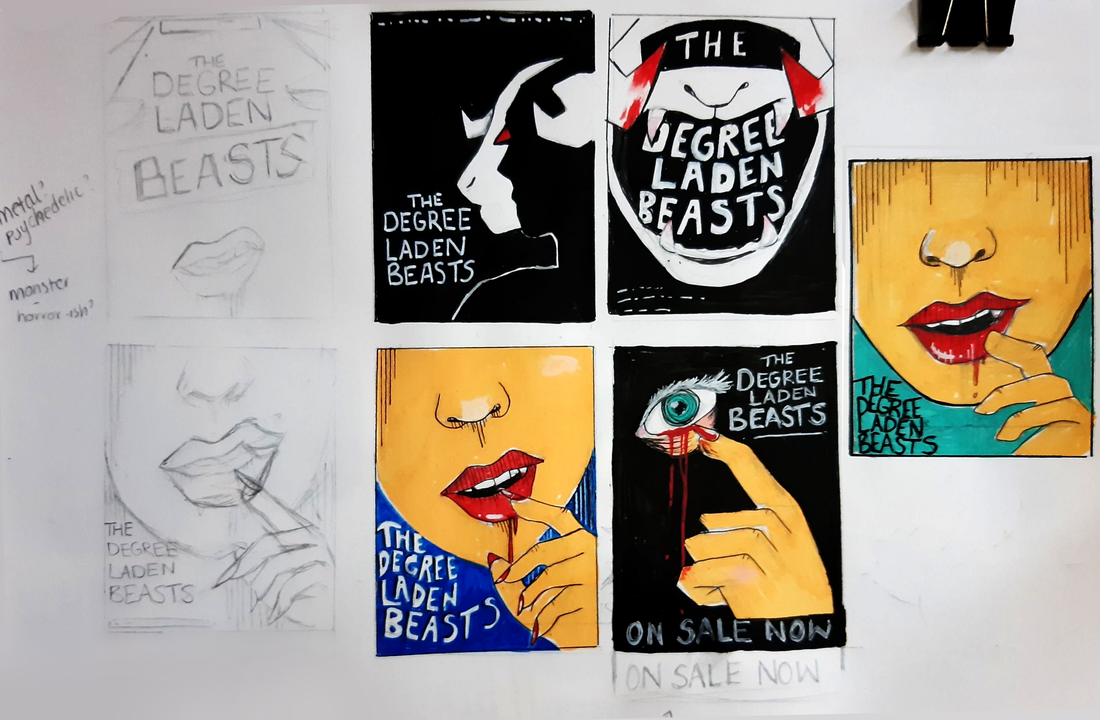
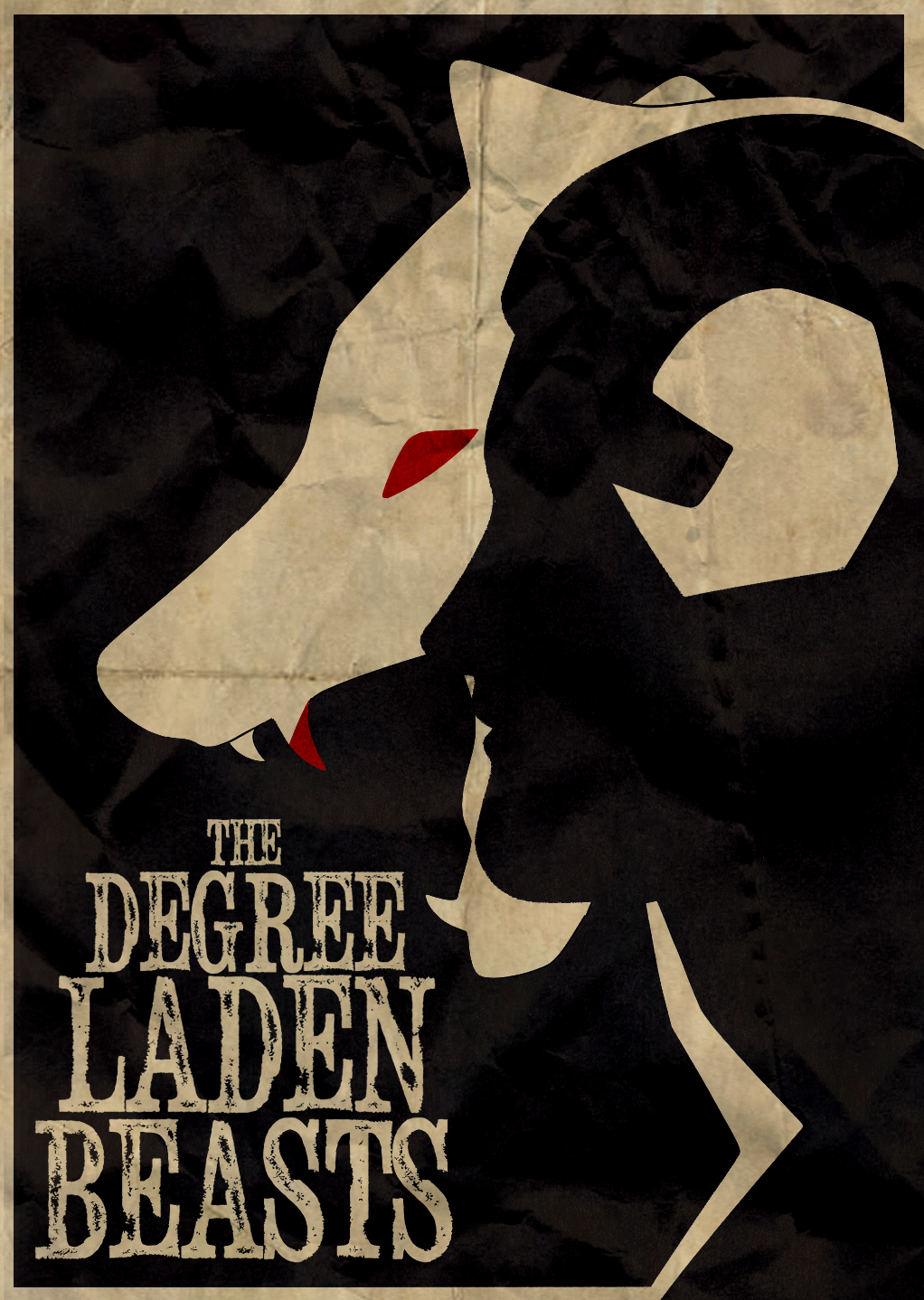
For this weeks task, we were assigned band names to create digital posters for. I was given 'The Degree Laden Beasts.' I began by starting to figure out what genre and vibe I wanted the band to have, and given their name, decided to go with something bold opting to play on the beast aspect and laden - meaning heavily loaded. For this reason I leant more towards Alternative or Indie Rock posters.


Noma Bar


Mouse and Kelly
Thumbnails
|
Having looked at different posters, I began sketching out ideas, aiming to go with a darker colour scheme as it would fit the band better, as well as push me out of my comfort zone. I particularly liked the use of solid colours, especially when using hints of red to give an uneasy feel to an otherwise bland piece.
|
|
|
For my thumbnails, I played on this idea, to see what I could create from my initial thumbnail.
Moving away from thumbnails and having watched tutorials on how to use different textures in photoshop, I began my making different marks to try and include in my poster and look at how they could be used. From there forth I decided to take some of my thumbnails and see how they could be translated into digital pieces. Whilst I didn't have access to photoshop over the weekend, I decided to try and see what my own software, Clip Studio, could do. I was pleasantly surprised to find that most, if not all, of the shown features in Dwayne's tutorials, were also features in Clip Studio. Some of which would be beneficial and easier to use when making my own personal pieces. |

|
Experiments

|

|

|

As I was able to do all of the techniques in Clip, I started playing about with the different overlays and use of traditional strokes to build up textures. My first attempt turned out too digital for my liking, so I attempted to fix it by making lines less digital and using tea stained textures to build up skin. Given this wasn't my final piece, I didn't go too far with it, leaving it to try a different style.
|

|

|

|
|

|

|

|

|
My second attempt was far more successful than my first. The simplicity of the base piece was easier to work with as it could be manipulated to look more traditional due to the bolder outlines. I did struggle with layering overlays on top of the black part of the pieces as the lighter parts of the piece was easier to work with. In the end, due to manipulating the saturation and luminosity of the piece, I was slowly able to build things up. Having taken two of my thumbnails to the digital world, it became apparent that the latter was easier to work with, and felt far more coherent as a piece when working with text, colour and composition. I believe I could take it further and has potential to be a final piece. 
|
I decided to try and make some more thumbnails for posters, deciding on what I wanted the composition to look like, before deciding to go ahead with a final option. I decided to stick with the majority of the overlays from my initial poster, but decided to go even further with textures and text.
In doing this project I learnt a lot about the processes used in different softwares. This was also helpful in seeing where techniques overlapped and where I could take things further in my own personal work. I decided to use some of the ink work from the first part of the illustrators toolkit project and use them to create something digital with analogue marks. I made up some more mark making with paint and markers to then take into the portrait and make up something more than the ink drawing.
In doing this project I learnt a lot about the processes used in different softwares. This was also helpful in seeing where techniques overlapped and where I could take things further in my own personal work. I decided to use some of the ink work from the first part of the illustrators toolkit project and use them to create something digital with analogue marks. I made up some more mark making with paint and markers to then take into the portrait and make up something more than the ink drawing.
Final Outcomes


|


|
Part 2 - Weeks 5-8
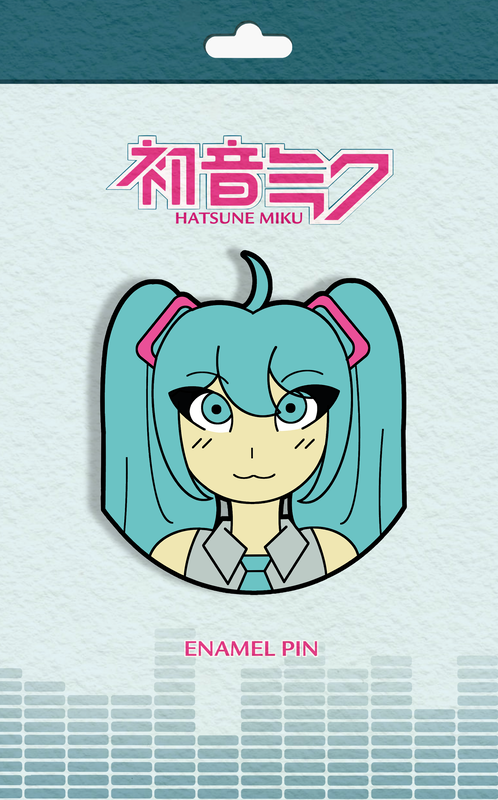
Illustrator - Pop Culture Pins
Following on from last week, we moved onto Illustrator, instead looking at making up mock enamel pins using vectors. To begin with, I started by looking at a range of enamel pins; ranging from official pins from large companies, and then unofficial pins created by smaller artists. For the most part, smaller artists didn't include backing cards to their pins, and made their work look notably less official. When looking at my own pin collection, it appeared that most of the enamel pins were around 3cm in length, and 2cm in width - although some more graphic were bigger.
Subject Research - Vocaloid
VOCALOID started life as a voice synthesiser product, with its first released in being two English voicebanks Lola and Leon in 2004. The software was produced to allow musicians to use synthesizing technology with specially recorded vocals of voice actors or singers. To create a song, the user must input the melody and lyrics. Since its release VOCALOID has exploded into pop culture and mainstream media, growing popular in the east before coming back to the west and surpassing the initial reason for creation.
Hatsune Miku is by far the most notable as well as the other five Crypton Vocaloids, having her own concerts, adverts, figures, merch, but above all giving a platform for many musicians to create music and art by expressing themselves through the characters and using their voices. It's for this reason I will be looking at three of the main six Vocaloids to make my pins, as Miku and the others have become a staple of online pop culture and harbours a worldwide community.
Hatsune Miku is by far the most notable as well as the other five Crypton Vocaloids, having her own concerts, adverts, figures, merch, but above all giving a platform for many musicians to create music and art by expressing themselves through the characters and using their voices. It's for this reason I will be looking at three of the main six Vocaloids to make my pins, as Miku and the others have become a staple of online pop culture and harbours a worldwide community.


|

|
|
|
|
|
One of the issues I had when deciding on how to start the pins was whether I wanted to just use the characters, or use music producer's interpretation of the characters. Initially I had decided I wanted to do producers interpretations but realised the pins would look very similar if I was only going to use Miku for the pins as although the producers had their own distinct style in using and illustrating her, it was going to be hard to replicate in an enamel pin.


|
I decided to against the idea of using different producers and instead just used the characters as this was the easiest way around things, and would be less complicated to work with in the long run. I wasn't sure which three I wanted to do so made up quick designs of all six. Finding pantone colours that would work was also a little bit of a pain, but worked out in the end - and worked well with white and black to give them a whole range. I didn't want to spent too long on the designing process, so quickly got them out to ensure I got to spend more time testing vector layers out to make the final pins. I wanted to get working on the vector layers and making the final pins before thinking too much on the backing card as I didn't know how detailed these pins were going to end up. If they were detailed, a simpler background would work best, and vice versa. The first idea I had was simple, using shapes to make up the look of music sound bars. Keeping this one tone would help make a coherent look across the three pins as the colours could be easily changed to fit with the look of the other pins. |

|
Illustrator

First attempt at using Illustrator
|

|

|
|
My first attempt at using Illustrator was mess as I hadn't used the software before. I found it difficult to make something with the basic shapes. Eventually I began to get the hang of it and combine different lines to get rid of the gaps in lines. After doing this quick attempt I decided to try and make my pins in Illustrator, but by using the sketches I had made for guidance. This made the process far easier. I was able to make shapes out of different lines and make them look smooth and more complex in comparison to my first attempt.
In the end I was able to create all the linework for each pin, but was unable to figure out how to colour them in Illustrator, and so I took them to my own software for that part of the process. Having decided on the pantone colours for each of the pins, I then played around with the line width as when I enlarged the pins the lines appeared too small. I also decided to give them a bolder outline as I liked how that defined the pins. 
|


|
Backing cards
|
When it came to the backing cards, I decided to go with soft colour schemes for the background, with faded sound bars at the bottom to make a connection to the music the characters are used for. When it came to text to go on my backing cards I looked at the logos used over the years for the text. I decided to find the original typeface (top left) as it matched the feel of the pins - combination of round and sharp lines.
Without the inclusion of the logo, the backing card just looked empty and generic and made the whole card look very bottom heavy with the sound bards at the bottom. |

|

|

|
Final Outcomes

|


|

|

|
All in all I'm fairly pleased with the outcomes, even if they took a lot longer than they should have to put them together. Although they took a while and were a little bit of a pain to put together as I had to use a combination of different softwares, I think they look effective and coherent. If I had more time, I would be able to get better at using Illustrator, and would cut down on how long it would take me to make each pin.


Part 3 - Weeks 9-12
Action!

|
The aim of this week's task was to explore the use of dramatic composition in different scenarios, using thumbnail visuals to explore possibilities. Going into this weeks task I initially struggled with using diagonal composition, but found it easier and more exciting to use as the week went by. For this week's task, I decided to include colour in my thumbnails - something that in hindsight, was a mistake to do. I could have spent more time exploring possibilities if I hadn't have spent so much on applying colour to my thumbnail visuals. |
Ambush - two figures - a city's back streets - night
Given the prompt being set at night, for this set of thumbnails I decided to do them in black and white as I felt it would be more effective. Once I had figured out where I wanted the figures to be, I began refining digitally. It was there that I decided to add the yellow tint from light of the torch as the only bit of colour to make it stand out.


Vertigo - a steeplejack - daytime - windy day
For this prompt I decided to go back to using full colours, but softer ones than other thumbnails. Once I had a couple of ideas, it was a case of working out what positioning was better - and I decided that I liked the second thumbnail the most to take and begin refining due to the framing. Having just the feet in the shot worked better than trying to include a figure, especially when it wasn't needed.

Tango - two figures, movement, sexy, close, exotic, café
For this prompt I decided to focus on the figures being the most dynamic, especially when it came to limbs and clothing. When it came to applying colour to my developed thumbnail, I decided to make the background warmer and softer to fit in with the prompt a little bit better.

Systems Failure - one figure, spaceship, physical struggle
Out of all the developed thumbnails from this week, this was the one that I liked the least. This may have been down to the lack of lines used to create the visual. With that said, I prefer the second outcome to the first, with the little hints of colour making it more atmospheric.


|

|
A Giant Leap - rooftop chase, three figures, peril, bravery
Initially, I wanted this prompt to be of silhouettes of figures, but that didn't work too well in my earlier thumbnails. Then I decided to try and include three figures running forwards, with the front two being more significant than the other. I decided to change the idea from a cat to a man as it fit better with the theme of a rooftop run.


January Sales - claustrophobia, queuing, doors opening, multiple figures
For the January sales prompt, I decided to try and tackle thumbnails from different view points - including a stand out figure and just shadows. I preferred the developed thumbnail as the figure stood out against the rest of the people, making it visually interesting and making her stand out against the panic as opposed to being a part of the panic.


|

|
Going into next week I have decided not to use colour as to allow myself to explore possibilities better - as in using pencil I can edit and see what works and what doesn't quicker. As well as this, I will be easier able to refine digitally, and make use of refining and deciding what the best outcome.
Part 3 - Weeks 9-12
Body Language

Moving on from last weeks tasks, the focus was instead on body language, while still thinking about the compositions of thumbnails. This week I focused more on the figures as opposed to the setting around to make the most of the body language to convey feelings.
Angry Boss - two figures - an office setting
For this prompt I decided to make the most of the framing to make the boss look larger and feel like he was wedge into the frame. This helped with conveying the pent up anger I wanted to convey. Additionally, lighting helped significantly, even if it was still a quick thumbnail. Some of the feedback I had been given from last week was to focus on refining ideas instead of making a variety of different ones. Admittedly I usually do this part of the process digitally, but decided to focus on getting my thumbnails sketched down traditionally instead of worrying about colour.


Good News - a single figure holding a phone - 1950s
For this prompt I began by sketching out a female figure on the phone, making sure to follow the 1950s part of the prompt. When working on these thumbnails I was heavily focused on where to place the figure in the frame as I wanted to go for the teen movie feel to my outcome. It was for this reason I kept colours bright and more saturated for this prompt when compared to others.


Mum can we go now? - two old friends meet on the street, the teenage daughter of one doesn't want them to talk for long
When sketching out my thumbnails here, I was seeing where to place the teenage daughter, as I had originally placed her behind the mother - but I soon realised it was more effective to have her at the front and her mother in the back. I liked the way my forth thumbnail turned out and decided to try and move the framing slightly, but decided against it as it made the daughter look more bored then wanting to leave.


The Anniversary - a couple celebrating an anniversary in a restaurant. They hate one another...
When creating thumbnails for this prompt, the cropping of the idea in the frame was key to show the disconnect between the two figures. I decided to keep the colouring for the developed thumbnail dull and dimly lit when compared to the rest of the thumbnails from this week.


|

|
The Big Jump - a figure in an aircraft just before having their first parachute jump
With this prompt I was unsure where I wanted to place the fearful jumper. Having it being the main focus of the piece was effective, if the body language was right. My later thumbnails seemed to be too literal, and obvious of ideas - even though I did try to fix the framing and angle of the aircraft and the figure. I went back to my first thumbnail to refine digitally as I believed this was the one with the most potential.
I was unsure how I wanted the digital outcome to be cropped, as although the first had been my initial idea, I'm unsure whether the sky below is necessary. But, when it was taken out, the front skydiver looked too off centre, and so I decided to move it over ever so slightly to try and make it look more balanced.
I was unsure how I wanted the digital outcome to be cropped, as although the first had been my initial idea, I'm unsure whether the sky below is necessary. But, when it was taken out, the front skydiver looked too off centre, and so I decided to move it over ever so slightly to try and make it look more balanced.


|

|

|
Genius at Work - serious concentration in an academic or scientific setting
For this prompt I was once again unsure on how I wanted to refine the idea. I believed that the last thumbnail showed the most concentration from the low angle - but could have done with more of a scientific setting. The third one was my second choice to refine as I believed those too showed the more concentration and thought through body language. With that said, I didn't want to focus too much on the setting, as I wanted to practise using body language in the short amount of time.

Part 3 - Weeks 9-12
Communicative Colour
Art Direction: rapturous, warm, magical, visionary unreal, comforting, celebratory, spiritual
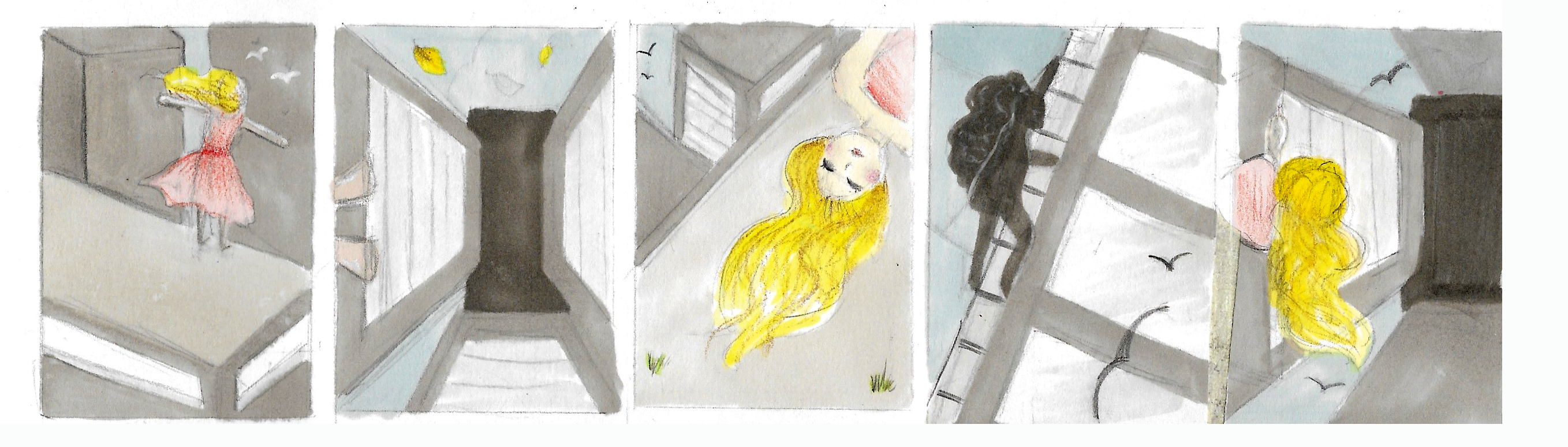
For the final part of these tasks, I was given Thomas Traherne's 'Centuries of Meditations' to work with. For this week we were focusing on colour and how it can be used to communicate. Having been given pointers on what the piece should feel like, I began by making a few thumbnails of the composition. My idea for this week was to focus on the natural world as the text is based on the wonders of the world and how it can be comforting and spiritual.
I wanted to have a hierarchy in my thumbnails, with the person in the foreground being of less importance. When it came to applying colour I wasn't sure what I wanted to go with, but knew I wanted the majority of the colours to be warm to convey the feeling of the text. I tried using pencils for some of my thumbnails, and posca pens for some others.
My initial thumbnails were messing around with overlaying colours instead of using literal ones. I was unhappy with them as they all merged into one, and unable to experiment in the way I wanted, I decided that it may be easier to play around with colours digitally.
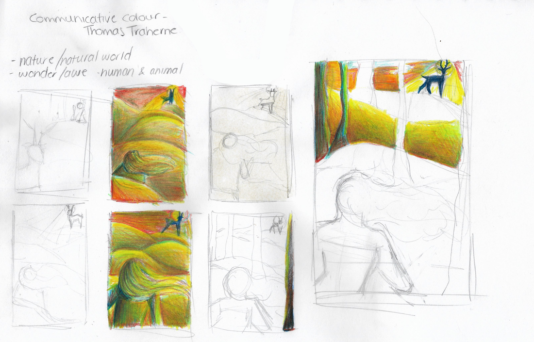
After my first attempts, I took a look at different areas for inspiration for colour palettes as I wasn't happy with my first thumbnails. I decided to look stained glass pieces based on the text to get a feel of how the text could be interpreted. In addition, I decided to look at Pixar concept art to get a feel for possible colour palettes given I already had an idea for the composition.

Stain glass windows based on Thomas Traherne's 'Centuries of Meditations'
|


Lou Romano - 'Up' Concept Art
|
Working digitally helped me to figure out what worked and what didn't as I went along. Initially the first coloured thumbnail I did looked too murky and less warm than I had hoped it to be. I decided to play around with lighter and more airy colours for the hills from there on as I did want to peace to feel warm and airy to convey the wonder of the natural world. Although this task was heavily based on colour, I did like the use of lines in these pieces, and thought I could use them in my own - focusing on line weight and balance as well as colour.
When trying out different colours I decided to merge the two layers of the hills together as I liked how they looked as a whole, looking warmer and brighter overall. My thumbnails consisted of figuring out what worked and what didn't as I went along, but before I began to work on things properly.
When trying out different colours I decided to merge the two layers of the hills together as I liked how they looked as a whole, looking warmer and brighter overall. My thumbnails consisted of figuring out what worked and what didn't as I went along, but before I began to work on things properly.


|


|


|
When making up the colours for the piece, it became apparent that some colours were too murky and dull for the warm tone of the text. I decided to change things as I went, as I was able to build things up easier than picking a palette from the start, but still had an overall idea for the piece. Once I had a stable set of colours, I began to tweak the settings of the saturation and hue of the piece to try and get a warmer feel to the prompts.

|

|

|
Out of all the thumbnails, I decided to chose the one on the right as my final outcome as this was the one to convey Thomas Traherne's 'Centuries of Meditations' better than the rest. The colours being far more vibrant did help significantly when comparing it to my first thumbnail. I was happy with the outcome, as it merged the both natural world and spiritual together as I wanted for the outcome - something I wouldn't have been able to do with literal colours.
