The Moon Rabbit - Illustrated Book
In this project, I aim to produce a children's books based on the tale of the rabbit in the moon. This project should take into consideration everything it takes to produce a self published children's book, from producing illustrations, to production of the book.
1. Research into book production. What sizes of books can be produced? What type of paper is used? What considerations are there in terms of sizing and formatting?
2. Exploration and rewriting of the subject matter. Does the story really need to be reinvented?
3. Development of ideas and thumbnails. What will characters look like? What style of illustration will the book be in?
4. Development of the book and narrative. How is type going to play a part in the story?
5. Outcomes. Finalised book ready for printing. Kickstarter(?)
The Rabbit in the Moon / The Moon Rabbit
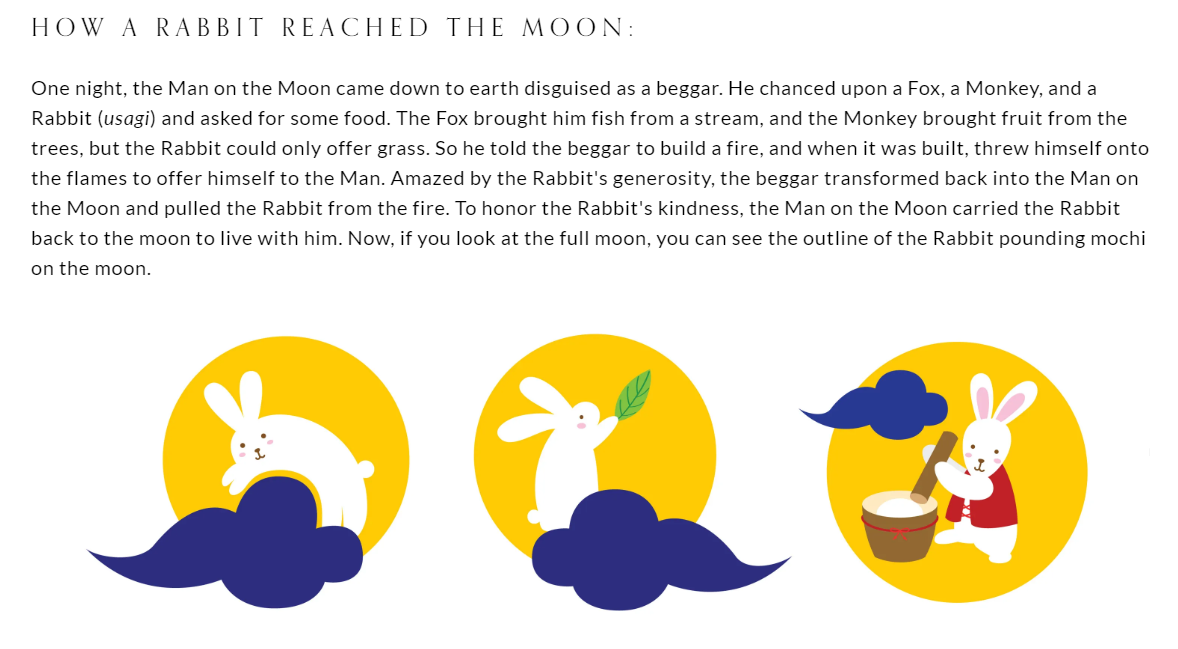
The story of the rabbit in the moon comes from craters on the moon that vaguely resemble a rabbit. Similar to The Man on the Moon, The Rabbit on the Moon is an old legend, passed down from word-of-mouth story telling. Different countries have different explanations as of why the rabbit is on the moon - and is most popular in Asia and the Americas.
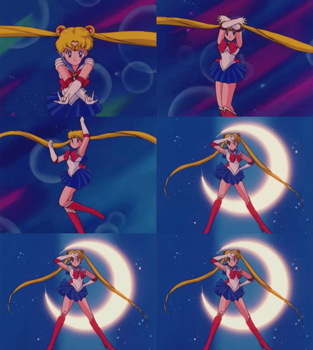
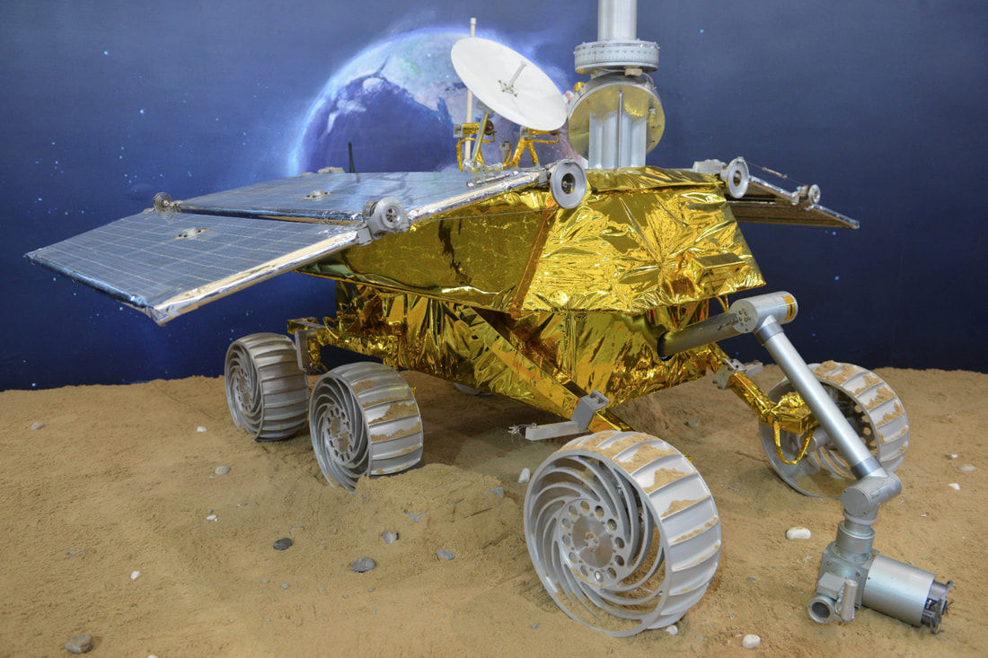
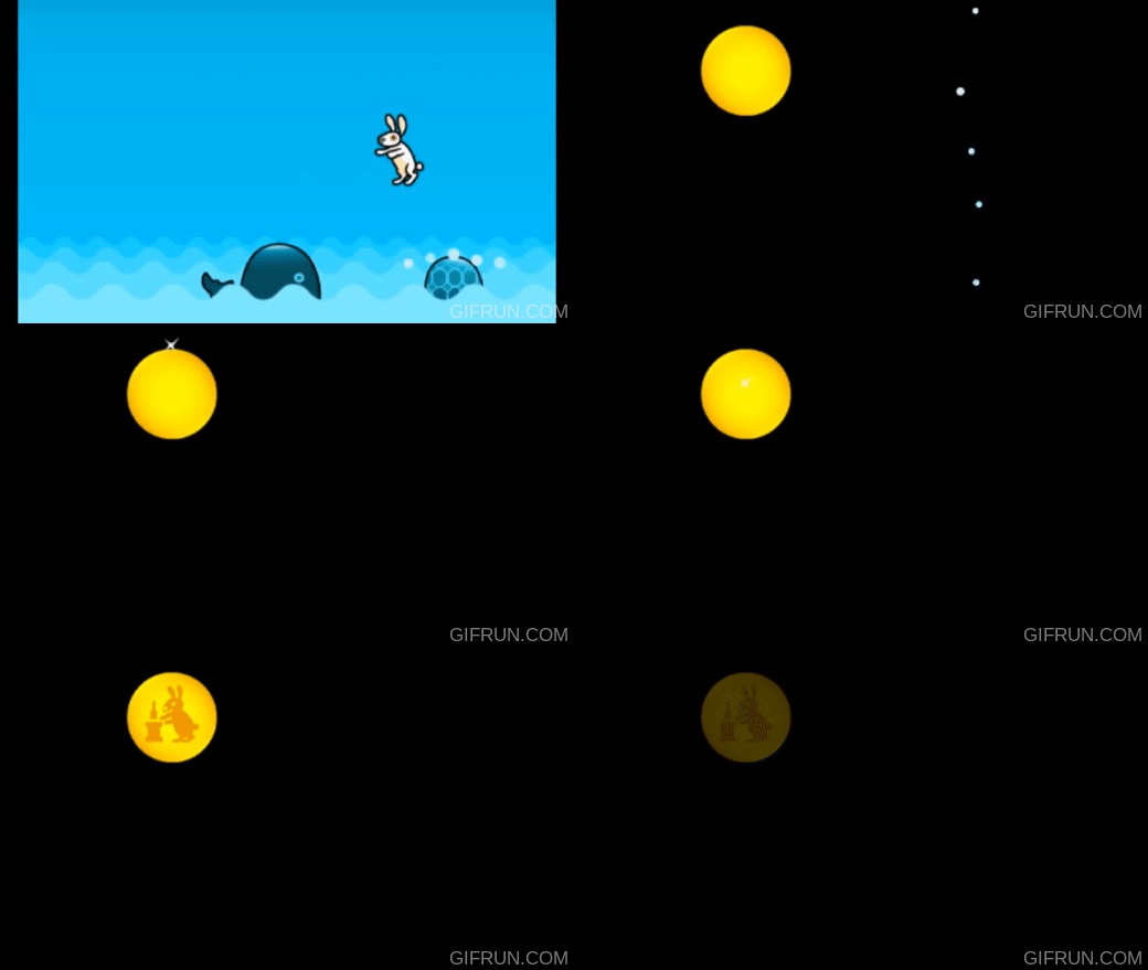
The Moon Rabbit has been adopted into all aspects of modern day culture. The legend can be found in all types of media, from animation to music. One of most popular references to the legend is in Sailor Moon, in which Tsukino Usagi's name is a pun on Tsuki no Usagi - meaning Moon Rabbit. In 2013, Chinese Rover Yutu, that landed on the Moon on December 14, 2013 was named after the Jade Rabbit, as a result of an online poll. Playing through Rhythm Heaven Megamix I coincidentally found reference to the Moon Rabbit in the rhythm game Bunny Hop.
The Moon Rabbit has been adopted into all aspects of modern day culture. The legend can be found in all types of media, from animation to music. One of most popular references to the legend is in Sailor Moon, in which Tsukino Usagi's name is a pun on Tsuki no Usagi - meaning Moon Rabbit. In 2013, Chinese Rover Yutu, that landed on the Moon on December 14, 2013 was named after the Jade Rabbit, as a result of an online poll. Playing through Rhythm Heaven Megamix I coincidentally found reference to the Moon Rabbit in the rhythm game Bunny Hop.
There are a variety of different renditions of the story, but below are two that follow the similar narrative I want to adapt.
Starting points and considerations - Book research
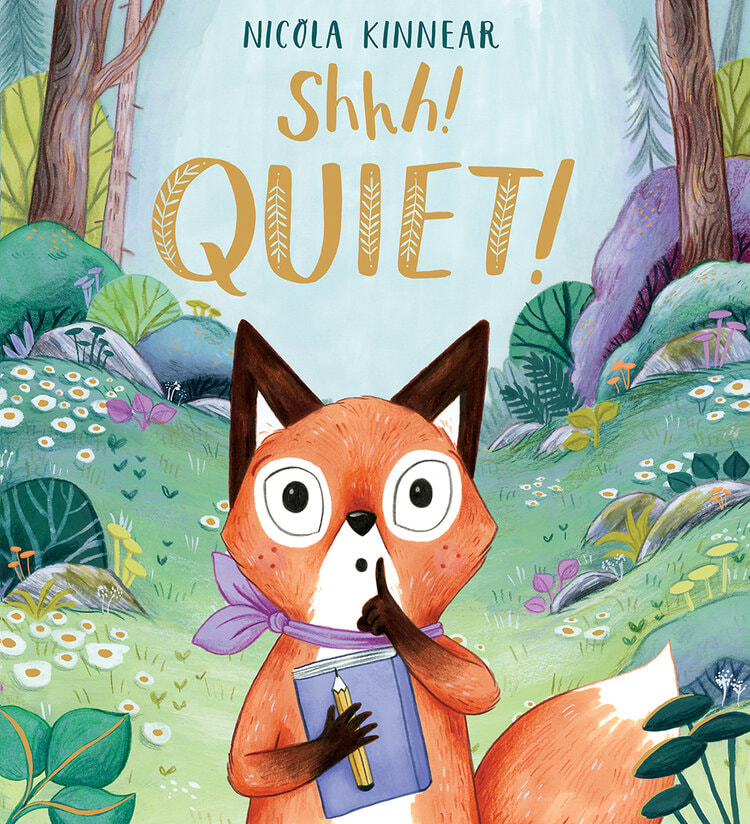
'Shhh! Quiet!' - Nicola Kinnear
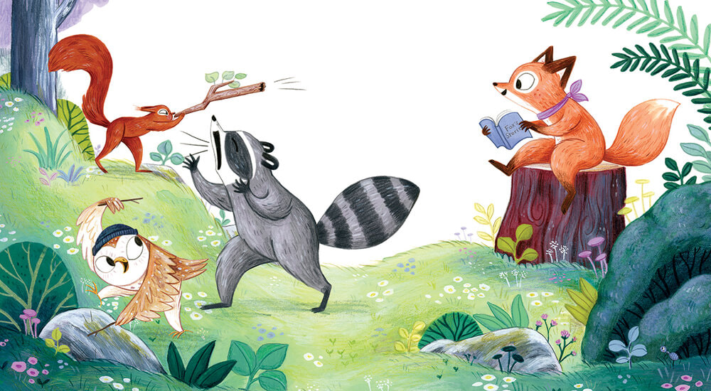
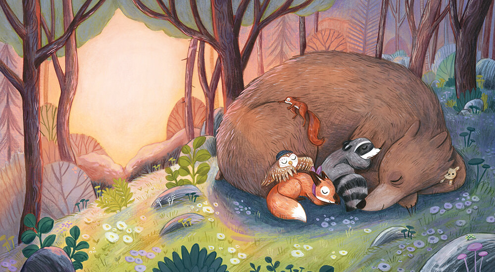
Shhh! Quiet! was the subject of my dissertation. Written and illustrated by Kinnear, the book follows a young fox and her journey into finding her voice.
Dimensions: 25.8 x 1 x 27.9 cm, 32 pages + front and back cover.
'Shhh! Quiet!' - Nicola Kinnear
Shhh! Quiet! was the subject of my dissertation. Written and illustrated by Kinnear, the book follows a young fox and her journey into finding her voice.
Dimensions: 25.8 x 1 x 27.9 cm, 32 pages + front and back cover.
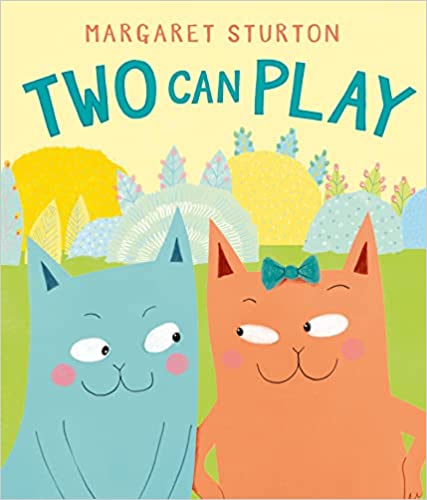
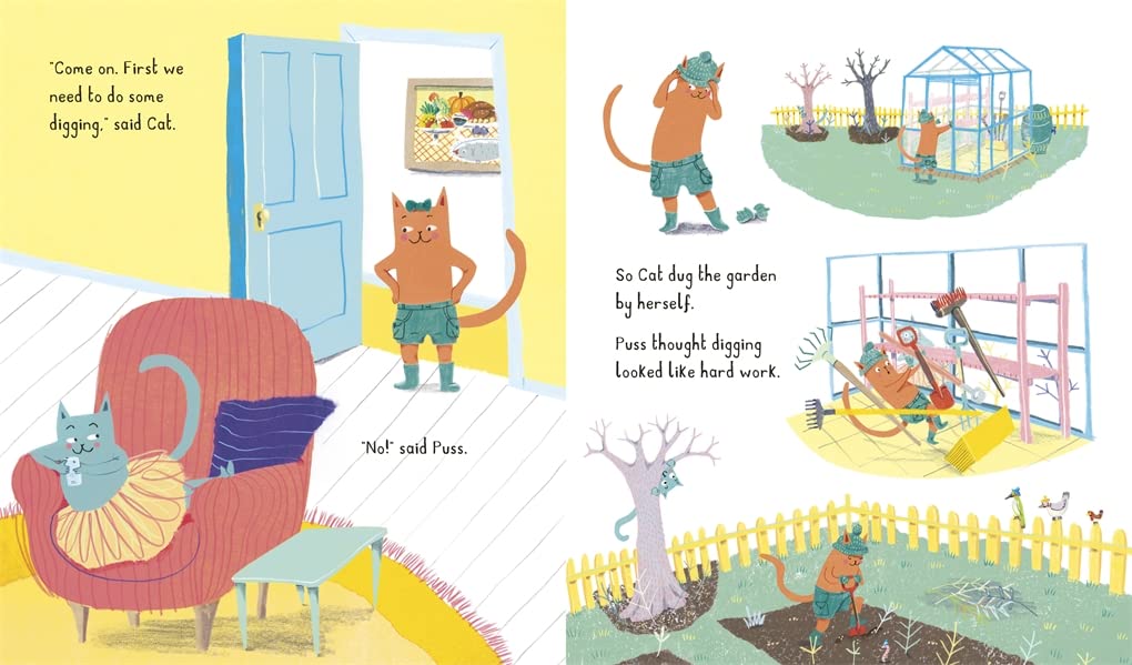
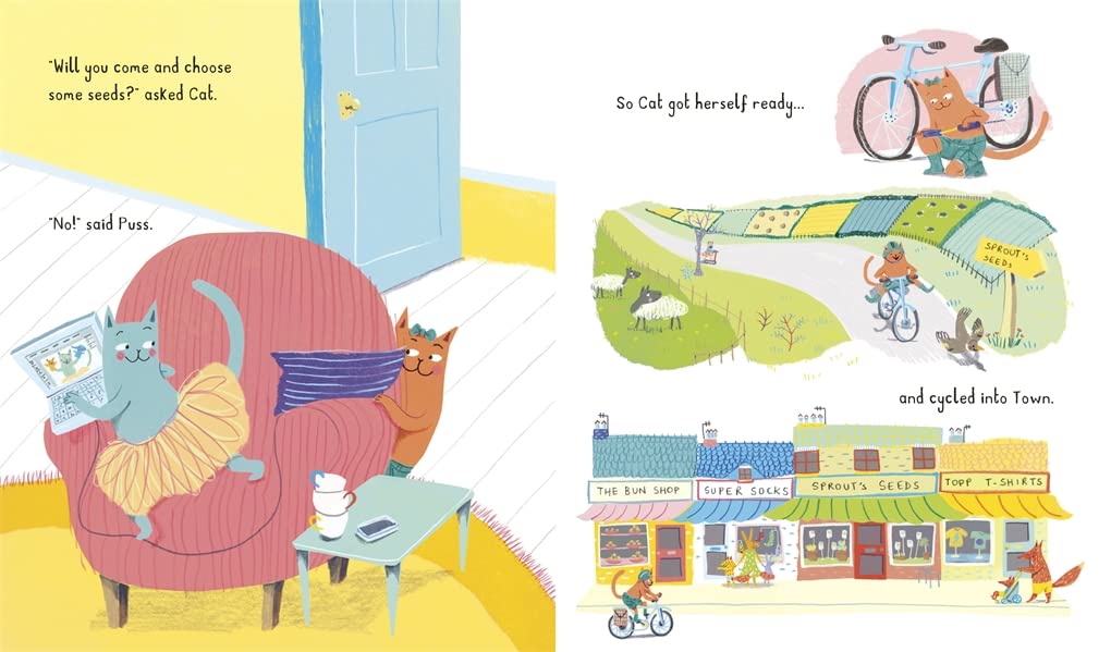
Two Can Play - Margaret Sturton
Two Can Play follows the adventure of two feline siblings and their misadventures. Takes on more of a graphic form of illustration, relying on shape and colour.
Dimensions: 26.9 cm x 22.9 cm x 4 mm, 32 pages + front and back cover
Two Can Play follows the adventure of two feline siblings and their misadventures. Takes on more of a graphic form of illustration, relying on shape and colour.
Dimensions: 26.9 cm x 22.9 cm x 4 mm, 32 pages + front and back cover
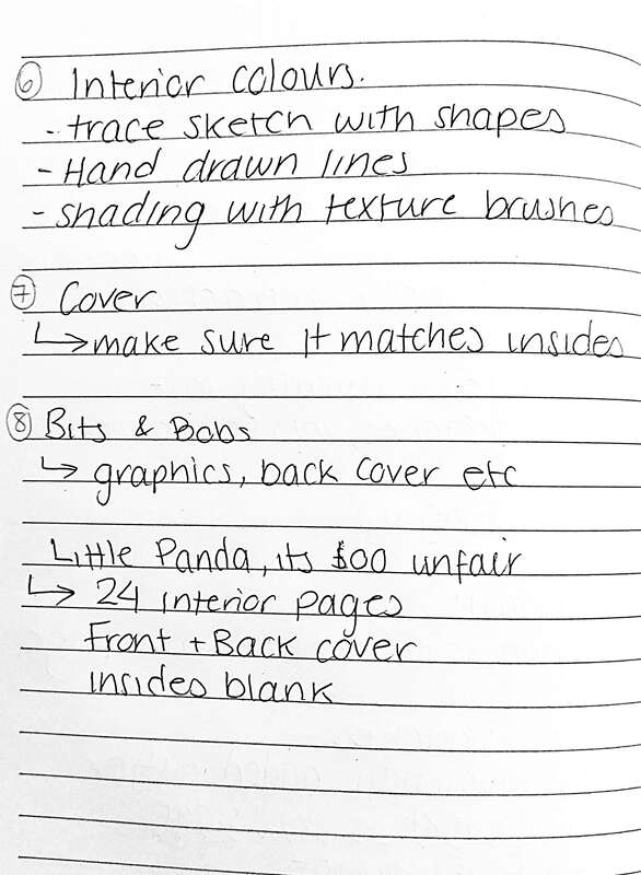
I decided to have a look at some Youtube videos to see how children's book illustrators went about illustrating their book. This was helpful with figuring out what steps I should take next.
|
Art Business with Ness
|
Angel
|
|
|
|
|
Dave Reed
|
Jules Marriner
|
|
|
|
Printing Options
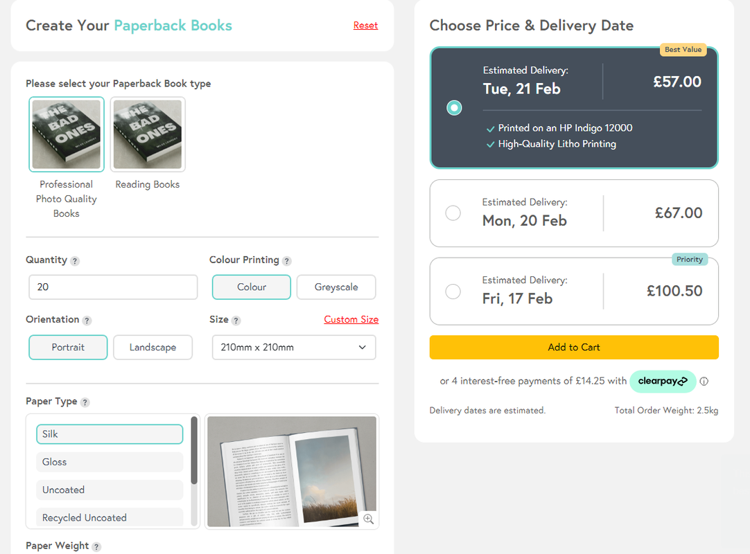
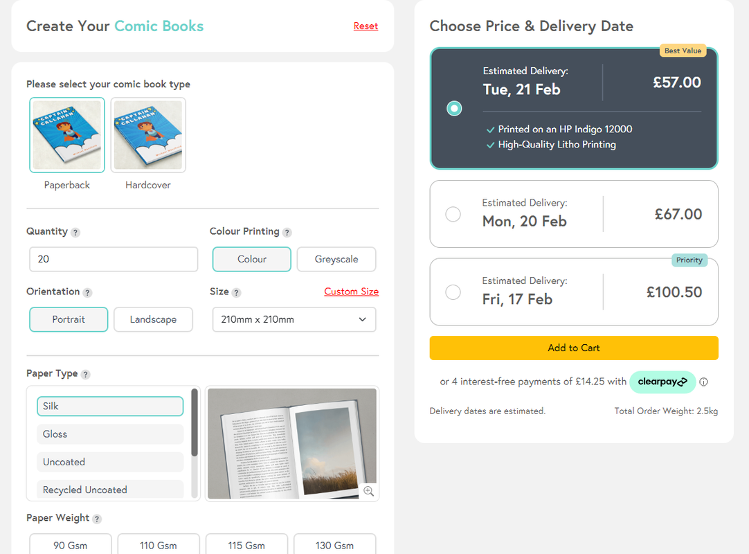
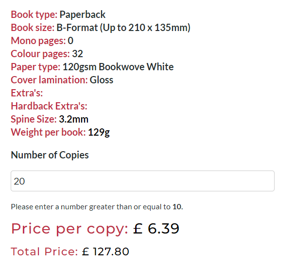
As I only had a rough idea of the format/paper weight etc. that I wanted my book to be, I decided to compare the most basic of books for price comparison. Mixam was significantly cheaper and formatted front and back cover separately, allowing more customisation. The only downside to Mixam is that they do not seem to offer a sample print.
|
Mixam - Paper back book
20 copies 28 pages + 4 pages for front, back, inside covers 170mg paper weight £57 ~ £2.85 per unit |
Mixam - Comic book
20 copies 28 pages + 4 pages for front, back, inside covers 170mg paper weight £57 ~ £2.85 per unit |
Imprint Design
20 copies 32 pages 120mg paper weight £127 ~ £6.39 per unit |
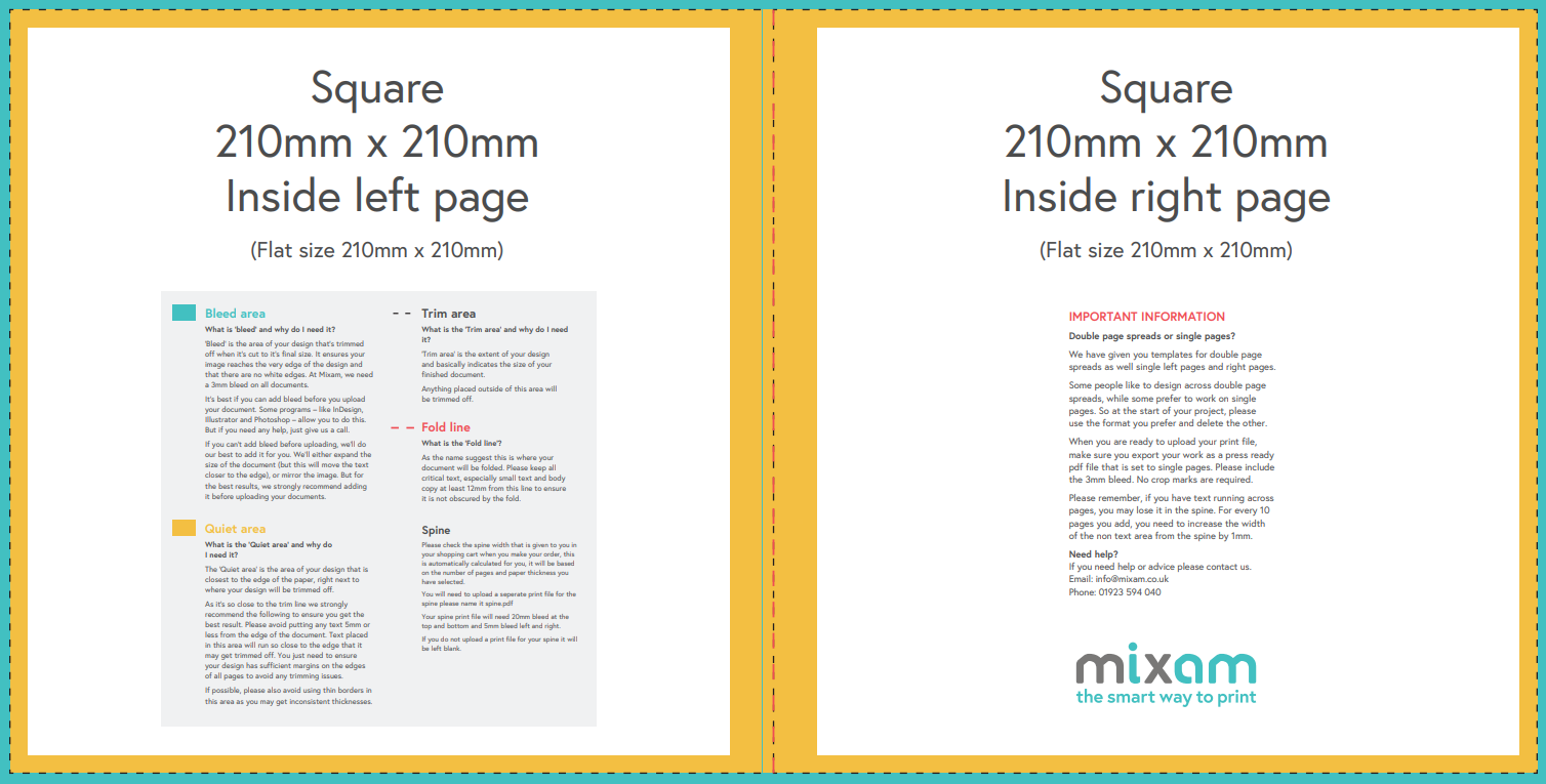
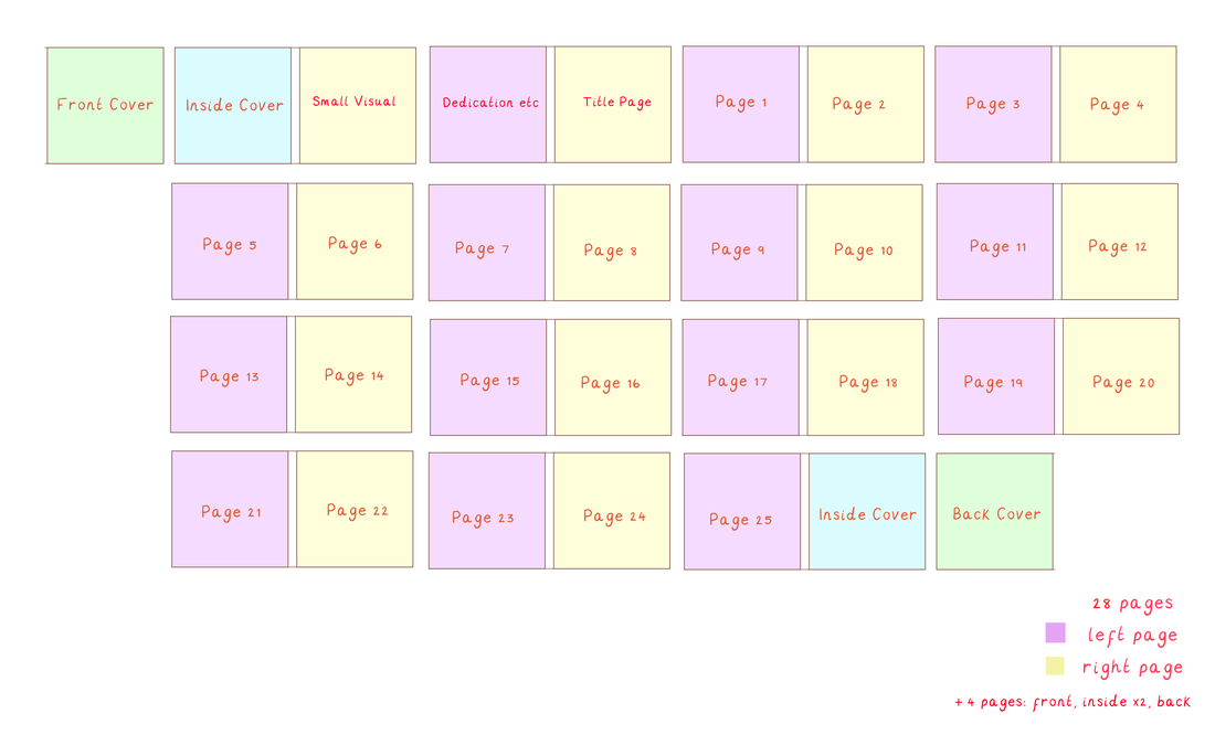
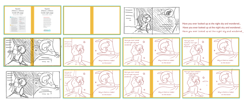
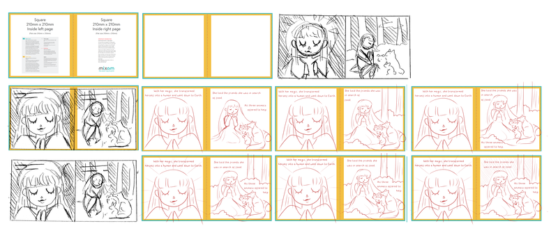
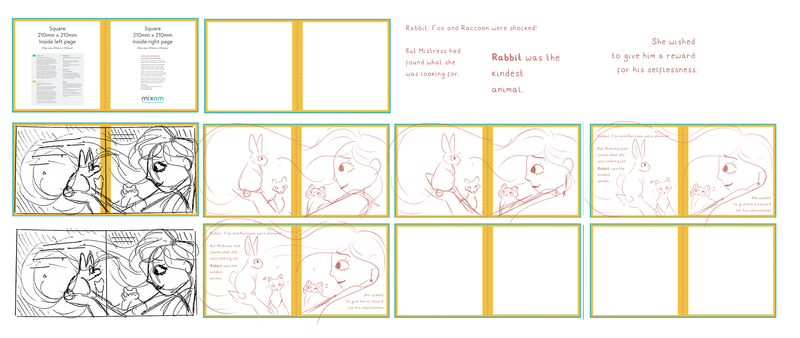
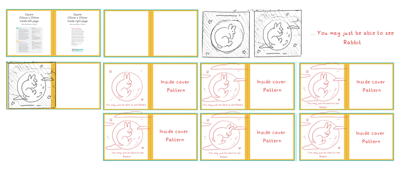
As a starting point, I was able to find the template for the 21cm x 21cm book layout on Mixam's website. Accounting for the front cover and inside covers, I made a rough plan of what I wanted the layout of my book to be, that way I would be able to better imagine and develop thumbnails.
|
Adapting the story
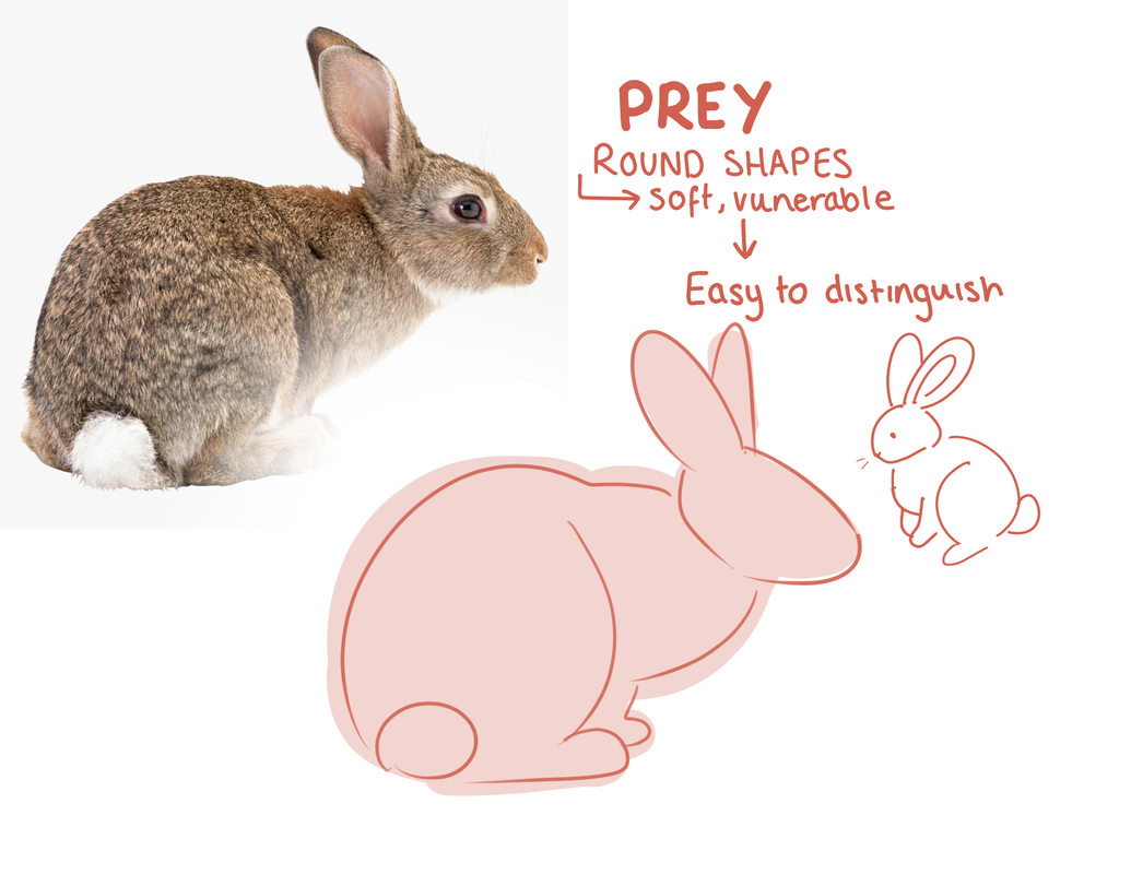
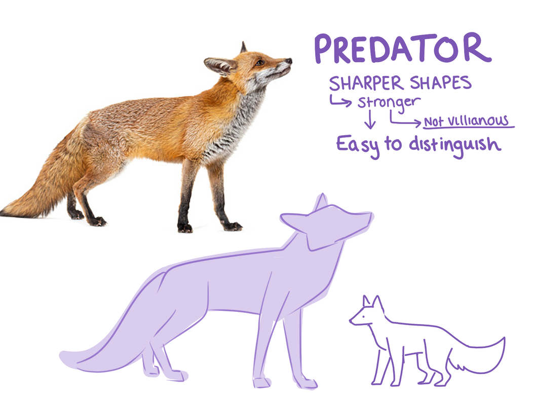
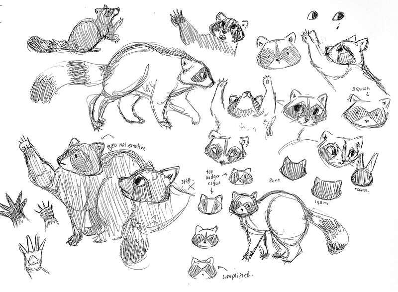
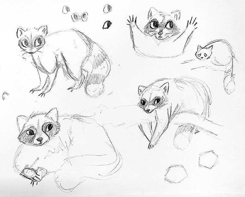
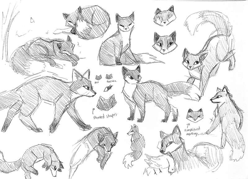
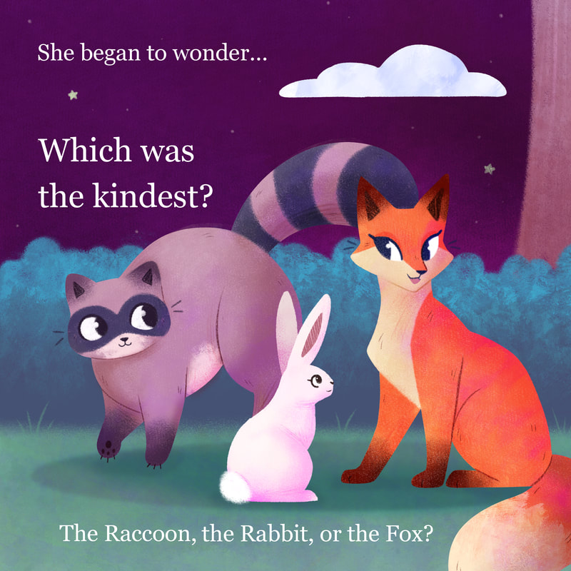
Although the core story of my illustrated book was to be based on the Japanese story of how the rabbit got on the moon, I wanted to adapt it into my own story. After some consideration, I decided to change the character of the monkey to something that fitted with the two other forest animals. The three animals in the story can be broken down into three categories; Prey, Predator and Scavenger. Breaking down the animals' body types, I decided to change the monkey to a raccoon as it felt like a better middle ground between prey and predators shapes. |
Prey
|
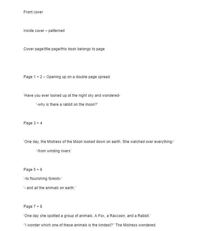
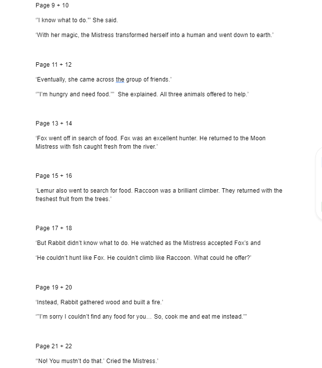
Rough breakdown of story, thinking about page numbers/page layouts.
Visual Research
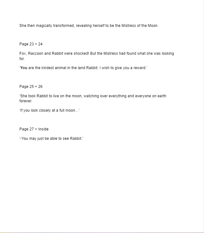
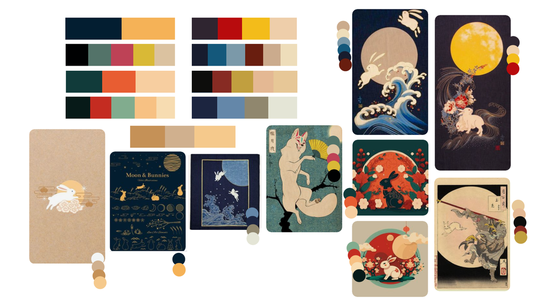
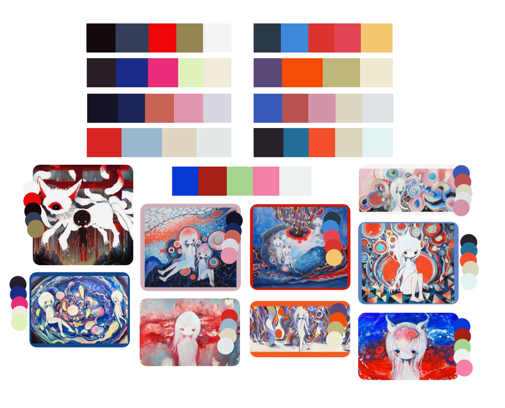
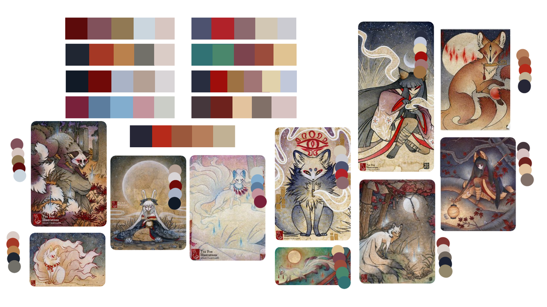
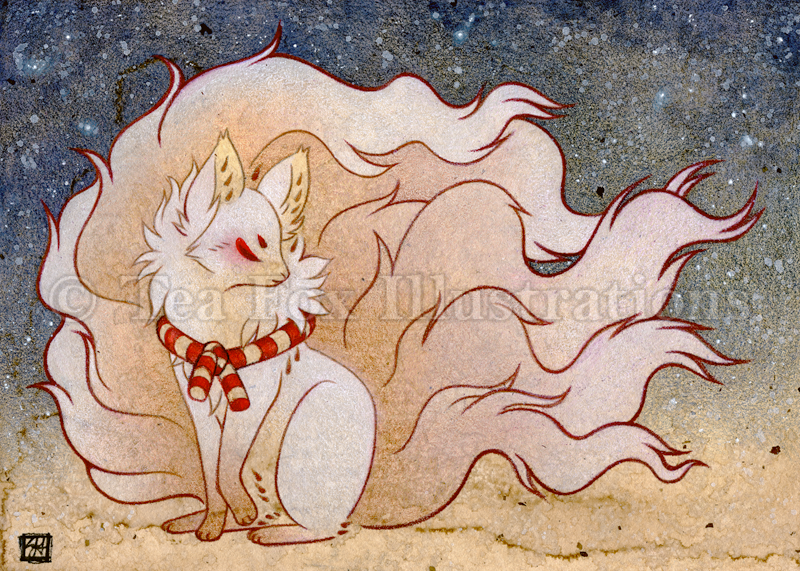
Although I'd be adapting the story to fit my own narrative and style, I began by looking at traditional visual imagery. This was mainly to focus on colour and begin to build a starting point.
Although I'd be adapting the story to fit my own narrative and style, I began by looking at traditional visual imagery. This was mainly to focus on colour and begin to build a starting point.
si_ku.k
TeaFoxIllustrations
Experimentation
Character Experimentation
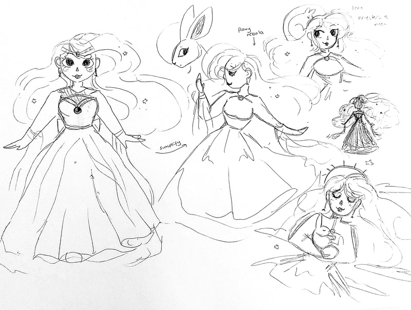
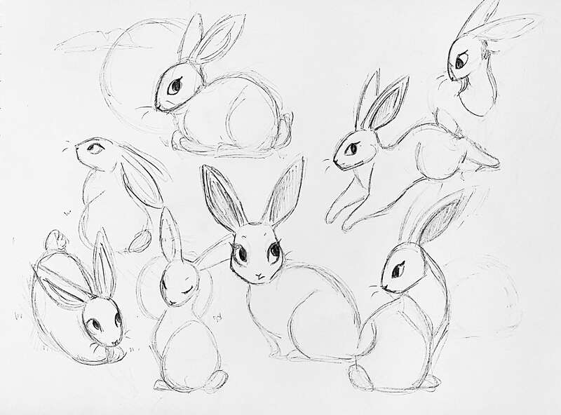
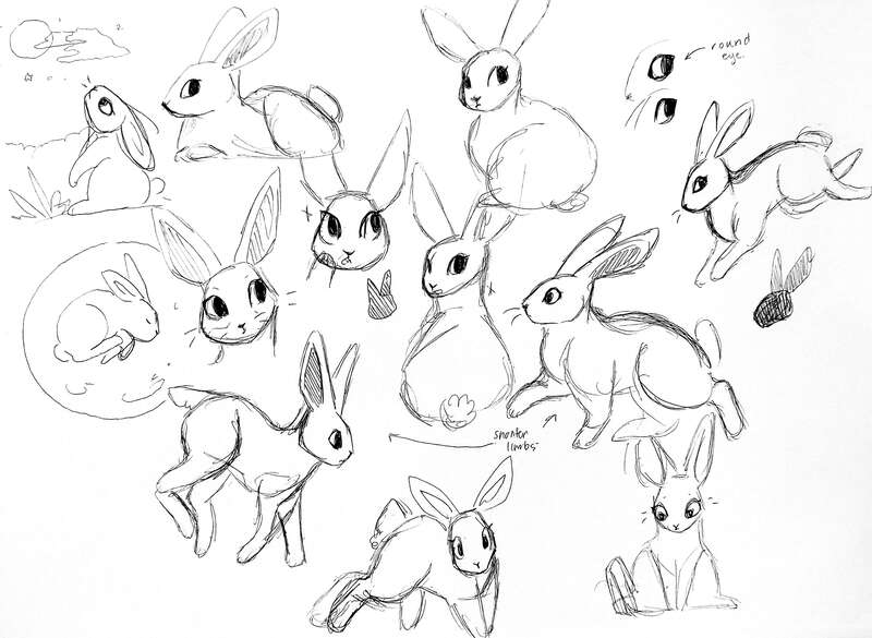
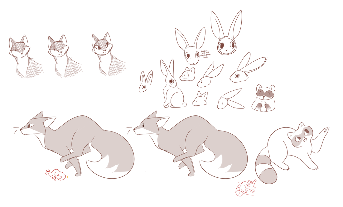
As a starting point, I decided to breakdown each of the characters into different shapes, basing them off the visuals seen above when adapting the story. I decided this was going to be the best way in keeping things consistent throughout the whole book without over complicating things.
|
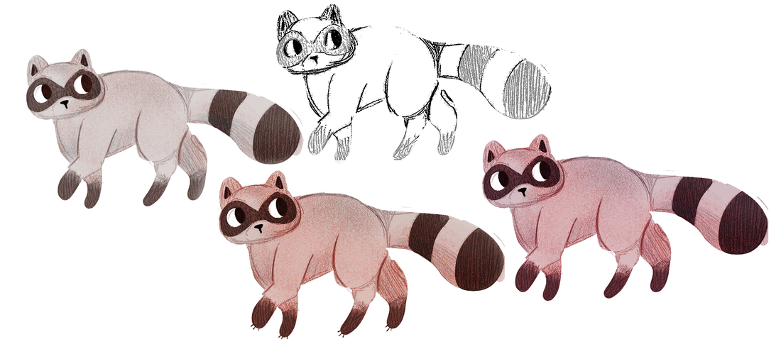
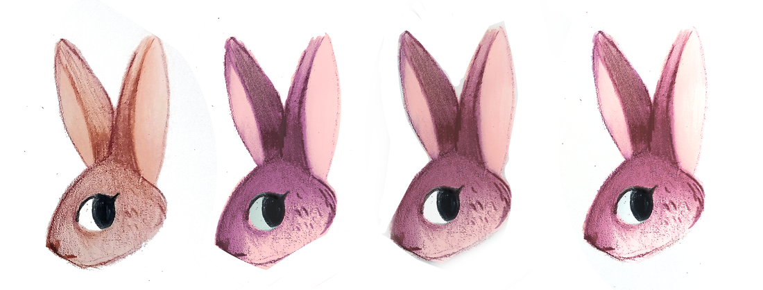
Traditional with the Digital
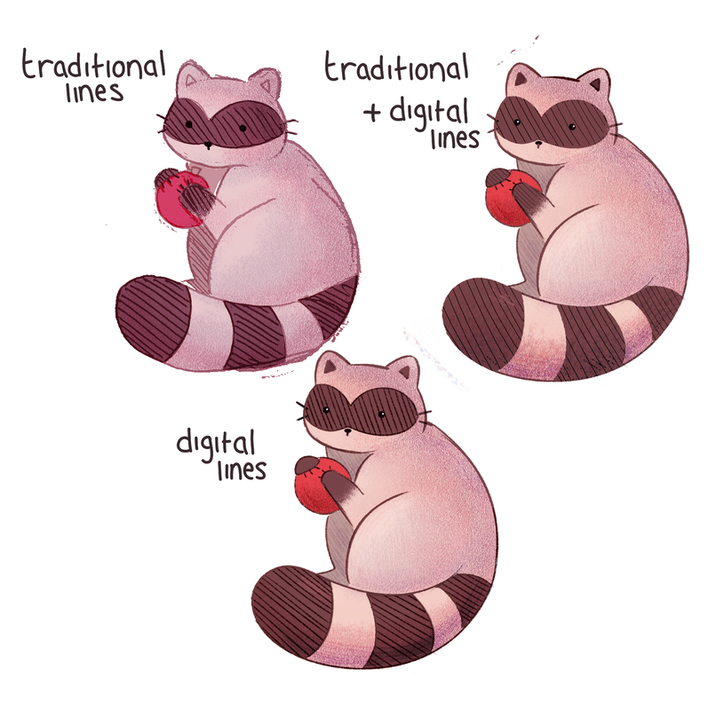
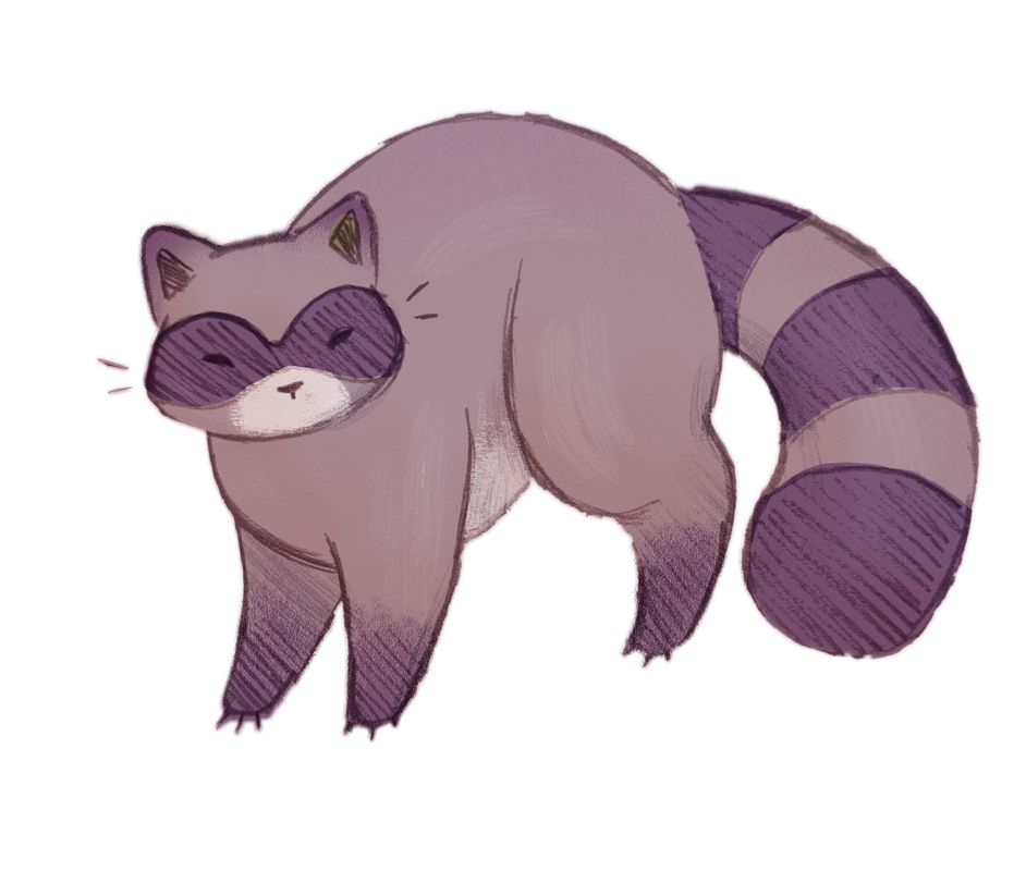
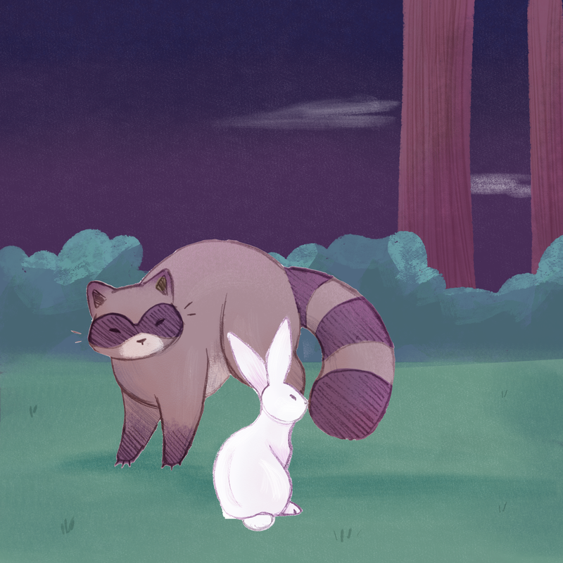
Looking at the likes of TeaFoxIllustrations, I took the character of Rabbit and Raccoon, and attempted to replicate the traditional feel found in her pieces, while maintaining a children's book feel. While these outcomes were interesting on their own, I struggled to put them into a page spread when using them later on in my development. In Page Experimentation 2 I attempted to make use of the traditional with the digital, but this made the animals stick out like a sore thumb when compared to the digital background. |
Taking a more Digital approach
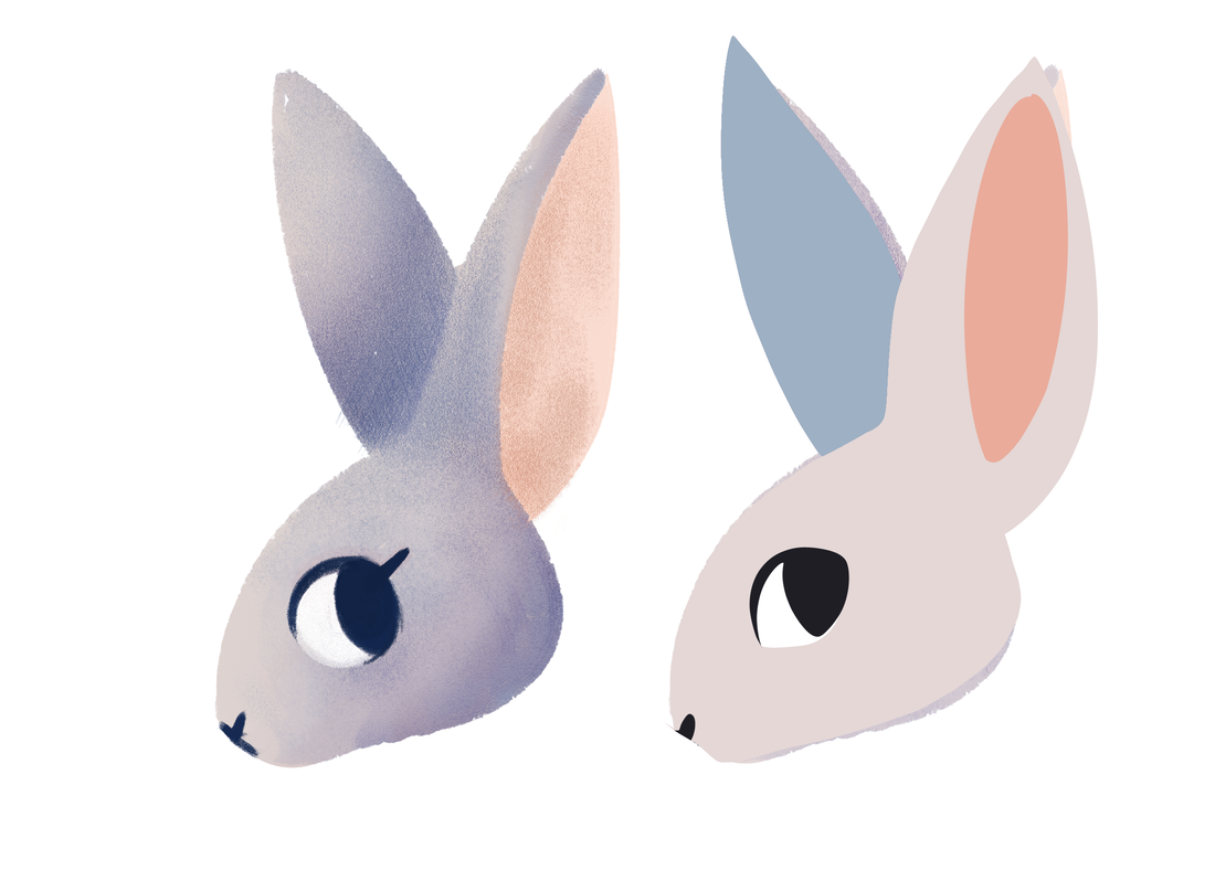
While I liked the feel of the traditional outcomes, creating a full book traditionally didn't reflect me. For this reason, I decided to try out different digital brushes to replicate the traditional feel of the outcomes without the mess and hassle of working them into the book.
While I liked the feel of the traditional outcomes, creating a full book traditionally didn't reflect me. For this reason, I decided to try out different digital brushes to replicate the traditional feel of the outcomes without the mess and hassle of working them into the book.
|
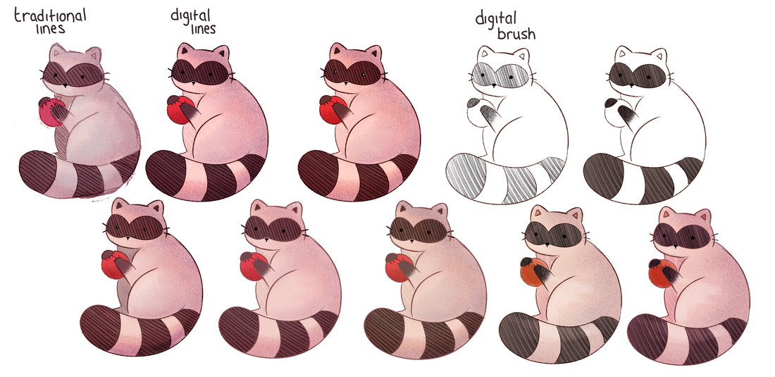
I made various different experimental pieces with each animal, focusing on the raccoon as that was the one with the most detail.
While I liked the traditional and digital mix on its own, when the characters were side by side, I didn't like how it looked. I decided to play around with digital outcomes instead as I was more confident in working this way. |
Page Experimentation 1
|
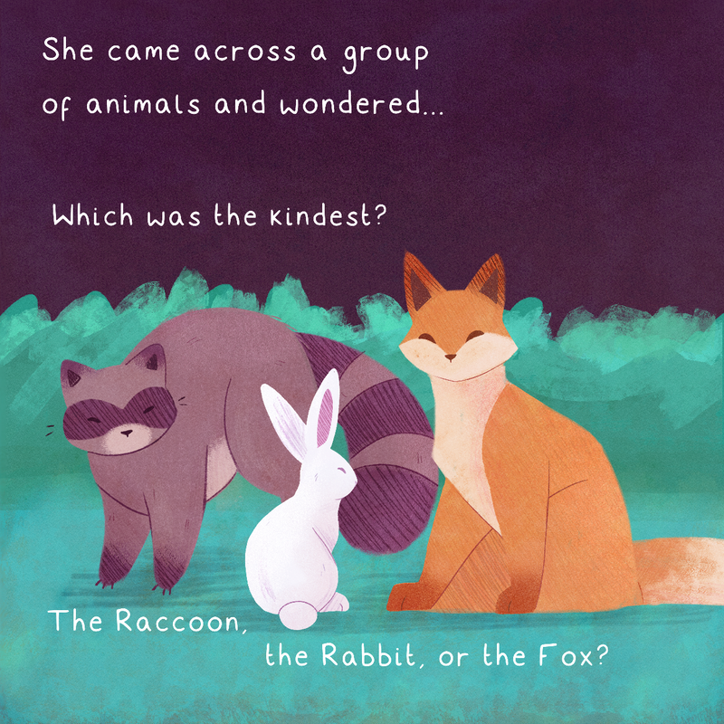
I decided it was best if I began to work up a page to see how the page would be laid out. But, I was unhappy with this first outcome.
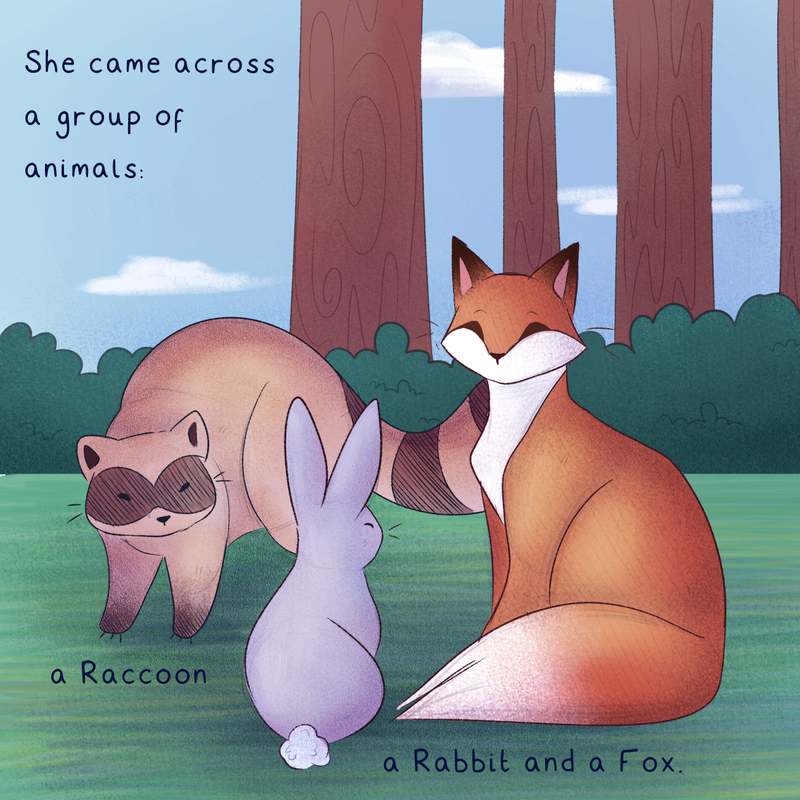
The colour palette was too literal and the way the animals were drawn made them look stiff and uninteresting. It became apparent that diving in and making a mock-up wasn't the best way to approach this problem. |
Instead, I took a step back, taking the thumbnail I had already developed to and applying colour to them to get a feel of what colour palettes I wanted to go with.
I decided to keep the traditional colours seen in earlier examples of Japanese inspired art, as they fitted the mood of the book better than literal colours.
I decided to keep the traditional colours seen in earlier examples of Japanese inspired art, as they fitted the mood of the book better than literal colours.
Colour Palette and Style Development
At this stage I also tried different ways I could develop the animals - trying to use traditional with the digital. While I liked the traditional Raccoon on its own, working it into a page proved difficult. It was for this reason I developed digital outcomes and I was also more confident in experimenting with this way of working.
Page Experimentation 2
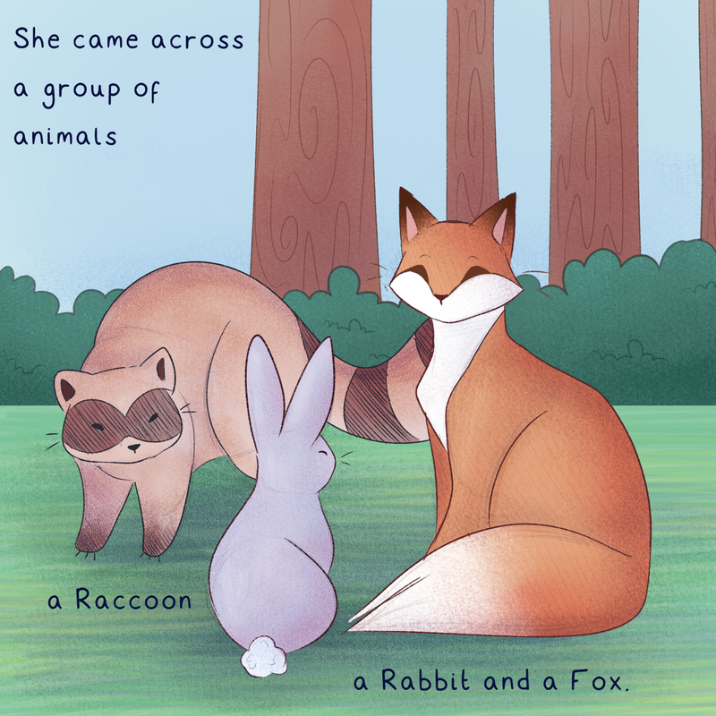
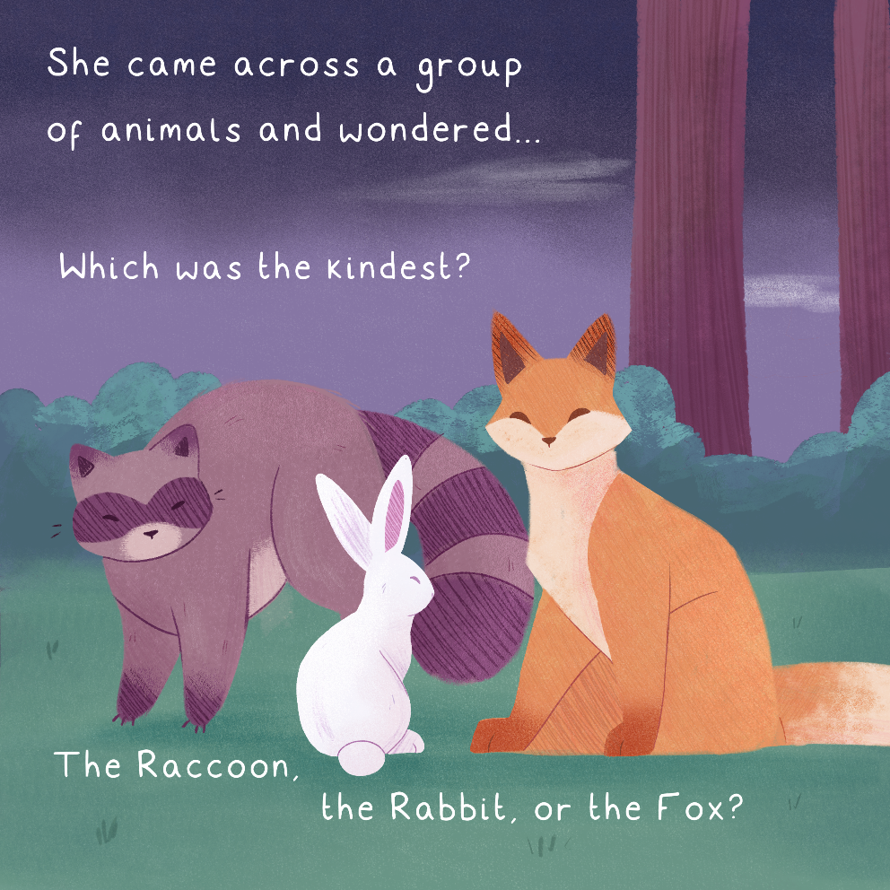
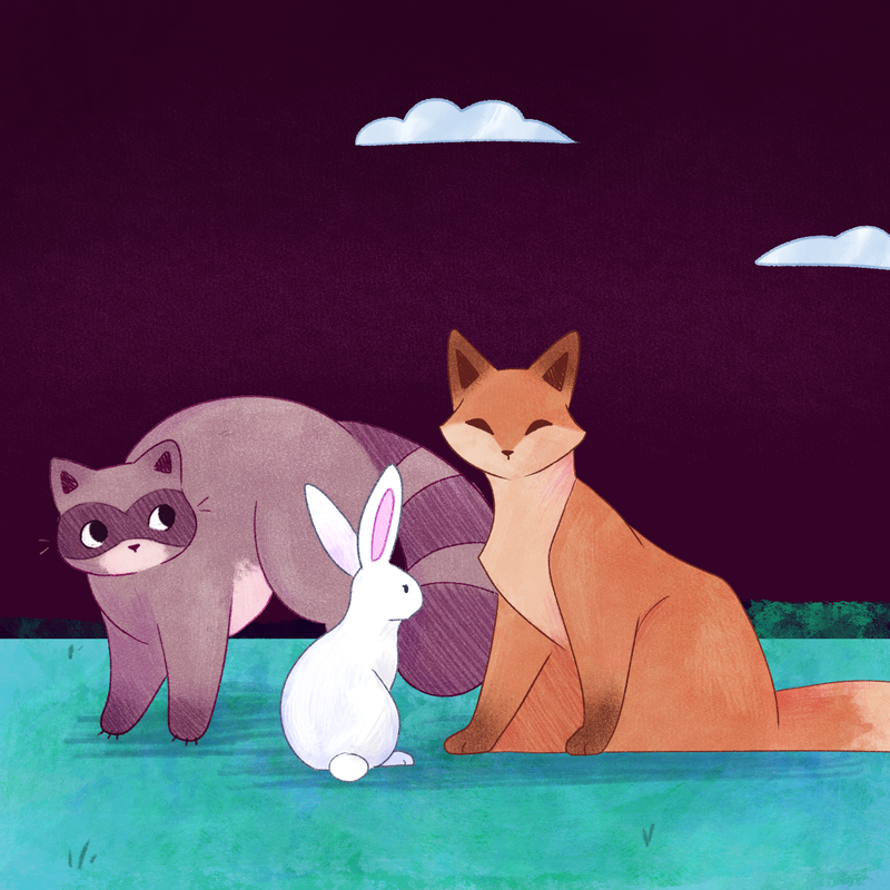
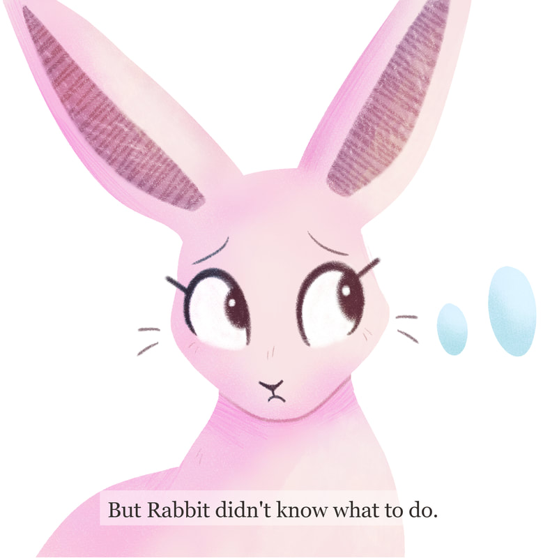
My second attempt at mocking up a page was more successful than the first. The colour palette better suited the tone of the book and the animals sat better on the page. While it wasn't perfect, it helped me figure out what direction I wanted my book to go in.
I first tested out using the idea of using traditional pieces with digital to see how they would work. Unfortunately, this didn't work the way I wanted it do. It was clunky, difficult, and time consuming.
I first tested out using the idea of using traditional pieces with digital to see how they would work. Unfortunately, this didn't work the way I wanted it do. It was clunky, difficult, and time consuming.
Reworking Fox
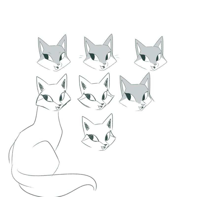
When working on my initial character sketches and the page mock-up, I was unhappy with the way Fox looked in each of the pieces. Instead, I decided to take another step back, and figure out her facial features, ensuring they were sharper than the other two animals.
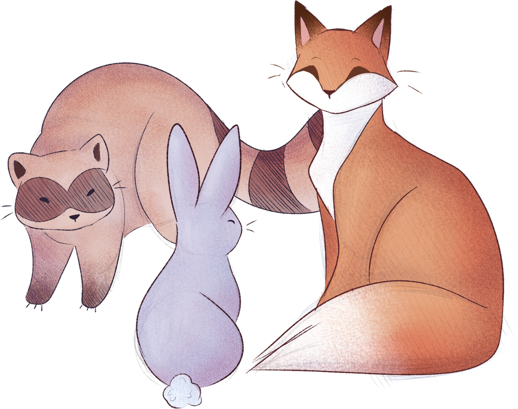
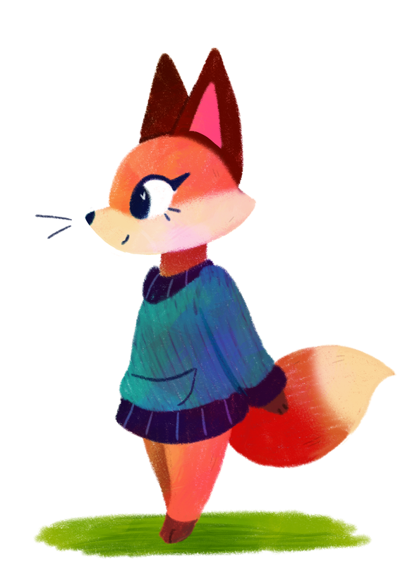
Taking a break from the character, I played around with different textures and ways of colouring on another fox character. I was far happier with the way she turned out in comparison to my page mock-up Fox. This was due to me using brushes that were less clean and more reminiscent of colouring pencils.
Taking a break from the character, I played around with different textures and ways of colouring on another fox character. I was far happier with the way she turned out in comparison to my page mock-up Fox. This was due to me using brushes that were less clean and more reminiscent of colouring pencils.
Thumbnailing
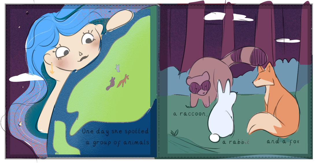
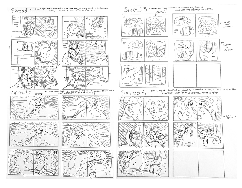
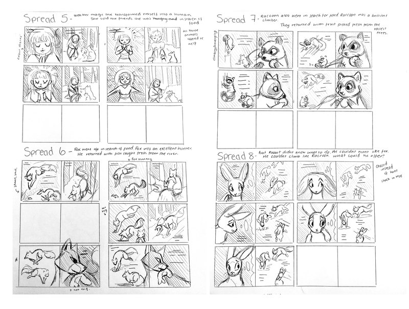
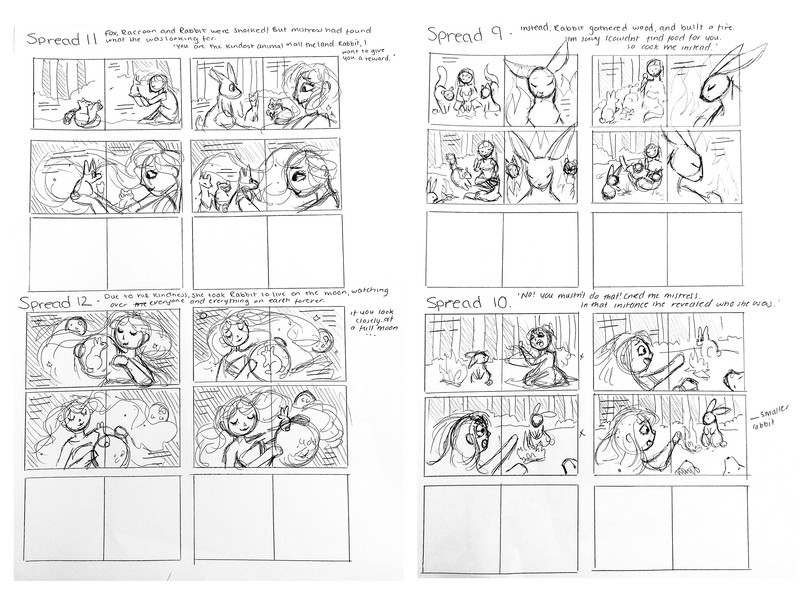
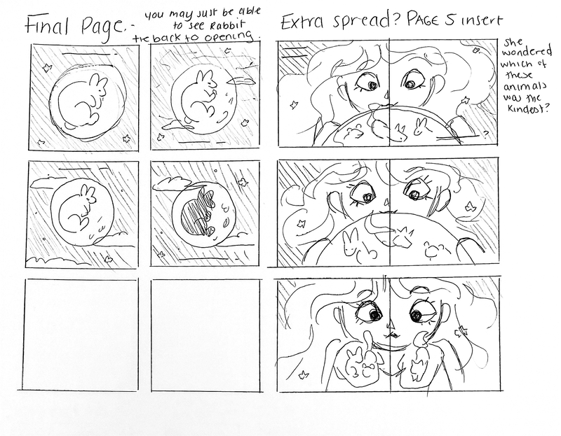
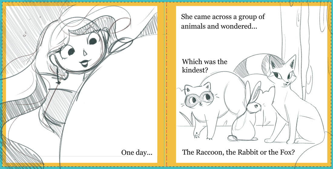
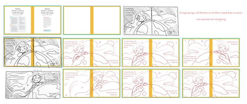
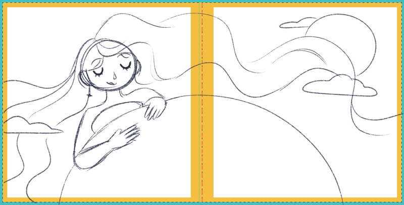
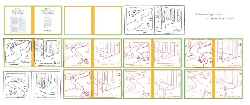
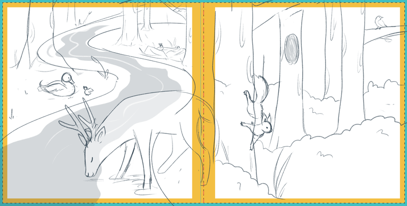
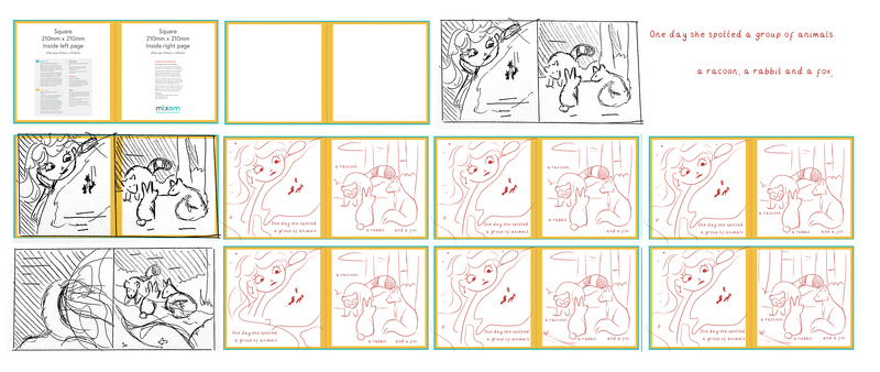
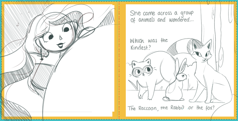
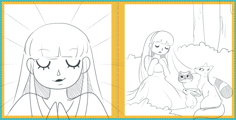
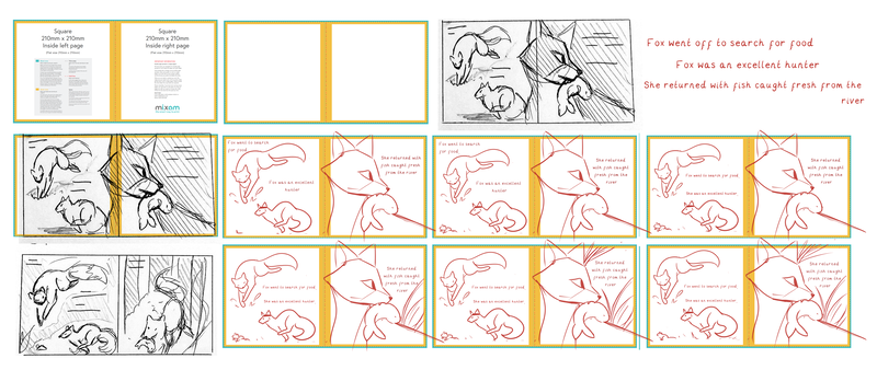
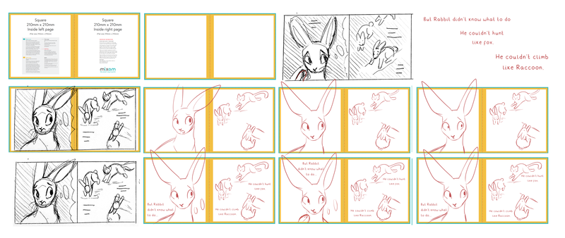
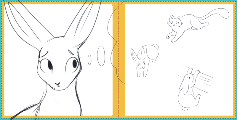
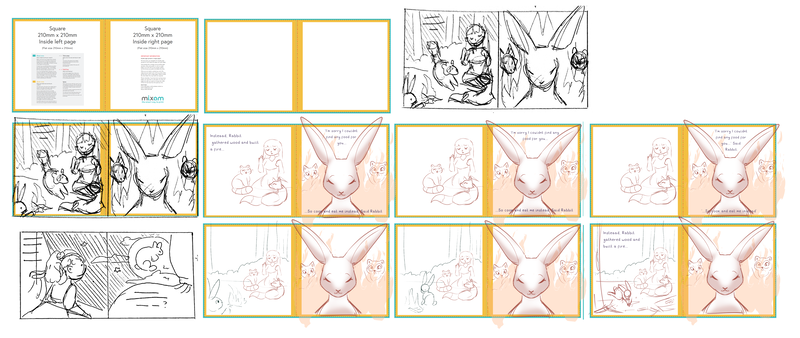
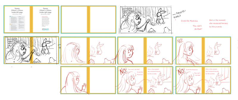
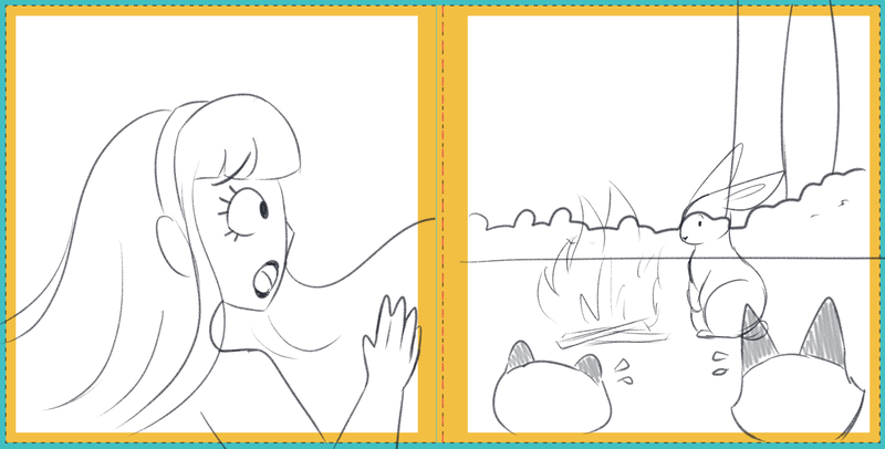
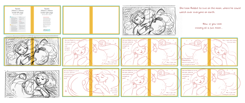
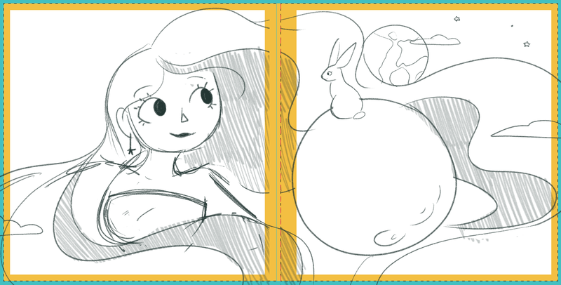
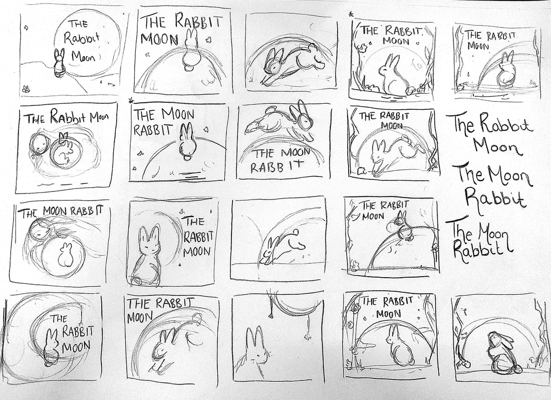
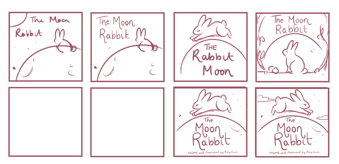
Having mock-ups and understanding how I wanted to approach the book, I decided to begin working up all the pages, from rough thumbnails, developed thumbnails, and then sketches to be worked on top of.
Having mock-ups and understanding how I wanted to approach the book, I decided to begin working up all the pages, from rough thumbnails, developed thumbnails, and then sketches to be worked on top of.
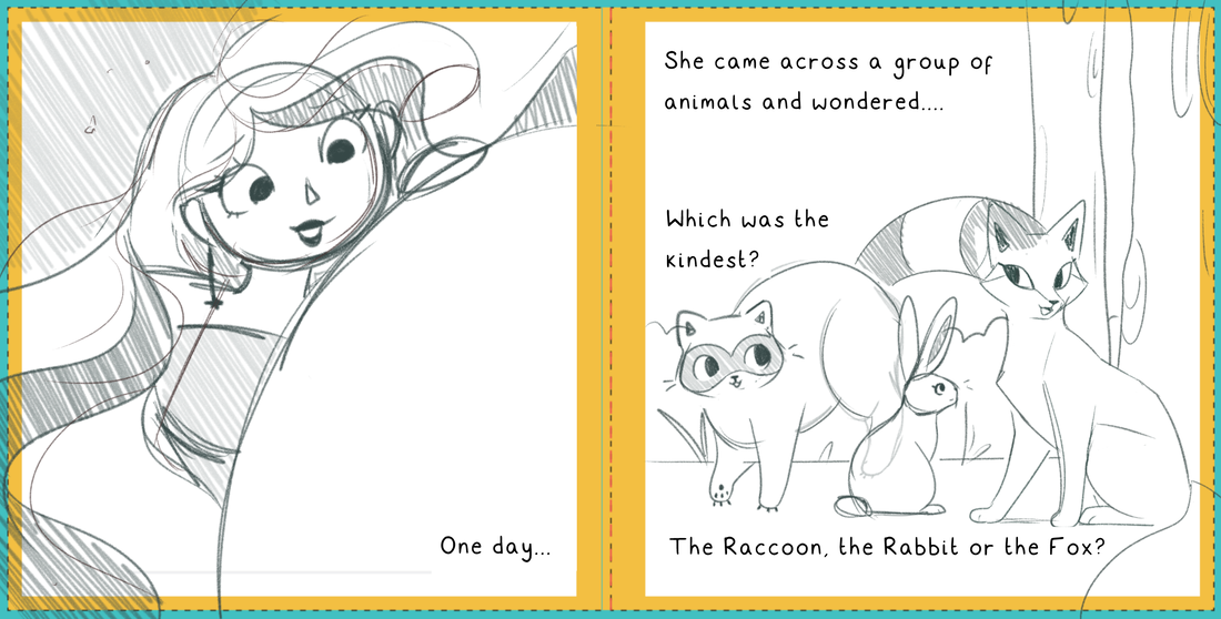
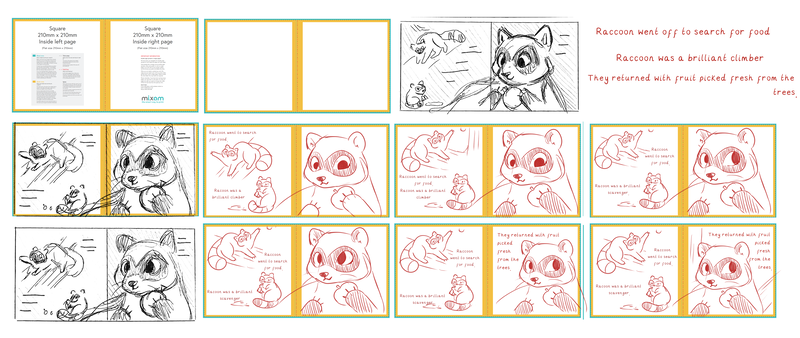
I began to refine my thumbnails, taking them into digital software to tweak smaller parts of the composition, and work out where text was going to place. While figuring out where the text was going to go, I decided to use my old handwriting font as I want the book to feel more personal. This may change later on in development.
Page Experimentation 3
|
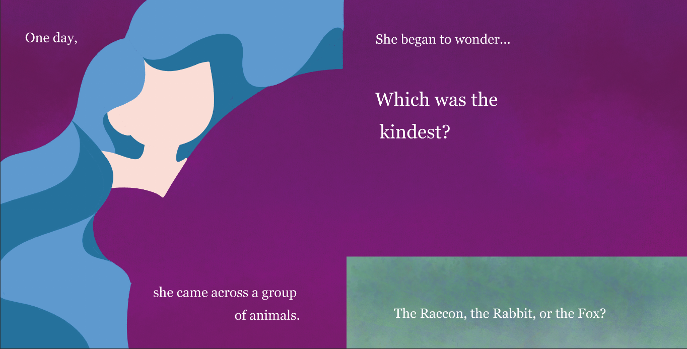
After struggling with mocking up a single page, I decided to instead try and tackle a different page; this time a double page spread.
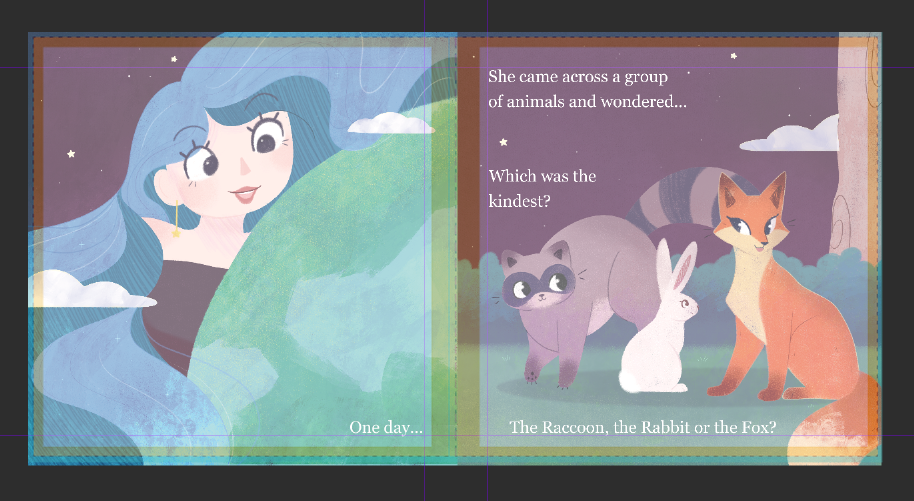
I first attempted to draw it out traditionally, and work on it digitally afterwards, but the outcome never looked as polished as I wanted it to. Instead I decided to experiment with different textures, seeing how far I could push certain elements without them looking too cluttered. I found that overlaying a different textures at the end of the process tied the page together, and would be another way of keeping pages coherent. |
Type Experimentation
Comparing the different typefaces, I narrowed my options down to my handwriting font, Georgia and Grill Sans MT. Given the softness of the illustrations, my handwriting got lost on the page, looking too childish with the illustrations. Similarly, Georgia also had the same issue. It's rounded shapes clashed with the soft shapes of the illustrations.
For this reason, I decided to opt with Grill Sans MT for my typeface.
Page Experimentation 3 - Lineless attempt.
With my new typeface, I decided to retackle the 7th and 8th page due to them being single pages. All in all I was happy with this outcome, but knew I could push it further with textures and details as my animals were looking flat.
This piece helped me understand which way I'd have to work to ensure mistakes weren't made. For example, colours bled out from under Fox in this was something I would have to fix to keep the outcomes polished.
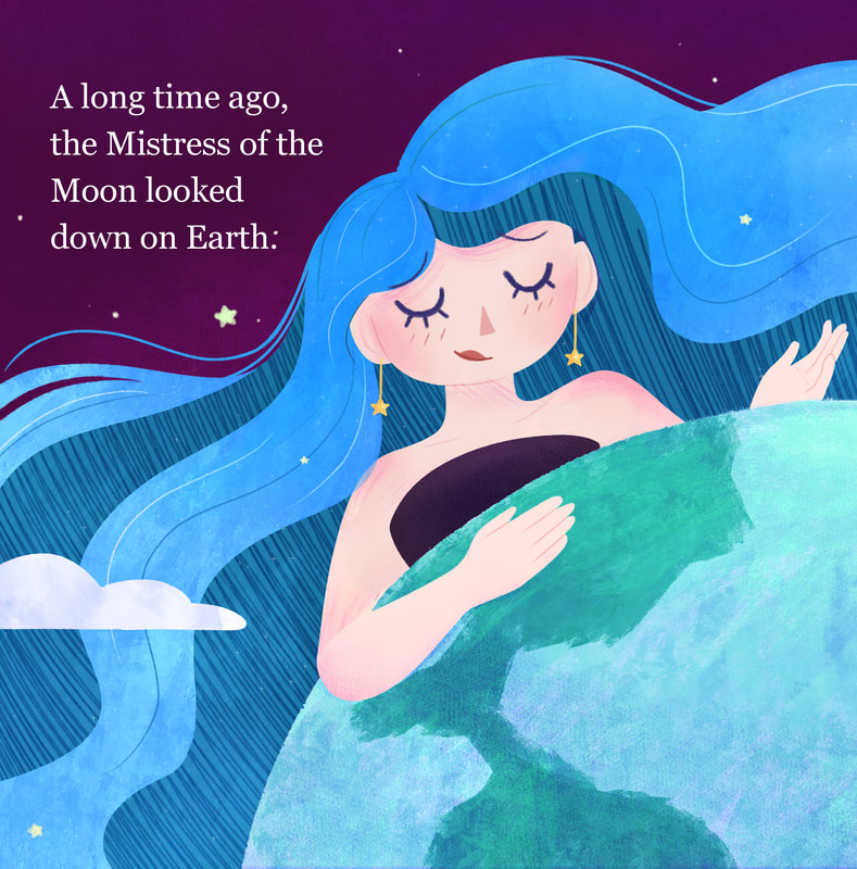
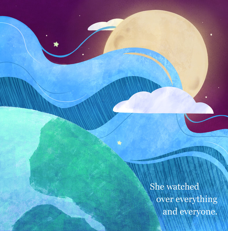
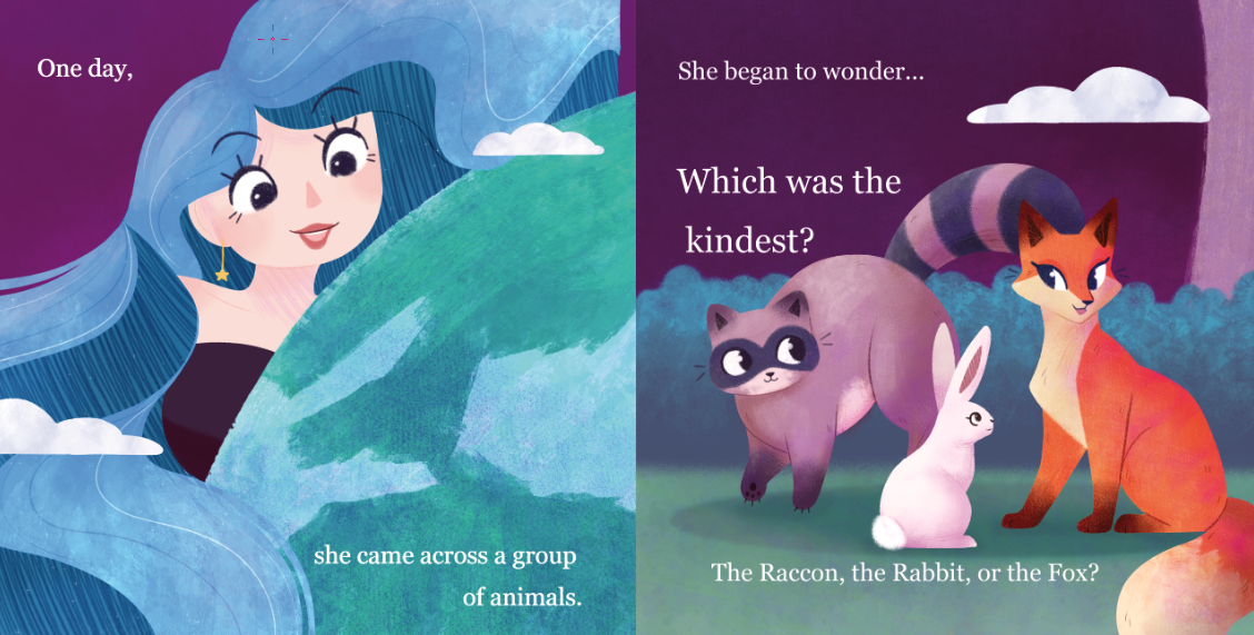
Page Development 4 - After Feedback
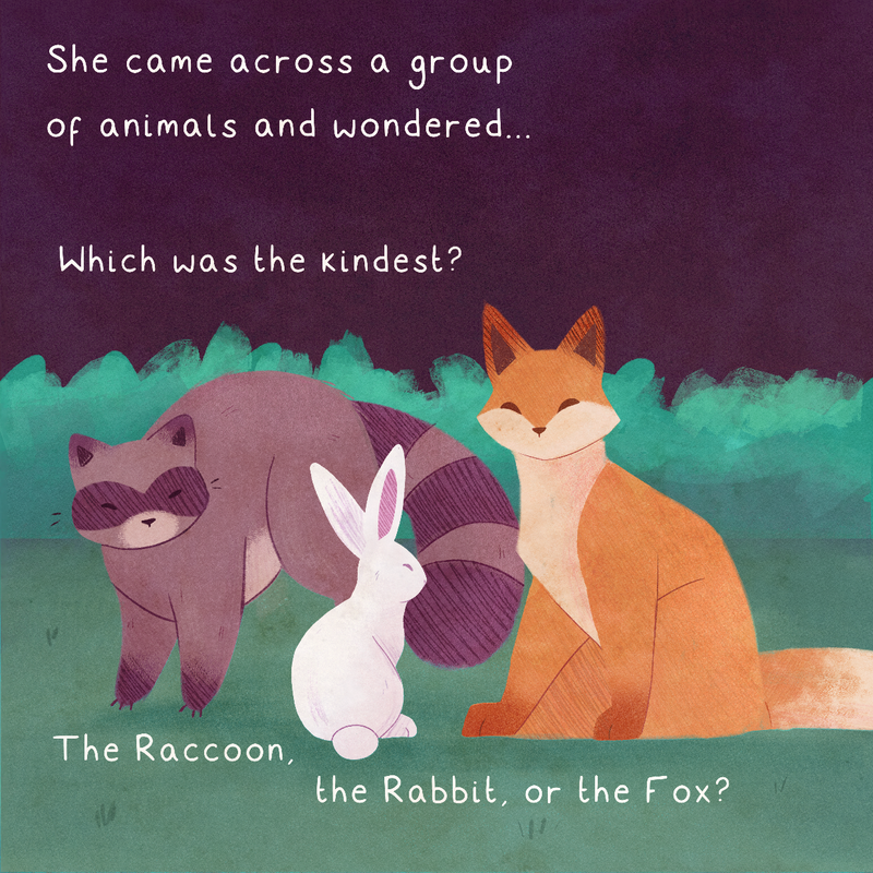
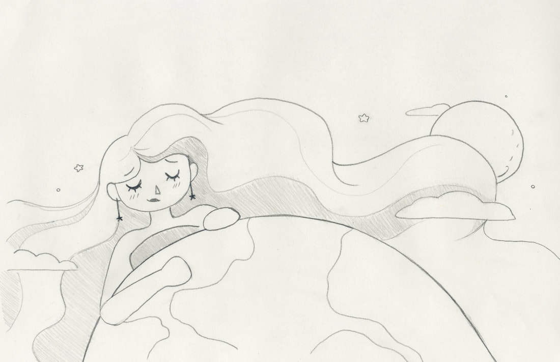
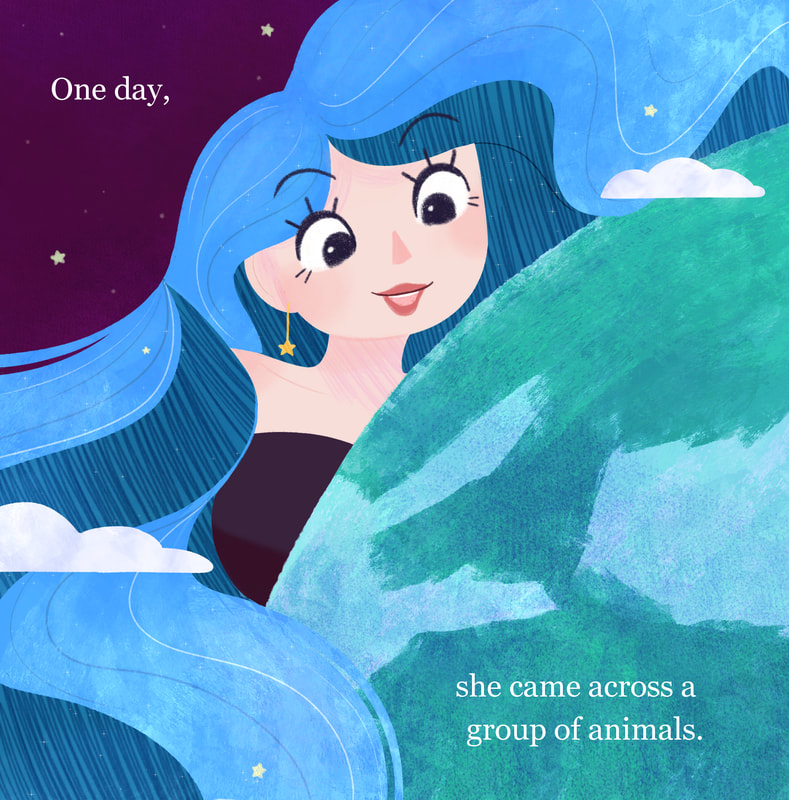
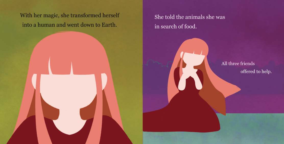
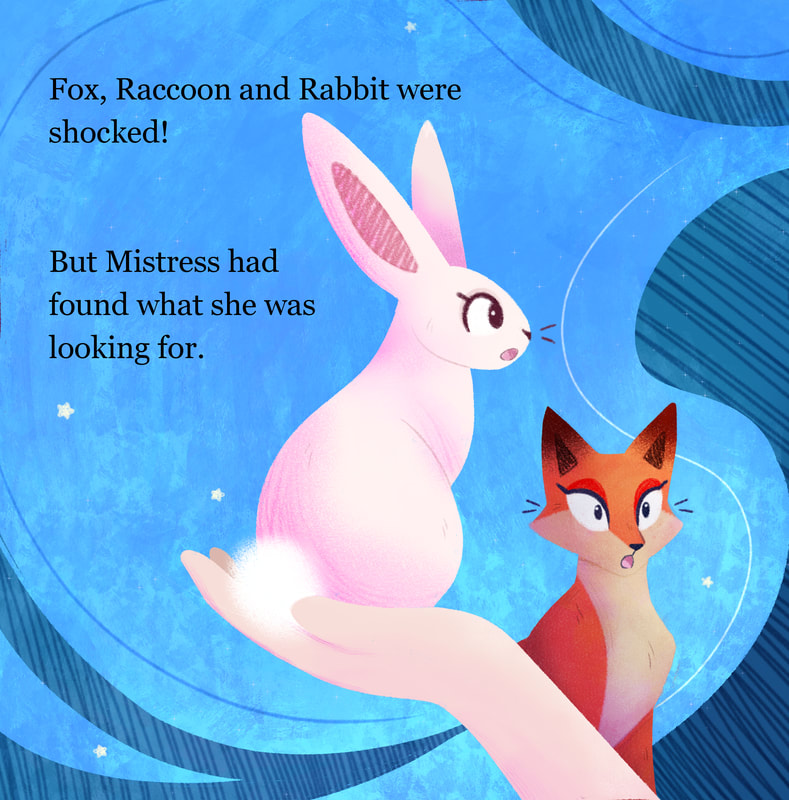
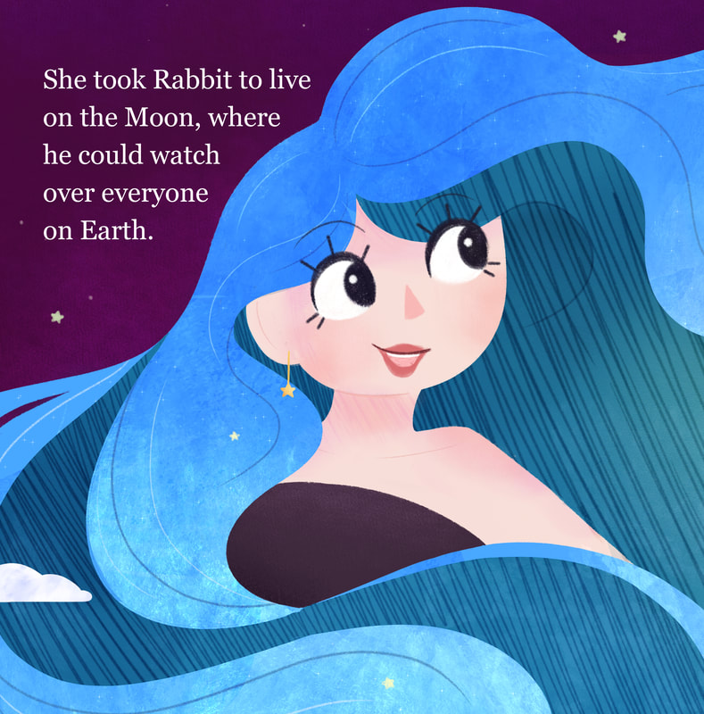
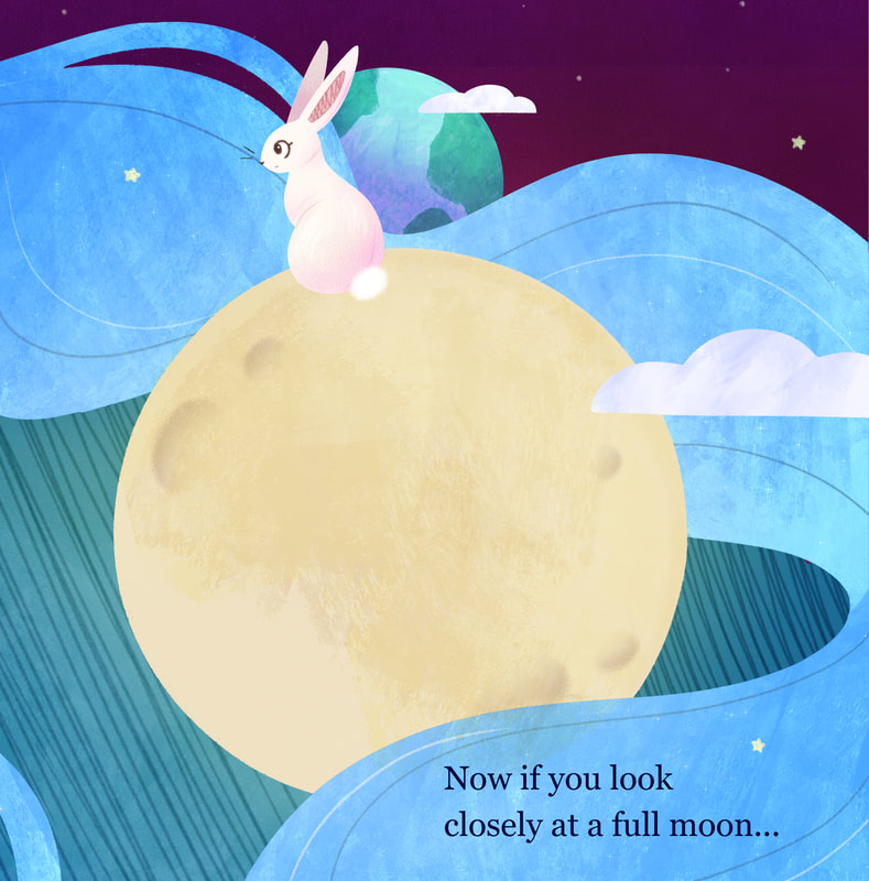
Happier with the outcome of the other page, I decided to run with that way of working, mixing the lineless style with textures to build up contrast and detail. Taking on board the feedback I had been given, I decided to retry my attempt at producing the second spread. For this attempt, I split the chunks of hair to make them look more like hair, while also taking into account where the type was going to be placed, creating more interesting shapes this time around.
Happier with the outcome of the other page, I decided to run with that way of working, mixing the lineless style with textures to build up contrast and detail. Taking on board the feedback I had been given, I decided to retry my attempt at producing the second spread. For this attempt, I split the chunks of hair to make them look more like hair, while also taking into account where the type was going to be placed, creating more interesting shapes this time around.
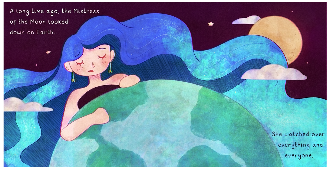
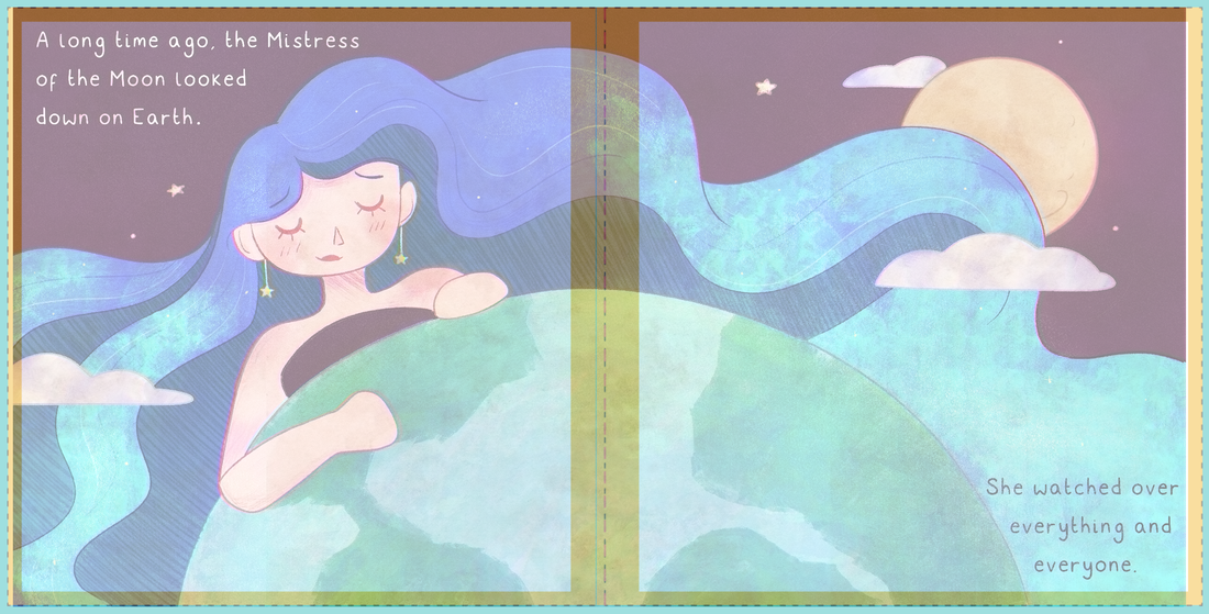
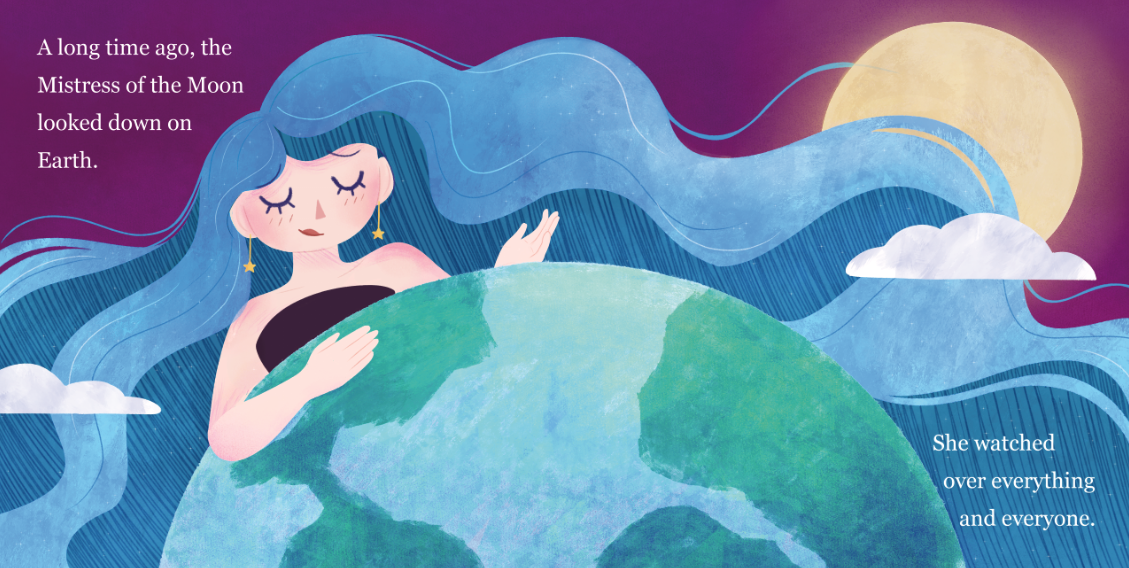
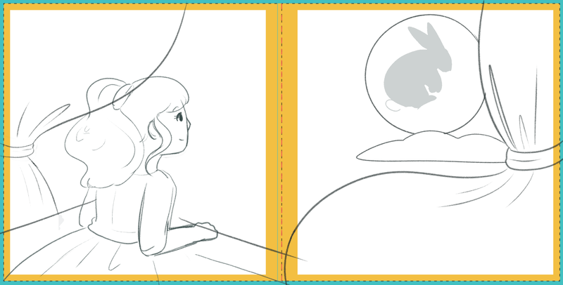
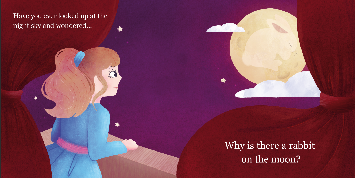
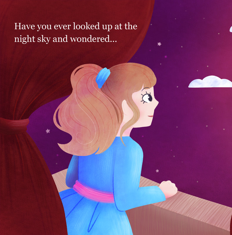
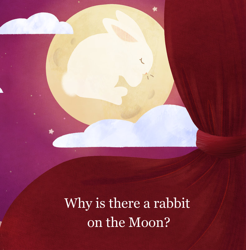
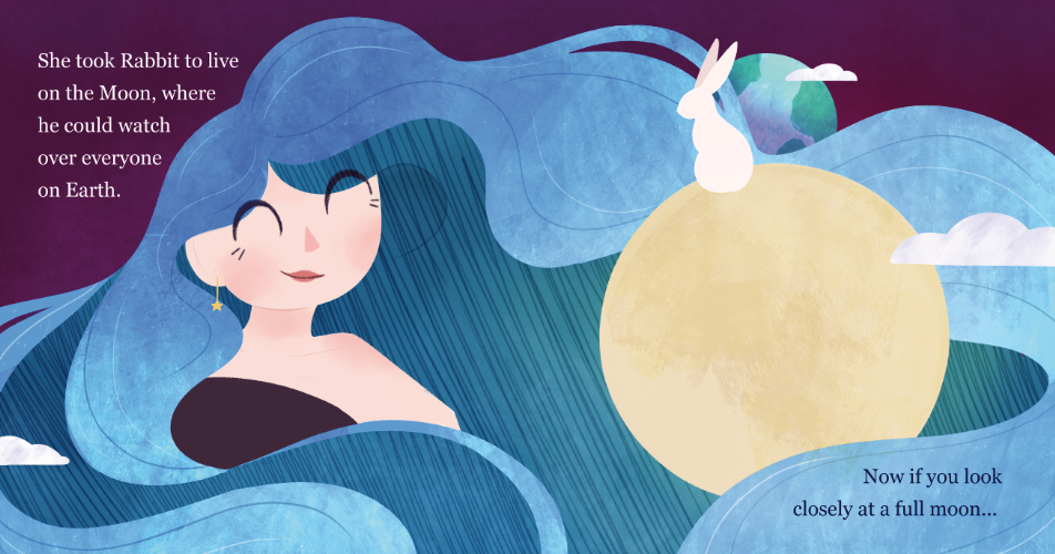
Spread 1 - Pages 1 and 2
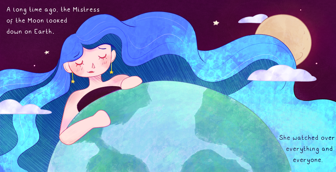
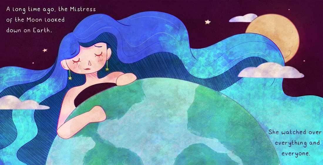
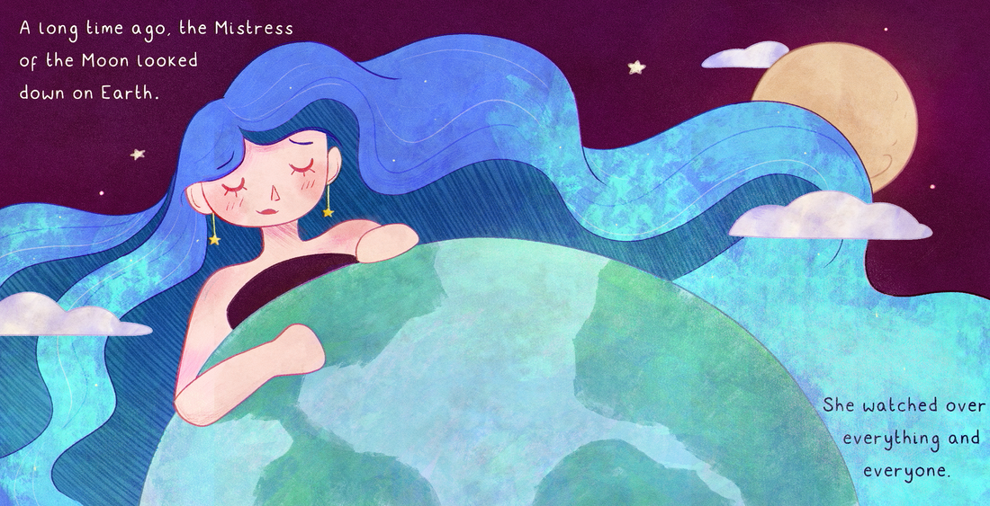
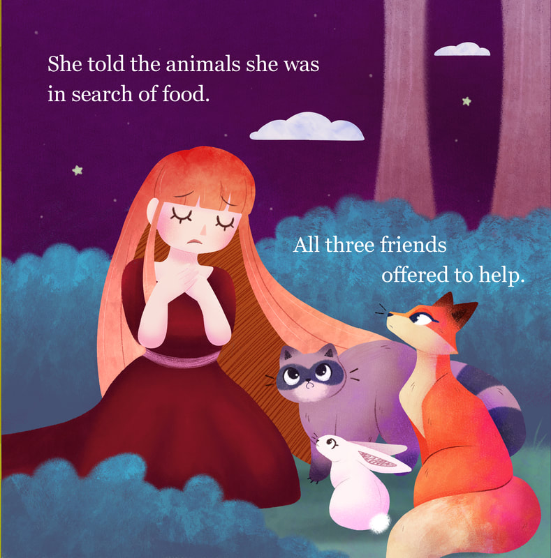
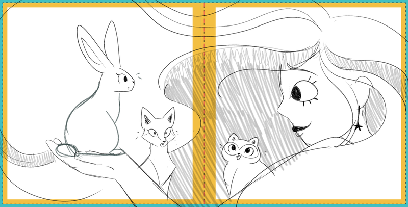
After getting feedback on this page, I made some tweaks to it to ensure the composition sat better on the double page spread. I made the moon and the rabbit larger. I also ended up reworking the girl's hand as the original position of it looked awkward on the page. I was much happier with the final outcome when looking back to my first attempt.
Spread 2 - Pages 3 and 4
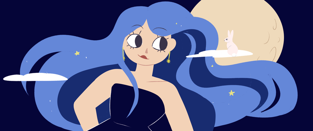
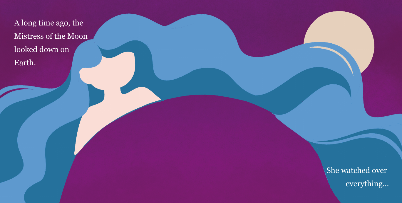
This double page spread was the first page I completed due to it being one subject. I was able to work a way of using textures through this page. With it being the introduction to the Mistress of the Moon, it stood as more impressive on its own and together.
Spread 3 - Pages 5 and 6
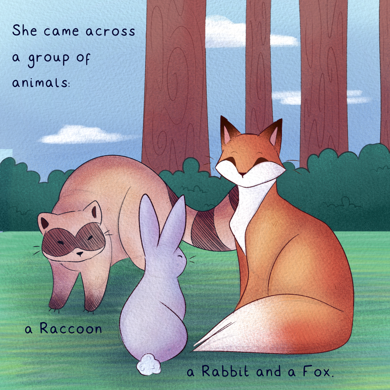
This double page spread proved to be a little bit of a struggle. Although it sat next to each other on the page, I didn't want it to look like one page. To tackle this problem, I separated the trees on the page, moving the right one along so it didn't look like one big tree down the middle of the page. The brighter colours of the left page also proved helpful to create a contrast.
Spread 4 - Pages 7 and 8
This page was the one I ended up working on the most. Compared to where it started, I am pleased with where it ended up. My earlier attempts looked generic and poor in comparison to this outcome.
Spread 5 - Pages 9 and 10
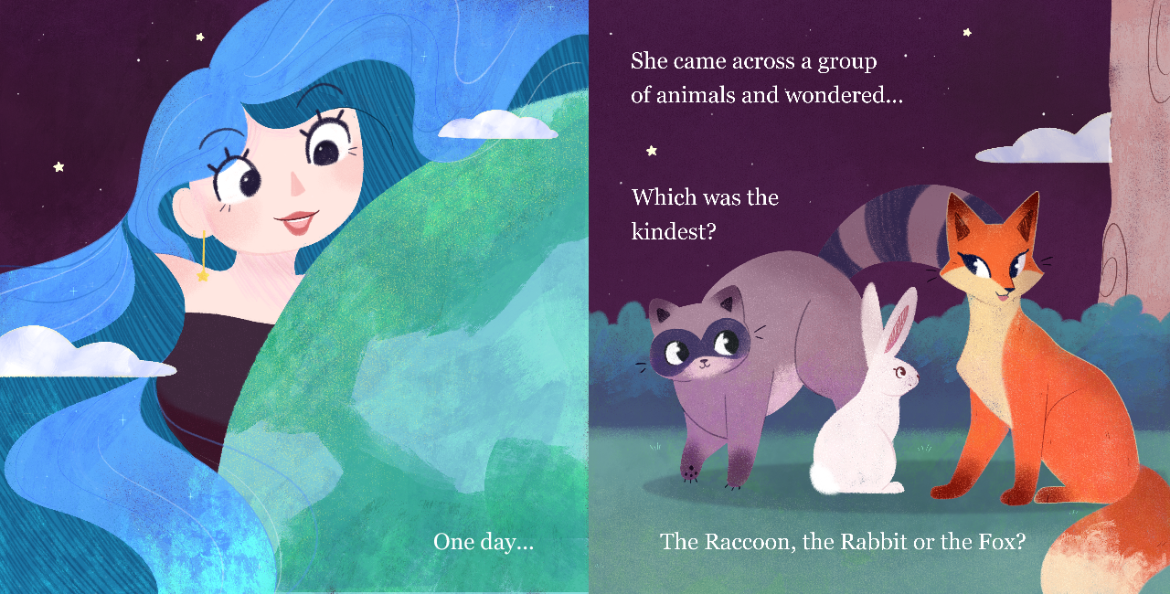
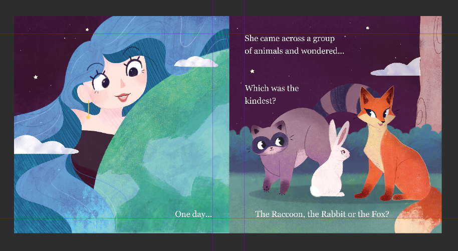
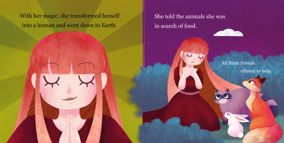
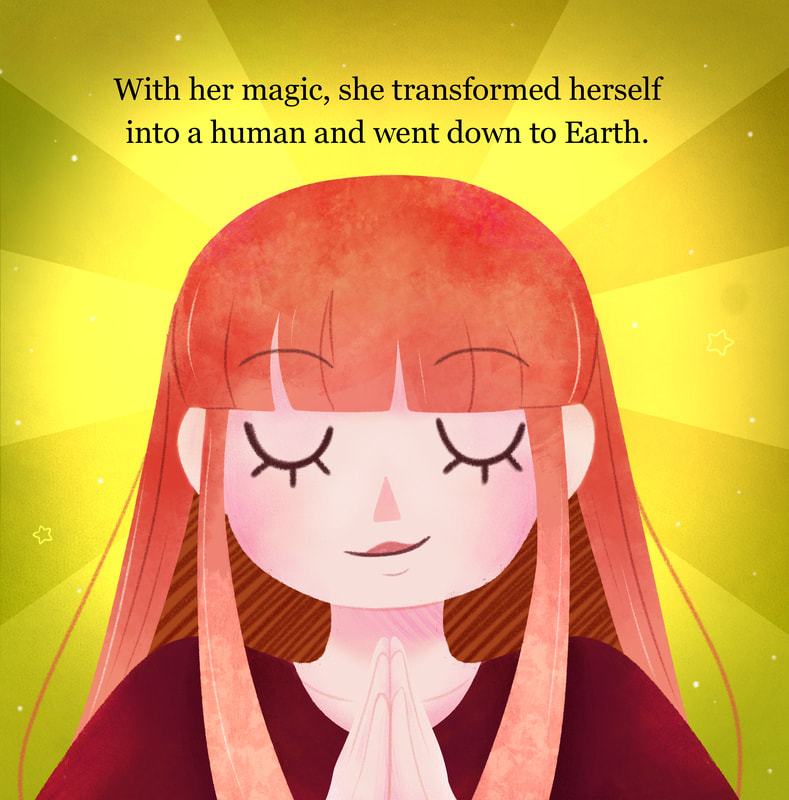
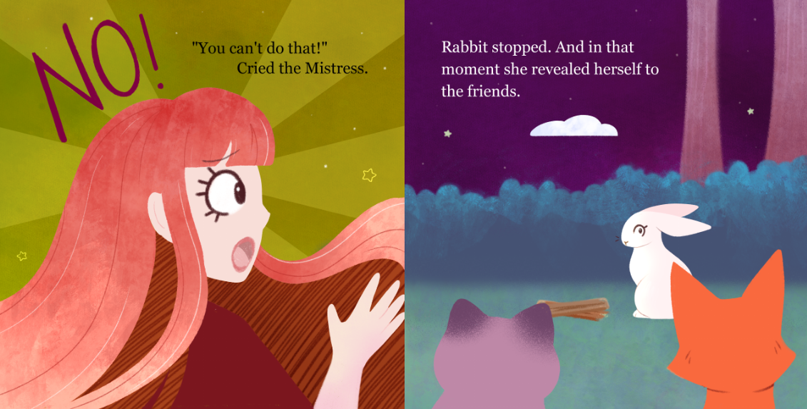
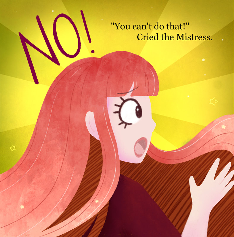
For this page, I ended up making the background so much brighter on the left hand side, separating the two pages and giving the Mistress a more magical aura and sense of being. Comparing the final outcome to my final page above, it really added to the peice and to the double page spread. This was one of my favourite pages, despite how simple it was.
Spread 6 - Pages 11 and 12
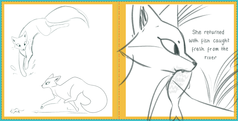
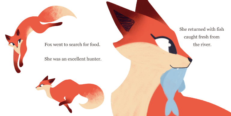
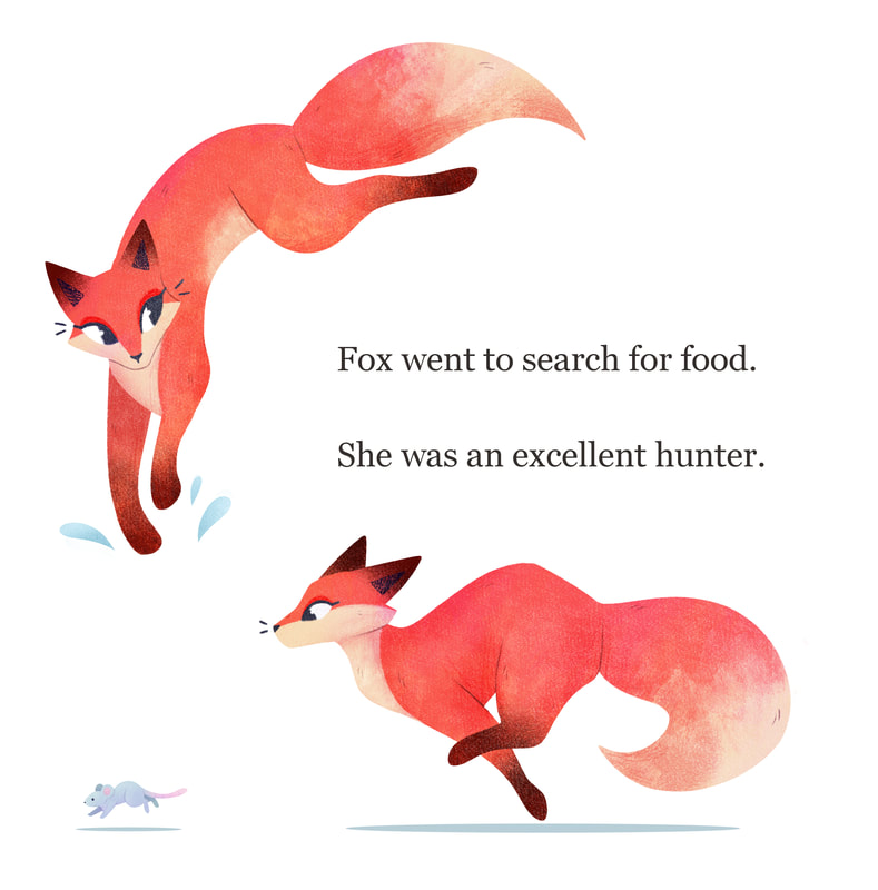
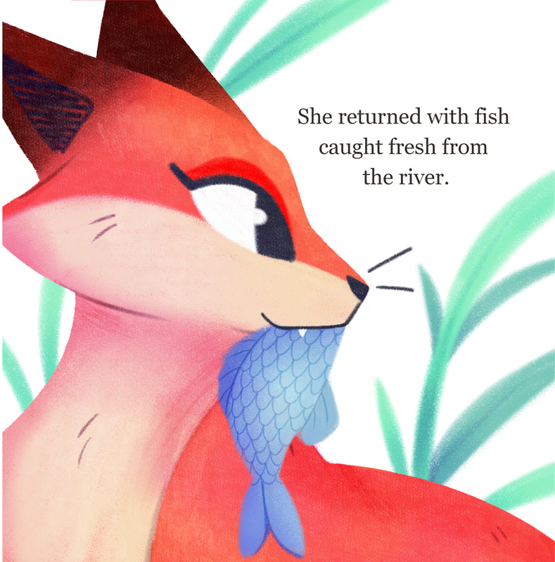
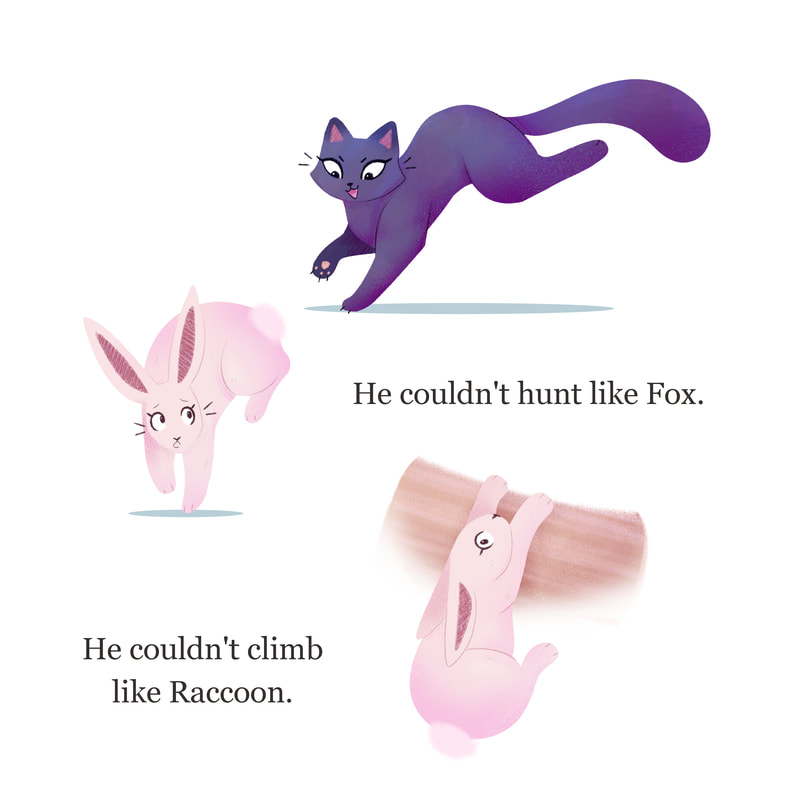
Fox's hunting page may be my favourite of the whole book. I loved the way white backgrounds are used in children's books to slow down a story while covering a lot of time. This page was fun to work on, making the most of composition and text. I loved the way the textures turned out of fox too, her colours really made her pop against the white background.
Spread 7 - Pages 13 and 14
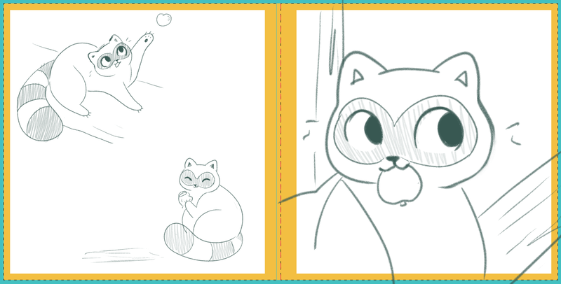
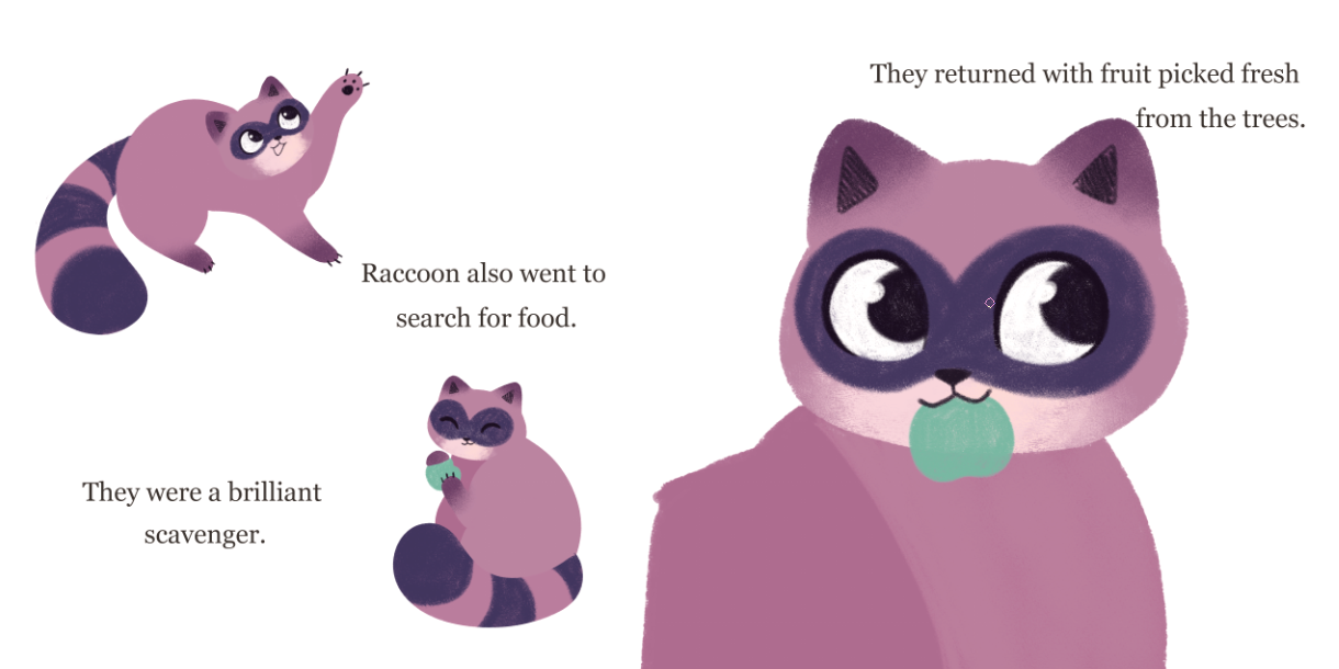
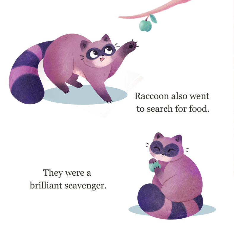
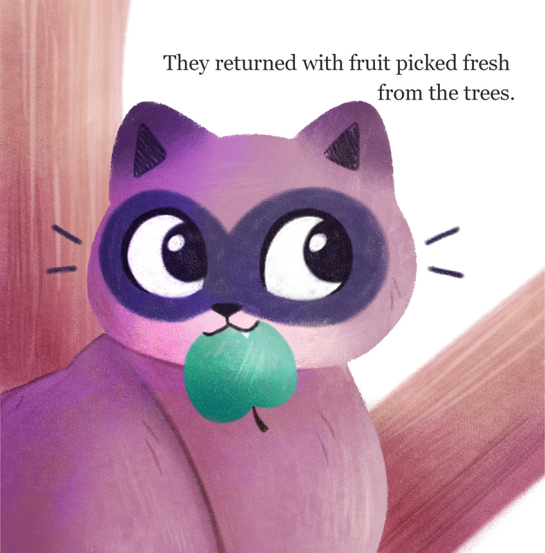
Much like Fox's page, I also had fun working on Raccoon's page. I enjoyed working on the smaller illustrations on the white background, as I could play up the texture on Raccoon. Their composition was more difficult to work with, however, it worked in the end. These pages really helped convey the different personalities of the trio.
Spread 8 - Pages 15 and 16
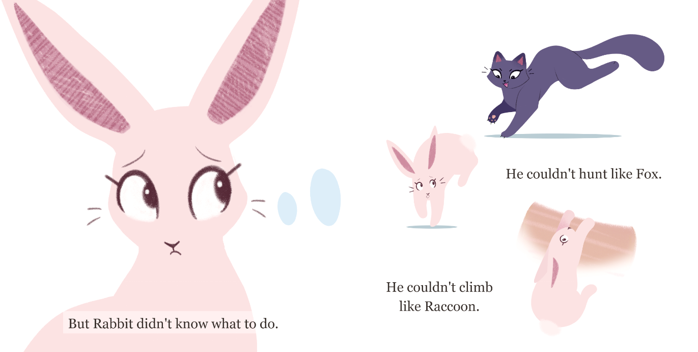
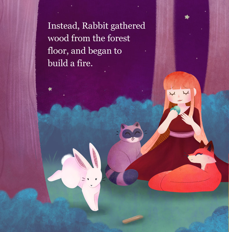
For this page, I tried to make a contrast between Fox's and Raccoon's pages to convey that Rabbit wasn't as skilled as his other two friends. Instead of hunting, Rabbit is getting hunted. Instead of climbing, Rabbit is stuck. This composition didn't work as nicely as the other two, but It was a nice contrast to the skilled and tidy pages of Fox and Raccoon.
Spread 9 - Pages 17 and 18
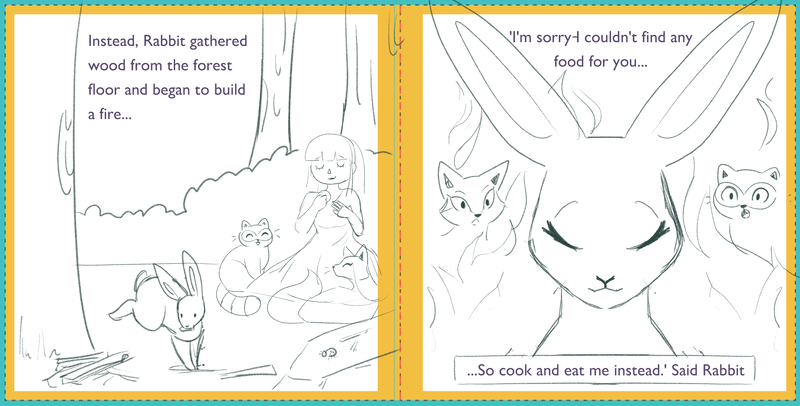
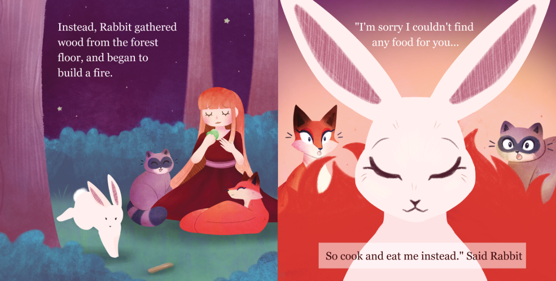
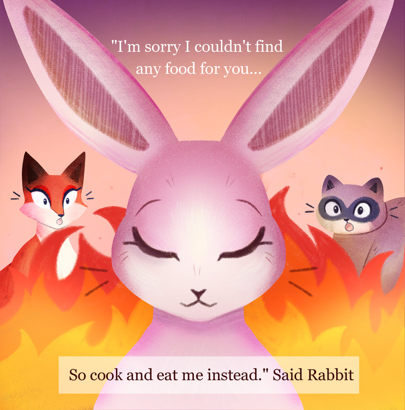
The climax of the story was one of the last pieces that I worked on. For this page I wanted to create some drama and humour. Rabbit can't hunt, and yet his first thought it to sacrifice himself. Similarly to other pages, using yellows and red helped to separate the two pages as two different events. Though I dreaded this page, I was happy how it turned out, able to subvert expectations while keeping it inline with style and story compared to the rest of the book.
Spread 10 - Pages 19 and 20
Similarly to page 9, I decided to up the brightness on this yellow background page. It helped differentiate the two pages as relating, but separate images. The right hand page worked well when compared to the fire page before this and conveying how rabbit had been caught. Overall, I was happy with this double page, despite it being on of the last ones I completed.
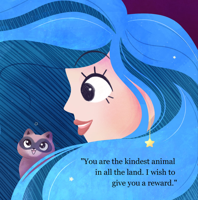
Spread 11 - Pages 21 and 22
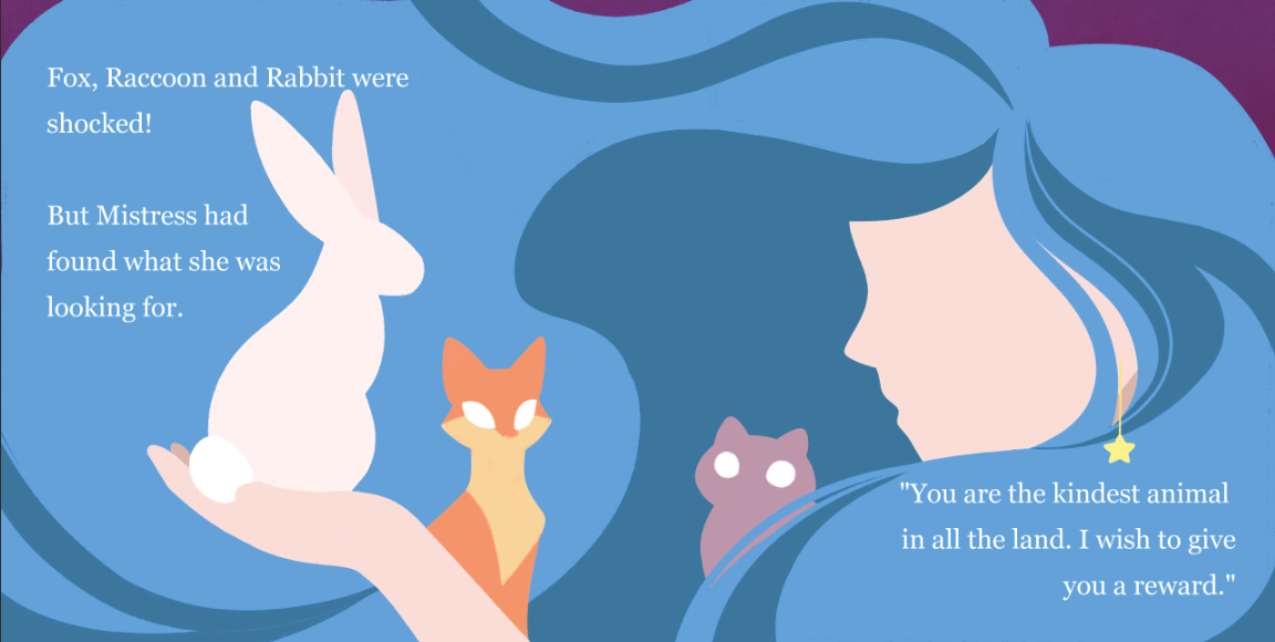
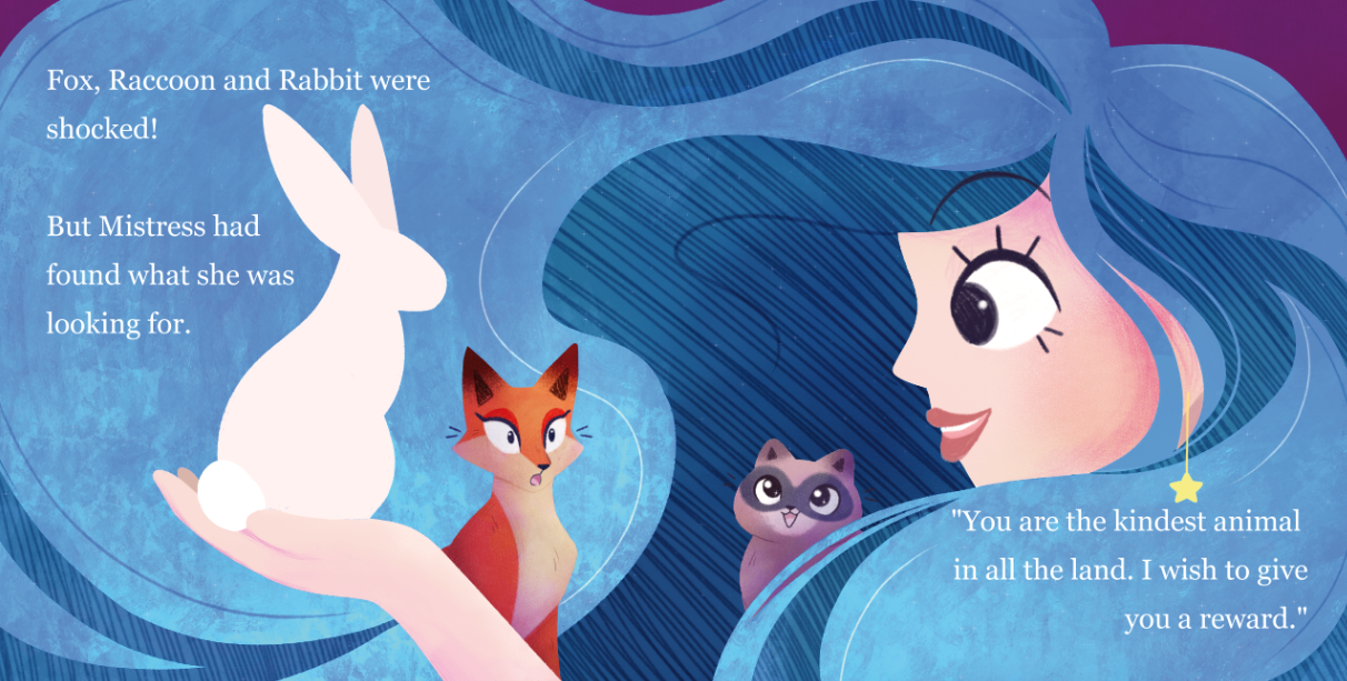
For this double page spread I wanted to make the most of the Mistress' hair, playing with shape in a more abstract way. While parts of this page proved to be a task, I enjoyed giving more character to the background characters. Raccoon may be my favourite part of this page.
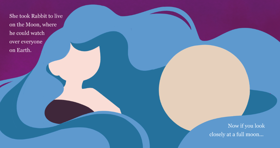
Spread 12 - Pages 23 and 24
Similarly to the page before, I used Mistress' hair in a more abstract way, making the most of the shape of it to create interesting composition. I was happy with the way this page turned out, even if in the thumbnail stage it caused me some issue. This page also helped establish that similarly to Mistress, Rabbit wasn't bound to realistic scaling anymore. He too now lived on the moon.
Spread 13 - Page 25
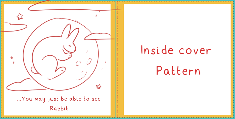
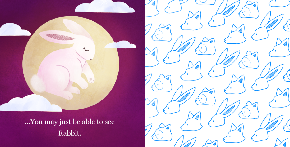
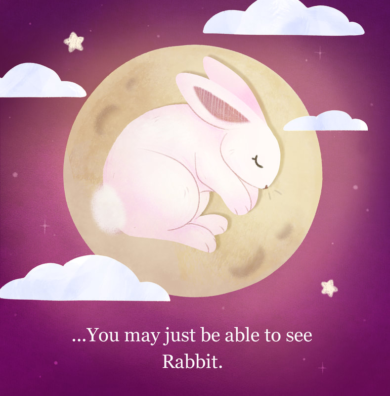
After working up my final page, I reworked it to ensure the rabbit fit better in the moon, and that as a final page, it was more satisfying of an end to the story. Overall, I was happier with the second outcome. It worked better as an end and looked more rabbit - like than the first attempt.
Front and Back Cover
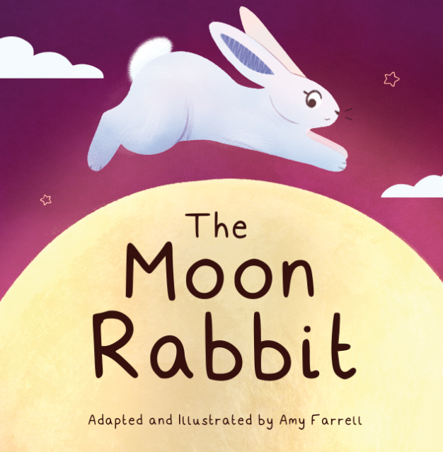
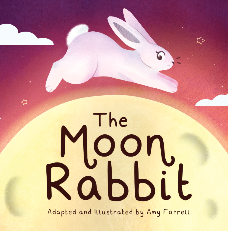
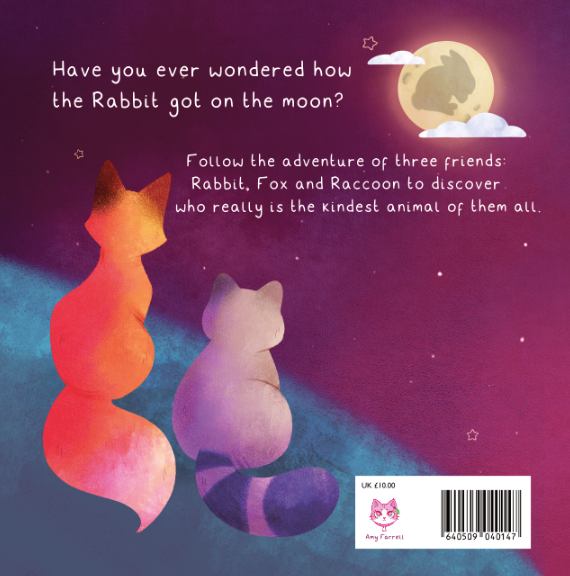
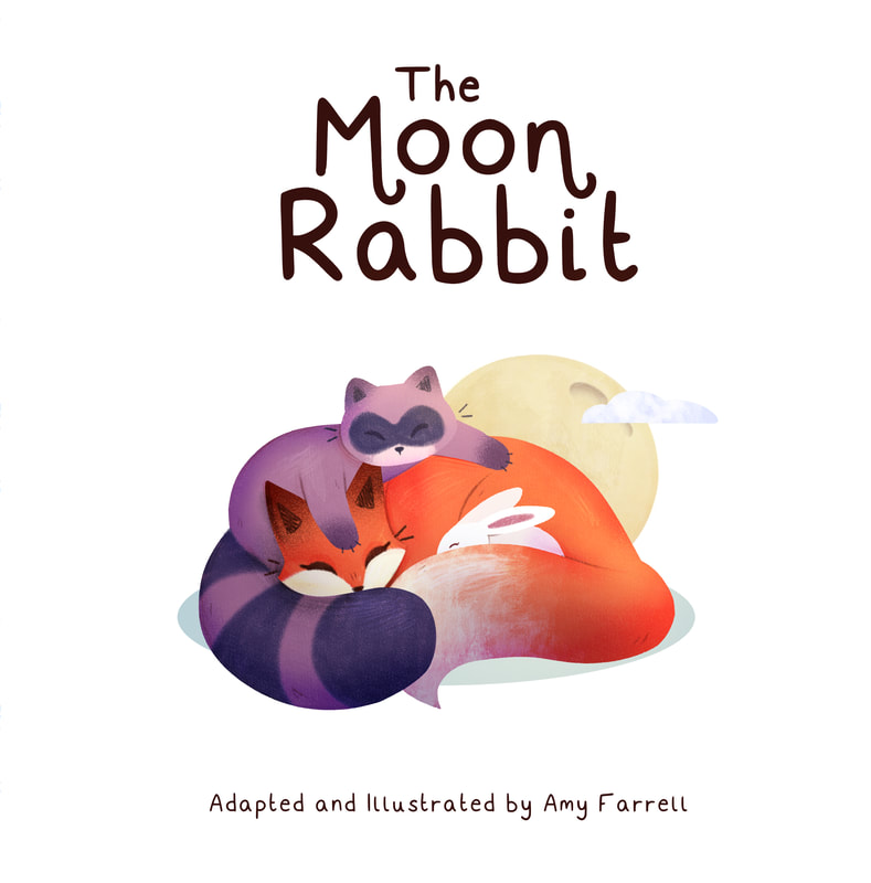
Once I had a feel for what my book was going to look and feel like, I began to work up my front and back cover. When I did my initial research, it was a piece of advice I heard over and over again from those who had made their own books. It would make the book more coherent and accurate to what was on the cover and inside.
Once I had a feel for what my book was going to look and feel like, I began to work up my front and back cover. When I did my initial research, it was a piece of advice I heard over and over again from those who had made their own books. It would make the book more coherent and accurate to what was on the cover and inside.
My front and back cover were the final things I worked up. I did this to ensure they matched the overall tone of the inside pages of the book. I tweaked where the type was on the back cover, making the position of the type more central and less cramped/
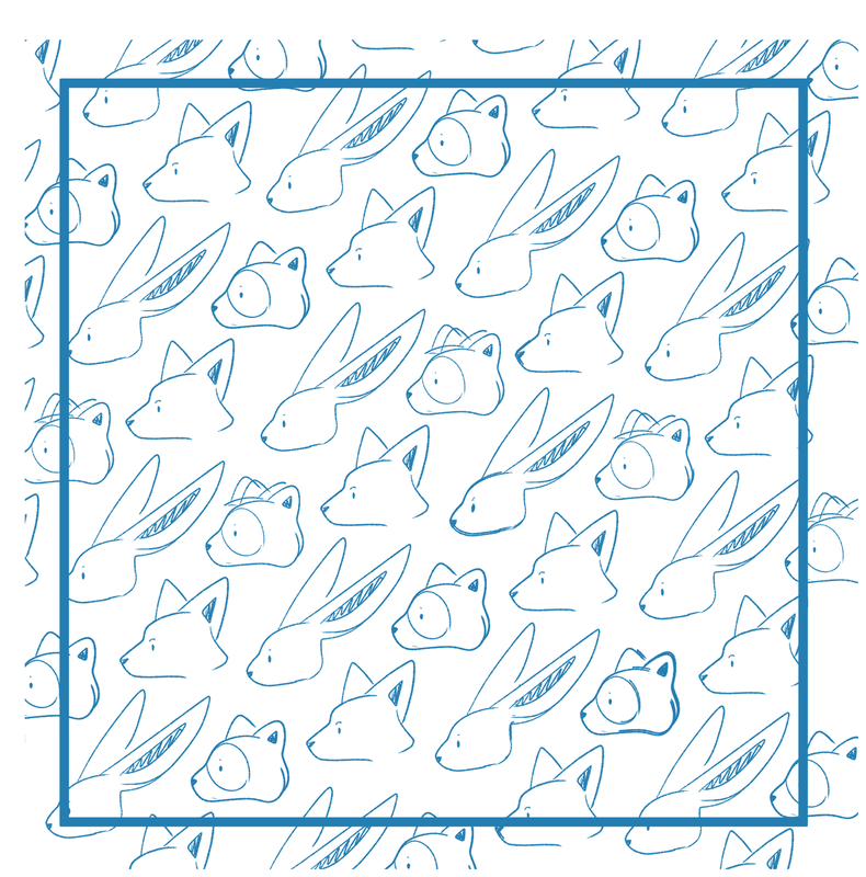
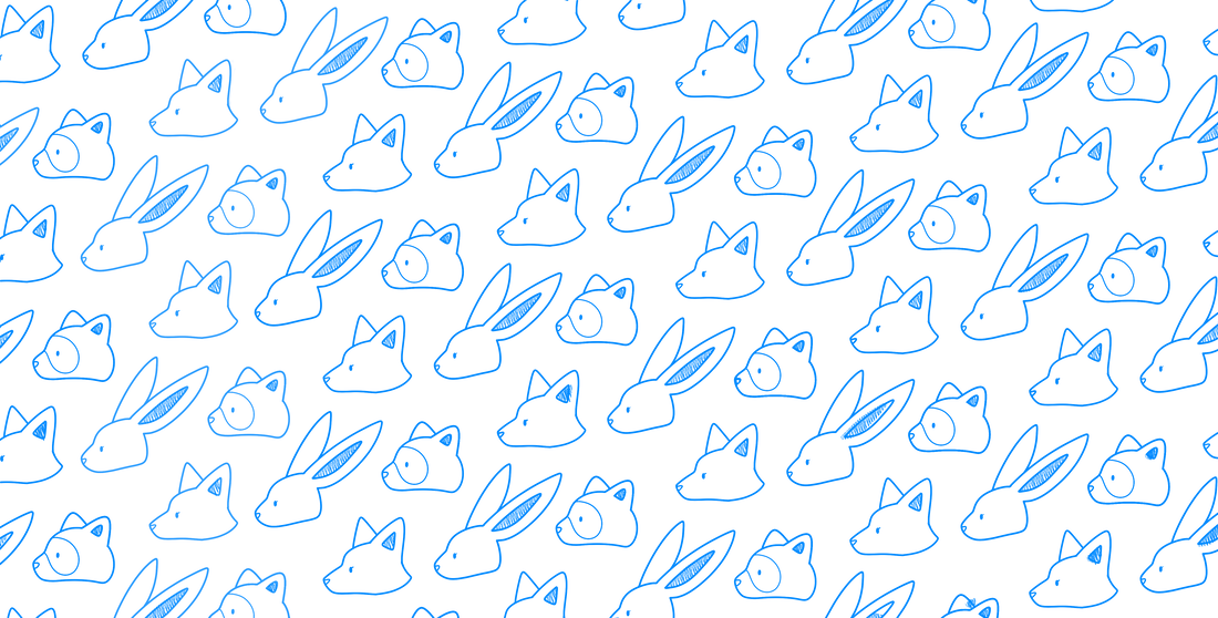
Repeating inside front and back pattern
Post Feedback Alterations
One of the pieces of Feedback I got regarding the whole book was the colour of the inside pages. With them being blue originally, they felt disjointed compared to the rest of the book. I decided to make them a purple shade to better match with the contents of the book.
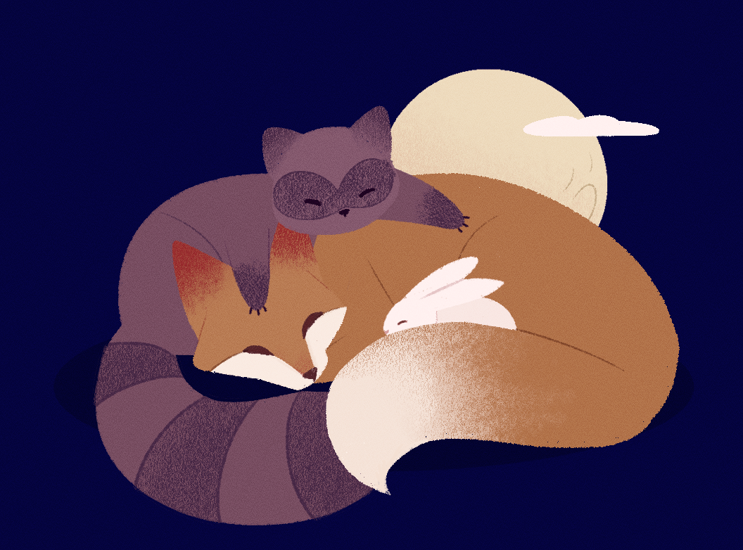
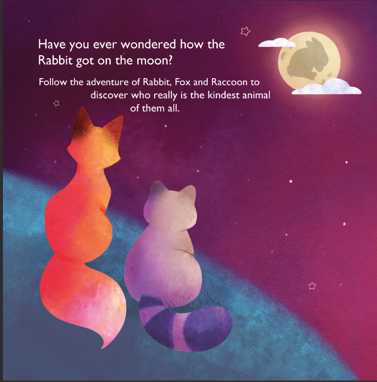
Additionally, I produced an inside cover, different to the main illustration on the front of the book - while still introducing the story. I produced an illustration that reiterated the friendship between the three main characters. It worked as a contrast to the back cover where the trio were separated.
Additionally, I produced an inside cover, different to the main illustration on the front of the book - while still introducing the story. I produced an illustration that reiterated the friendship between the three main characters. It worked as a contrast to the back cover where the trio were separated.
Finals
Overall, I was happy with the outcomes I produced. This project was a big learning curve, from working with the timing to get things produced, as well as accounting for my other projects. I made mistakes along the process, but were things I now know how to fix.
Now I now know the process of illustrating a full book, it is something I would be interested in doing again in the future.
Site powered by Weebly. Managed by 34SP.com

