
Stamps
Create a set four stamps which commemorate or celebrate British culture or history worthy of the honour. Including some sort of presentation of the set. Your stamps should be striking additions to the contemporary collection and should function/communicate/be legible at their intended print size, which is 38x20mm (plus 1mm surround of non printed surface area = 40x22mm)
The stamps should include the monarch's profile
The stamps should include their monetary value
Examples of commemorative stamps:
Over the past year alone, Royal Mail has produced a plethora of commemorative stamps, covering all different topics. Some are more generic, and others are more specific to a certain time period of organisation. Some are made up of eight stamps, and some made up of more. But despite all the different variables, each set looks coherent. This is due to a running theme of colour palettes, composition, or over all style.
Refined possible stamp ideas:
- Animals that aided the war efforts - celebration and commemoration of animals that aided the British forces in war. Ranges from canines and horses to cats and pigeons. Were a major part of the war effort, but are usually overlooked.
- Animals that aided the war efforts - celebration and commemoration of animals that aided the British forces in war. Ranges from canines and horses to cats and pigeons. Were a major part of the war effort, but are usually overlooked.
- Animals that are extinct/endangered - British wildlife that had either already gone extinct, or is on the verge of going extinct. British wildlife isn't necessarily the first thought when it comes to extinction, but many of our species are in danger of being wiped out completely.
After Feedback:
After the feedback session, it was decided that the topic of animals that aided the war effort was the strongest of the two topics. Possible routes to go down was looking at whether the stamps look commemorative, or celebratory and how styles and time periods could change the feel of them. I could also look at the Dicken Medal to chose specific animals that have been recognised and awarded.

|

|

|

|

|

|
|
Topic Research
Animals aiding the war effort: The PDSA Dicken's Medal Expanding on the topic of animals working for the war effort, I looked into specific animals that had been awarded the Dicken's Medal for bravery and loyalty. The award was first introduced in 1943 in the United Kingdom. It is seen similar to the Victoria Cross for animals. From the years 1943 - 1949, the medal was awarded to 54 animals: - 32 pigeons - 18 dogs - 3 horses - and one ship cat The medal was revived in 2000 and a further 24 animals were awarded the award. Of the 24, 22 were dogs, 2 were horses. The last medal to be awarded was to German short haired pointer, Hertz in February 2022 for detecting electronic equipment during a war in Afghanistan. |

PDSA Dicken Medal
|
Pigeons and the Dicken Medal
|
Some of the very first animals to win the Dicken's award were Pigeons.
During World War Two, Pigeons were used to carry messages back from troops on the front line or at sea. With an ability of finding their home loft no matter where they were, and being able to fly at a speed of 50mph, pigeons were smart and fast. This meant that they were able to avoid enemy fire. The pigeons were so successful at delivering messages that the Germans began training birds of prey to bring the allied birds down. Back home, the British public were told not to shoot pigeons during the war in fears of shooting down birds that carried messages home. |

Royal Blue receiving his Dicken Medal
|
Royal Blue
Royal Blue was he first pigeon to deliver a message from a downed aircraft on the continent was one with a royal roots .He flew 120 miles in 4 hours and 10 minutes on the 10th October 1940 after the aircraft he was on had been forced to make a landing in occupied Netherlands. Delivering his message with the aircrew's whereabouts he was awarded the Dickin Medal in March 1945.
Royal Blue was he first pigeon to deliver a message from a downed aircraft on the continent was one with a royal roots .He flew 120 miles in 4 hours and 10 minutes on the 10th October 1940 after the aircraft he was on had been forced to make a landing in occupied Netherlands. Delivering his message with the aircrew's whereabouts he was awarded the Dickin Medal in March 1945.
Winkie and White Vision
Two of the first pigeons to receive their Dicken Medal's were Winkie and White Vision on 2nd December 1943.
Winkie flew back home when the plane she was aboard was damaged and fell into the North Sea. Winkie flew 120 miles back home without the note, but working out how long it had taken for her to get home, the Royal Air force was able to rescue the crew of four.
White Vision was a similar story. Despite poor weather conditions, White Vision flew over 9 hours back home to deliver a message after her aircraft crashed. After 18 hours, the Royal Airforce were able to rescue all eleven crew members.

Winkie receiving her Dicken Medal
|

White Vision
|
More can be read about Pigeons in World War Two here
|
Dogs and the Dicken Medal
Much like pigeons, many dogs have been awarded the Dicken Medal. Bob was the first dog to receive the medal on 4th March 1944. Since then 35 other dogs have been awarded the medal. Jet Jet was an Alsatian from Liverpool awarded the medal on 12th January 1945. He was one of the first dogs to be awarded the medal. He assisted in the rescue of over 150 people trapped under blitzed buildings. Jet refused to move for over 12 hours until bodies had been recovered from blitzed buildings. He was also awarded the RSPCA's Medallion of Valor. 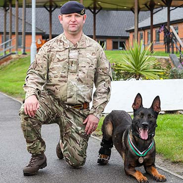


|

Jet with his Dicken Medal
Kuno Kuno was awarded the Dicken Medal on 29th August 2020 for courage under fire during a Special Boat Service raid against al-Qaeda in Afghanistan. When forces were facing gun fire, Kuno was sent in wearing night vision goggles to attack the gunmen. Despite being shot in both hindlegs, Kuno successfully wrestled them to the ground. Upon returning to Britain, both of Kuno's hindlegs had to be amputated, and he was given prosthetic legs in their place. Kuno is now enjoying a peaceful retirement. 
|
Kuno with his Dicken Medal
More can be read about Kuno and his story here
More can be read about Kuno and his story here
|
Cats and the Dicken Medal
Of all the animals that have been awarded the Dicken Medal, only one cat has ever been given the award. His name was Simon, a stray from Hong Kong, awarded the medal in August 1949. In the height of the Chinese Civil War in 1949, the HMS Amethyst came under fire. The ship’s captain, Lieutenant Commander Skinner, died when an artillery shell blew a 15-foot hole in the bulkhead and many others were injured. Including the ship’s cat, Simon. The ship received a further 50 hits. Hot, humid conditions were the perfect breeding ground for a rat infestation. The already limited food supplies were in danger of being completely destroyed. Despite shrapnel wounds to his legs and burns to his back and face, Simon was all that stood between the rats and the crew’s essential supplies. Simon continued to protect essential supplied for weeks. Not only is Simon the only cat to be awarded the medal, but he is also the only Navy animal to be awarded the Dicken Medal. |

|

|

|
Simon with his Dicken Medal
More can be read about Simon and his story here
More can be read about Simon and his story here
|
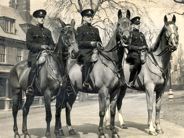
Horses and the Dicken Medal
When researching about the different animals that have won the Dicken Medal, horses were the ones that had the fewest information. Although five horses have been awarded the medal, there is little information about the individual horses themselves. This is due to the award being handed out years after the passing of the animal. Of the five horses there was only two that I could find information about. Warrior Warrior was a World War One horse that was awarded the Dicken Medal in September 2014. It was to signify all animals that had aided conflict. While Warrior wasn't awarded the award for something specific, it is still significant. Reckless Reckless was a mare that worked with the United States Marine Corps in the Korean War. On one day she made 51 solo trips to resupply multiple front line units, as well as carrying injured soldiers from the battle field. Although serving with the US Marines, Reckless was awarded the medal for her work with the allied forces. For this reason, she would still be valid in being celebrated despite not being part of the British Forces. Reckless was promoted to Sergeant during her time in the Korean War. More can be read about Reckless and her story here
|

Sergeant Reckless
|
Olga
One of only three British horses to be awarded the Dicken Medal in April 1947. Olga was used in crowd control and rescue operations following a bomb explosion. Despite initial panic, Olga returned to aid in the rescue of those injured.
One of only three British horses to be awarded the Dicken Medal in April 1947. Olga was used in crowd control and rescue operations following a bomb explosion. Despite initial panic, Olga returned to aid in the rescue of those injured.
Olga, Regal and Upstart following their Dicken Medal ceremony.
|

Sergeant Reckless
|
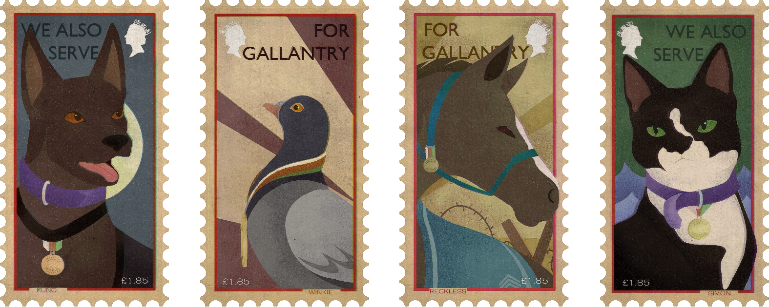
Before I began refining ideas, I narrowed down which four animals I wanted on the stamps, taking one from each of the four species to be awarded the Dicken Medal. I decided to include US Marine Corp, Reckless as much like the Victoria Cross, it can be awarded overseas, but is still the highest award in the British honours system.

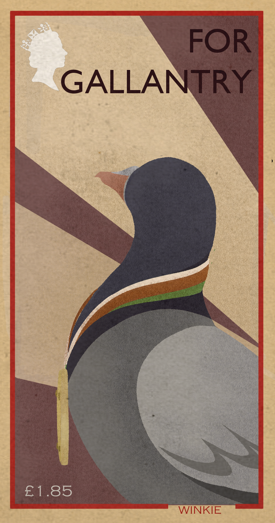
Winkie: first animal to be awarded the Dicken Medal, 1943
|
Simon: only cat and only Navy animal to be awarded the Dicken Medal, 1949
|

Sergeant Reckless: US Marine Corp horse who served during the Korean War, fought in 1953, awarded in 2016
|
Kuno: Canine Protection and Detection dog, lost both hind-paws in shooting, awarded in 2020
|
Illustrative Research
Illustrated Stamps
Having researched about the Dicken Medal and the animals that have won it, it is clear that the award is not only a commemoration of the animals' work and lives, but also a celebration. After talking through my topic, it became apparent that making realistic stamps would hinder the message.
There are also plenty of other examples of illustrated stamps done by individual illustrators, some are more minimal, but tend to be vibrant in colour. Others are more refined and highly detailed. After talking through different kinds of stamps, I decided that looking into stamps that were less refined and highly detailed would benefit me, as this would allow me to do more research into techniques and experiment more when researching.

Mammals of the British Isles by Tom Frost

Vietnamese endangered animals by Tùng Nâm
|

Christmas stamps illustrated by Julia Allum


Canadian environmental issues stamps by Maxime Francout
|

Pop culture stamps by Clark Oor Solo


Around the World by Mike Karolos
|
Looking at how different artists have interpreted working on stamps, the majority that are more graphic, are more vibrant and reliant on shapes and colour instead of detail. This ensures that the stamps are able to be read at such a small scale. I'd like to be able to include and play around with textures into my stamps, to make them more interesting without relying on fine details.
But of all the stamps above, I was particularly drawn to Tom Frost's stamps, especially the vintage feel they have compared to the cleaner and more digital examples above. Looking further into vintage stamps, I began to examine the way they have aged, and how those textures could be used.
Vintage 1960s Letter Stamps
Vintage 1960s Letter Stamps

Japanese 1960 Bird Preservation Congress letter stamp
|

Christmas and New Year's Greeting for 1960 designed by Kang Bak
|

German Kingfisher letter stamp, 1963
|

Mammals of the British Isles by Tom Frost 2012
|
|
When doing my research into vintage stamps, I found that the majority began to be produced in refined colour palettes due to the cost. Many stamps were mass printed on cheap paper, making them easier and quicker to produce.
Although the stamps are more graphic, they make the most of composition, shapes and texture instead of relying on detail. Given most of the animals are older, and all are timelessly being celebrated, I wanted to include the vintage feel into my own stamps to replicate the feel of the few portraits of the animals that are available. |

Soviet Union White Goose letter stamp, 1962
|
Thumbnails
Having looked at different styles of stamps, I moved on to making thumbnails, initially focusing on figuring out the composition. I wanted each animal to look strong in their own right - Winkie and Reckless to be the strongest two, while Simon and Kuno looked proud due to their individual stories.
*scan in thumbnails

|

|
After deciding on initial composition, I began to develop them digitally. In doing so I was able to move around smaller details of the composition, and then began to add colour. The colouring process was a struggle, as deciding on background colours took quite a bit of time and experimenting.

|

|

|

|
After putting all the stamps together, it became clearer where the issues lay. The Pigeon stamp stood out too much on it's own, being the only one with sharper yellow lines compared to the others' rounder lines. The Horse stamp looked out of place too, and so I decided to replicate the search lights from above on Reckless' stamp - making the groups more coherent and stronger as a set.
Each of the animals' background bears reference to their stories:
Kuno's background references the night patrols he was sent on, and the attack he carried out that resulted in the loss of his two hind paws.
Winkie's background is reference to the search lights and planes of WW1 that she took to the skies with.
Reckless' background is a reference to the fact she served on the front line, and the search lights that were present above her.
Simon's background is a reference to the days and nights he spent as sea, as well as the fact he was able to protect and save the crew's goods - ensuring their survival.

|
|


War Stamps and 1960s Vintage Stamps
Following feedback sessions, I was recommended to look into specific war time stamps for inspiration, particularly when it came to making the tone of the stamps more mature, in particular when it came to the backgrounds.
Following feedback sessions, I was recommended to look into specific war time stamps for inspiration, particularly when it came to making the tone of the stamps more mature, in particular when it came to the backgrounds.

World War One Poster
|

World War One Poster
|

First World War Recruitment Poster

1946 Post War Poster
|

|
Looking at the different types of War Time Posters, despite their different ages, the muted colour palettes are used throughout. Specifically when it comes to the background text and colour.
Instead of white, the colour of the paper is grainy and discoloured. This was something I wanted to experiment with when I was looking at 1960s stamps. |
World War Two Propaganda


|

|

|
Vintage 1960s Commemorative Stamps
There was an overlap between the War Posters and the 1960s Stamps I initially looked towards during my initial research. The use of print was something I was drawn towards, keeping shapes simple and textures plentiful.
There was an overlap between the War Posters and the 1960s Stamps I initially looked towards during my initial research. The use of print was something I was drawn towards, keeping shapes simple and textures plentiful.

1960 British Gibraltar Stamp
|
|
|
|
Commemorative Vs Celebratory Vs Propaganda I included the examples above, at they were to commemorate different animals of different countries and are read as positive. Although I want to draw inspiration from War time posters and art, I don't want my stamps to be read as propaganda. One of the main features of Propaganda posters is the vibrant red used to make things stand out - mostly negative. For my stamps, I could instead use the red to highlight the good things about the animals rather than the bad. For my starting point I focused on putting down basic shapes and colours - ready to build texture on top like the 1960's stamps. Looking at the stamps and War material, while they were reliant on the colour and texture, the print work was reliant on shapes - as to be able to differentiate easily. This is something I want to replicate in my own stamps with them being at such a small scale. |

|

|

|
Textures - Test Piece
Before I began refining possible ideas, I decided to make a quick mock-up piece with some parts of my thumbnails to try and experiment with the different colours and textures. Although it was a very quick mock up, being able to see how the colours worked together, and how they'd work with textures applied on them helped significantly. I applied two textures, one an old stamp paper overlay, the other a paper overlay to give the gritty feel - this helped to give the piece a timed effect - placing the time frame for it somewhere between World War One and World War Two, which is where most animals served. Exception being Kuno, though he has also served in a War. |
New Stamp Layouts

|

|
|
|
|
Following the feedback I was given, I found it difficult to imagine how the stamps would look without the main body of the animal. I decided it would be best to begin to develop my stamps, beginning with the flat colours/silhouettes of the animals so I could see where the monarchs head and value would go. I also decided to do this, as although I haven't finished the stamps, I could work on each step over the four different stamps, rather than completing one and trying to replicate it on the other. This would ensure the set looked more coherent towards the end. Working this way also allowed me to play around with textures, to try and get that vintage stamp feel and quality. |
Stamp Flat Colour
As I went along and worked out the issues with the composition with each stamp, it became evident that some things needed to be moved around and altered. But this also let me see how they stood individually, and as a group.
I decided to leave the eyes out during this process as I'm unsure how to tackle that just yet - ideally, I want them to look similar enough to make them all the more coherent.
I decided to leave the eyes out during this process as I'm unsure how to tackle that just yet - ideally, I want them to look similar enough to make them all the more coherent.

|

|

|

|

|

|

|

|

|

|

|

|

|

|

|

|

|

|
When putting my stamps side by side, I found an issue with the layout. Some had the layout on the right with monarch and price on opposite sides, while some others had the layout on the left.
To decided where I wanted the price to be in relation to the monarch, I set them out side by side. When put together with the names, I much prefer the layout on the left, as it works better leading the eye from monarch, to animal, to price, and finally to their name. I then switched the ones that were in the other layout to see if they worked better. As a group, it became easier to see them together with flat colours instead of rough thumbnails that weren't in the style I was going for. While I like how they look, they still need more work - specifically on the backgrounds to make them more unique and link them to their lines of work. |

|

|

|

|
After feedback, I focused on fixing the issues that had cropped up. Firstly was Reckless, and I worked on fixing her head to make less dog like and more horse. The fix, however small, helped the piece look stronger and more powerful than before. As for Kuno and Simon, I began by adding their medals onto their collars.

|

|

|

|
Kuno Final Development

|

|

|
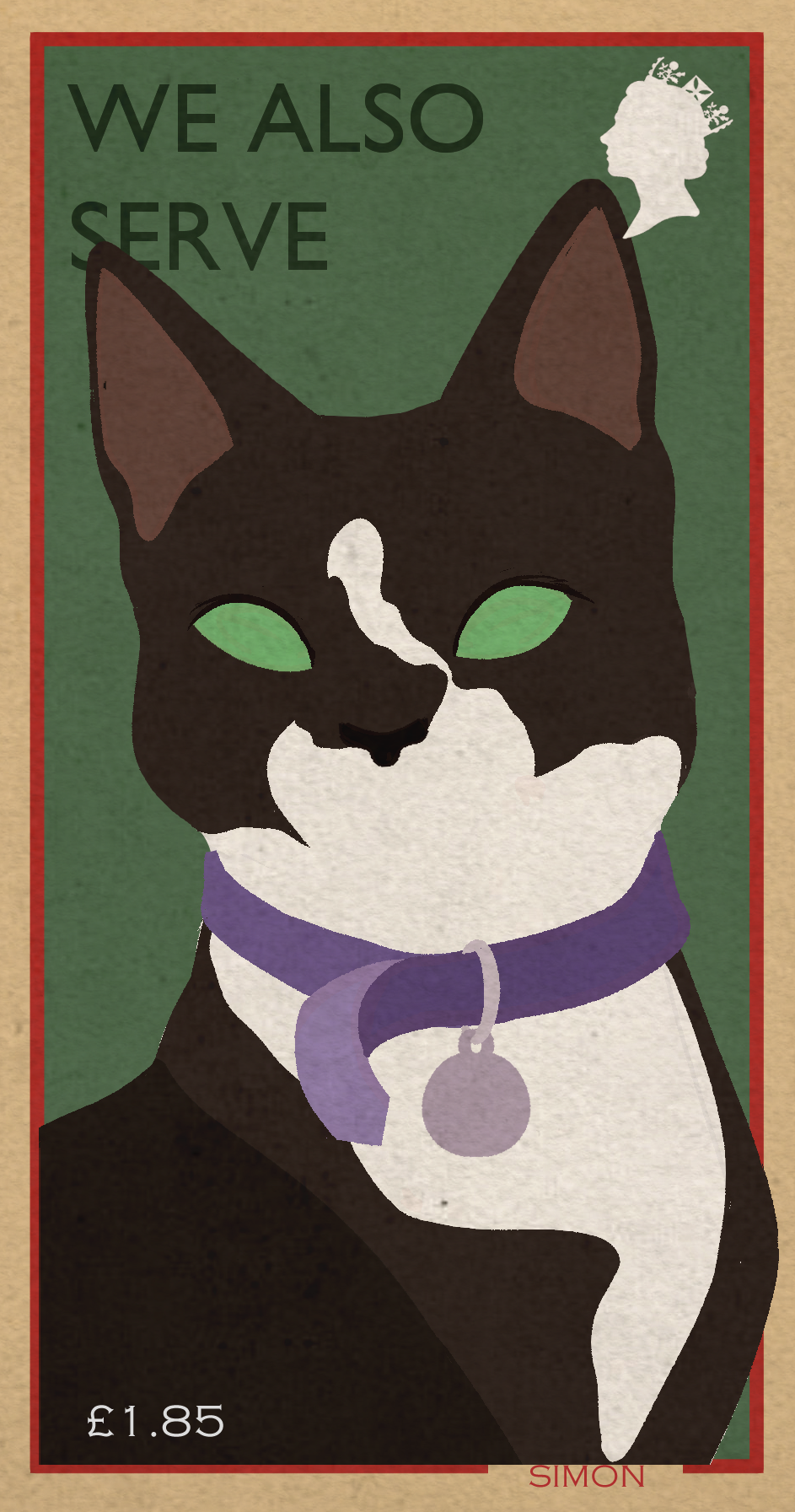
After piecing everything together for all four stamps, I began to refine each one. For Kuno, I focused on getting his medal right, as I didn't like the triangular band that had been used for Simon's medal. Figuring out the eyes also took a little bit of time, in the end deciding that they should be less detailed to work better with the overall piece. This was a change I made a little further on in development. |
Winkie Final Development
|
|
|

|
Unlike the other animals, I wanted to include a medal at a side view for Winkie, as it would have to also be bigger due to her smaller scale. As the others would be from a front view and clearer seen on the animals collar/reign, it would give context to what the medal was if there was any doubt.
I also decided to keep Winkie's eye more detailed, again to make up for her smaller scale compared to the other three larger animals. |
Reckless Final Development
|
|

|

|
In contrast to Winkie, Reckless' medal was to be the smallest of the four. I struggled to find a position for it, as I realised that if it was overhanging off the reigns, it would clash with the background colour. For this reason, I attached it to her reigns. I also struggled with the eye style as I didn't want it to be detailed as established in Kuno's development. |
Simon Final Development
|
|

|

|
Developing Simon's stamp, I noticed the same issues that had appeared in Kuno's. The eyes stood out too much and didn't match the over all style of the stamp. For this reason I decided to scale the detail back |
Patrick Leger & Charley Harper - Print Screen and Textures


|
As part of my feedback, it was suggested that I look into the work of Patrick Leger and Charley Harper to see how I cold make my work less digital as their work was traditional.
As my process was quite far along, I focused on the subtleties. I found an effect on my software that would give a grainy effect - and dropping the transparency gave the stamp a subtle colour inequality effect. I also focused on making some of the pristine lines bleed over into the background or other colours. But given the small scale, I didn't want to overdo it and make the stamps unreadable.
|


|


|


|


|
|
Backing Cards
With my stamps in a place I felt happy with, I decided to move my attention onto the backing card and how I would present them as a unit on a piece of card. As I did with my initial research, I looked towards the Royal Mail stamps for some inspiration. Looking at the examples the range in complexity of the backing cards varied. But they all followed the same layout of title, logo and banner. This was a good starting point. |
|

|
|
|
|

|
Looking at the Royal Mail commemorative stamps that have already been made, the backing card for all the stamps had the same format. I began by planning the layout of by own backing card. For my own backing card I wanted red, white and blue to make an appearance to make a further link celebratory British feel.


|

When building the backing cards, I found the blue was too clashing with the muted colours of the stamps. For this reason I decided to stick with a warmer colour for the banner. I added the colours of the Dicken Medal to the banner to even out to Royal Mail logo. I decided to chose a bolder font for the main title, and stuck with the same font that details on the stamps were in. |
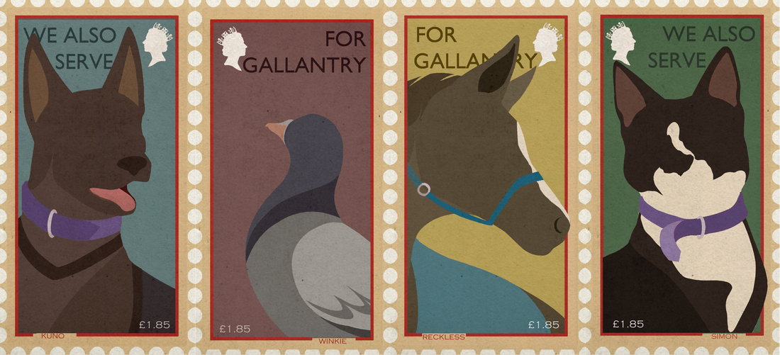
Final Stamps

|
Overall, I was happy with the way my stamps turned out, especially with all the different problems I'd run into when developing them. I was pleased with the way they looked as a set, and individually.

|

|