
Book Jackets
In this project you will design covers for (or 'repackage') a series of classic children's literature. In addition to providing a suitable introduction to narrative within, your illustrative designs will address 2 requirements.
You are asked to demonstrate a treatment across a minimum of 3 titles, to include a full wrap (front & back cover + spine). You must include:
Title (cover & spine)
Author (cover & spine)
Synopsis (back cover)
barcode & price box (back cover)
You can add any other details that you believe lends your work believability.
Dimensions
20.1 x 13.7 x 2 cm
(spine widths vary from book to book, but in the case of this project we will use 2cm as a standard width)
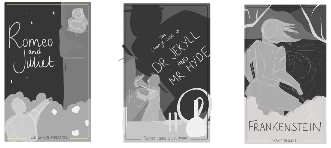
For my three book jackets, I have decided to go with;
- Dr. Jekyll and Mr Hyde
- Romeo and Juliet
- Frankenstein
Talk with Scholastic designers
In this project you will design covers for (or 'repackage') a series of classic children's literature. In addition to providing a suitable introduction to narrative within, your illustrative designs will address 2 requirements.
You are asked to demonstrate a treatment across a minimum of 3 titles, to include a full wrap (front & back cover + spine). You must include:
Title (cover & spine)
Author (cover & spine)
Synopsis (back cover)
barcode & price box (back cover)
You can add any other details that you believe lends your work believability.
Dimensions
20.1 x 13.7 x 2 cm
(spine widths vary from book to book, but in the case of this project we will use 2cm as a standard width)
For my three book jackets, I have decided to go with;
- Dr. Jekyll and Mr Hyde
- Romeo and Juliet
- Frankenstein
Talk with Scholastic designers
|
* scan in images
The main takeaway from the talk we had with Aimee and Beth was starting with typography instead of the illustration to make sure it works as a whole unit instead of two separate pieces jumbled together. It was also helpful to know what to stay away from when thinking about designing the book covers, as certain colours would look too murky. After making a few notes on the subject topic and from the talk, I decided to begin by looking at pre-existing book covers for some inspiration before I did further research or even began to make thumbnails. 
|

|
Initial Inspiration
Scholastic

|

|

|

|

|
Bookishly

|

|

|

|

|
Other children/teen covers

|

|

|
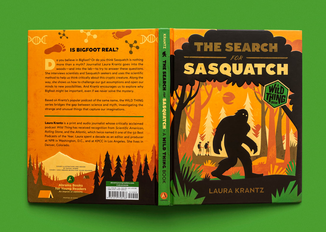
Rafael Nobre
Having looked at sets produced by different companies, I decided to look at individual illustrators and how they tackled the task of book cover designs. Rafael Nobre is a Brazilian graphic designer and illustrator. His covers rely heavily upon colour to covey the feel of the book without having any prior knowledge to the books content. I also like the use of framing in his books, keeping the placement of the text rather simple, but having it integrated into the overall illustration.
Having looked at sets produced by different companies, I decided to look at individual illustrators and how they tackled the task of book cover designs. Rafael Nobre is a Brazilian graphic designer and illustrator. His covers rely heavily upon colour to covey the feel of the book without having any prior knowledge to the books content. I also like the use of framing in his books, keeping the placement of the text rather simple, but having it integrated into the overall illustration.


|

|


|
Linh Nguyen
When looking at Nobre's work, I came across a Vietnamese Illustrator who had designed covers for Greek Mythology. Although she uses far less colours, the integration of the type face was something I liked, integrated into the illustration in a different way to Nobre's work.
When looking at Nobre's work, I came across a Vietnamese Illustrator who had designed covers for Greek Mythology. Although she uses far less colours, the integration of the type face was something I liked, integrated into the illustration in a different way to Nobre's work.

|

|

|
Book Breakdowns
Frankenstein
Story about a scientist succeeding in giving life to a creature, but it is shunned by Victor and society. The novel follows the monster's life and murder spree, as well Victor's journey in tracking down his monster and his avoidance of responsibility. 19th Century. Mainly set in Geneva, Switzerland.
Locations: 19th Century Geneva, Switzerland, Mont Blanc, Lab, Hovel, Barn, Lake


|


|


|
Romeo and Juliet
Tragic love story about lovers from rival families, sworn to be enemies but they fall in love. Play about murder and the eventual suicide of the two lovers as they cannot bare to be apart. A Shakespearean tragedy. 16th Century. Set in Verona, Italy.
Locations: 16th Century Verona, Italy, balcony, city.


|

|


|
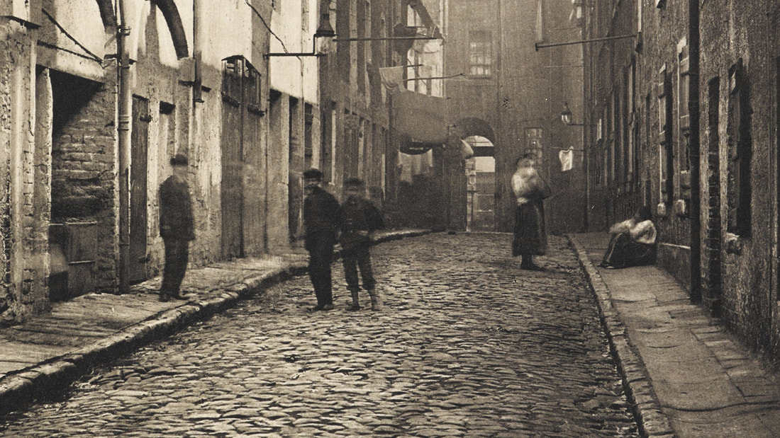
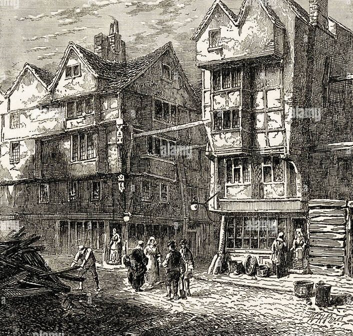
The Strange case of Dr Jekyll and Mr Hyde
Novel about a scientist who tries to bring out his second nature, trying to separate his bad side from his good. Follows the story of Hyde who commits murders, and Jekyll who is unaware of what his darker side has done. Unable to control Hyde, Jekyll kills himself and Hyde in the process. 19th Century. Set in London.
Locations: 19th Century England, London, Labs, Backstreets.
|

|


|
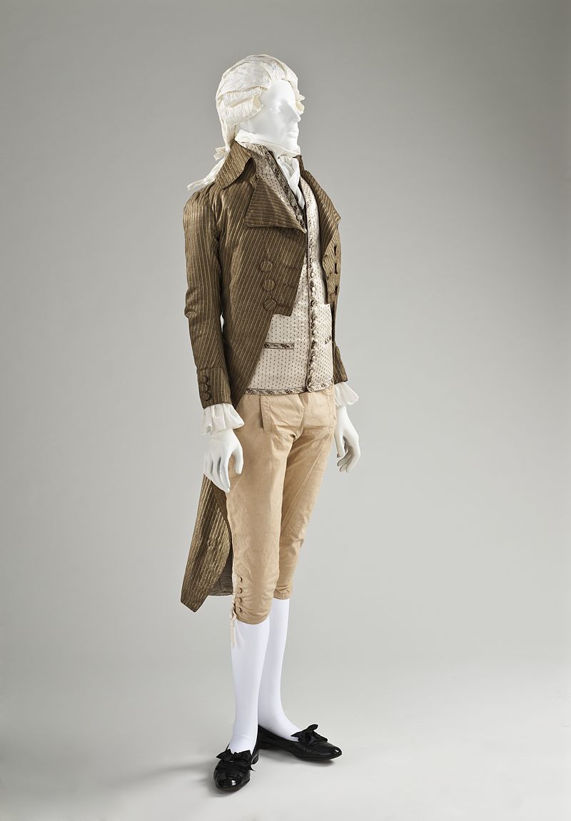
Romeo and Juliet - Research

Clothing
'A rich nobleman like Count Paris or a wealthy young man like Romeo would wear a doublet, possibly of velvet, and it might have gold embroidery. Juliet and Lady Capulet would have worn taffeta, silk, gold, or satin gowns.' - Utah Shakespeare Festival
Although Romeo and Juliet was sent in Medieval England, the style of clothing they would have worn; doublets, remained in style until the mid 17th Century, replaced by Charles II's court costume for men, consisting of a long waistcoat and being the early version of the modern suit.

14th Century Clothing
|

The Tailor, painting by Giovanni Battista Moroni, 1570–1575
|

Early 1600s doublet
|

c. 1550 Italian Silk dress
|
To appeal to a more modern audience, I also took the time to look towards more updated versions of Romeo and Juliet's clothing - attempting to find common ground between the old and new. Although the doublets are different over time periods, they have the same defining features across different eras.
As the play was written and preformed in Elizabethan times, I specifically looked more towards 16th Century clothing. 
Medieval dress
|

c. 1550 Italian Silk dress
|
Inspiration
Art Nouveau borders - Romantic, Natural
Art Nouveau borders - Romantic, Natural


|
Breaking frame? Borders? - Possible tie to each book.

|
Jekyll and Hyde - Research

Clothing

L’Elegant, 1857.
|
Set in 1830s London, I decided to look as men's fashion around that time period and just after to try and determine what the defining features of 1800s clothing was. Frock coats, tail coats and top hats were key elements that continued throughout the majority of the era. Although appealing to a modern audience, the style of clothing and shaping would be able to better help differentiate the well respected Jekyll from the supernatural ghostly Hyde |

1830s Wool Tailcoat, Cotton Twill Trousers, and Cut-Velvet Patterned Vest.
(Kyoto Costume Institute) |

1852 Frock Coat and Trousers.
(LACMA) |

1870-1880 Wool Trousers.
(Victoria and Albert Museum) |
|
Borders - Link
Border link to all three books - gothic borders for Jekyll and Hyde + Frankenstein. Modern take on gothic borders? Old style too complicated for the book cover, 


|

|
Frankenstein - Research

Clothing
1790 - 95 Tailor Coat
|

Cutaway Tail Coat, 1805-1810.
(Mint Museum) |
Unlike the other two books, the main focus is not going to be reliant on clothing. Instead setting and character.
Although clothing wouldn't play a large part, I looked at 18th century fashion, as well as early 18th century fashion for some inspiration. 
Steel engraving for the frontispiece of the 1831 revised edition of Mary Shelley's Frankenstein, published by Colburn and Bentley, London
|
Thumbnailing

|

|

|


Front Cover Thumbnail Development
|

|

|

|

|

|

|
|
|
Back Cover Thumbnail Development

|

|


|
Styling and Type
When it came to deciding on what type of style I wanted for my illustrations, I looked at how other illustrators had tackled the task of redesigning book covers. As my thumbnails were focused on integrating the type into the illustration, I looked at illustrators that had done similar. To try and balance the type, a majority of them were simpler in style and shape. However, many that were simple in shape were made up of various textures, this is something I wanted to replicate in my own covers.
Article on Penguin Book cover redesigns
Article on Penguin Book cover redesigns
|
|


|
Handwritten Type

For my Jekyll and Hyde type, I struggled with finding a correct placement for it. There were so many words but not a lot of space on the page. I came up with the solution of skewing everything off slightly - making titles smaller and connectives thinner. This worked well to give an organised chaos to the title without it being unreadable.
|


|
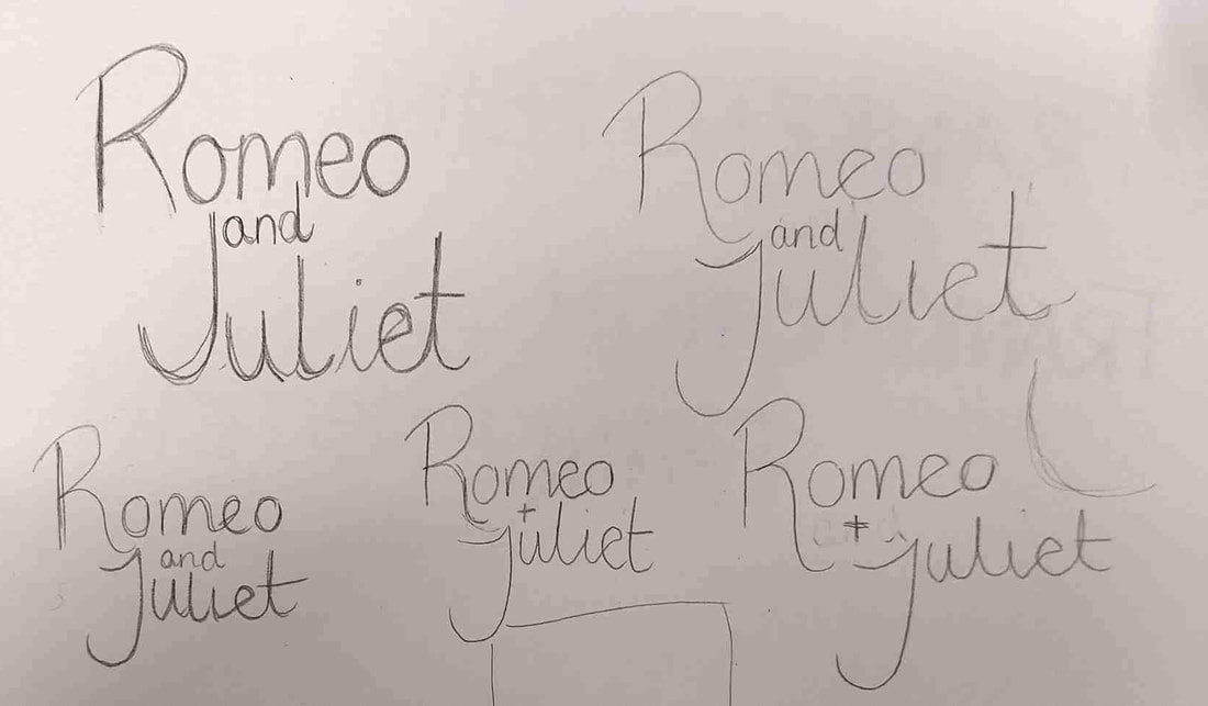

Romeo and Juliet as a title was easier to work with, as the R and the J interlocked nicely when written in cursive. From feedback with inkymole (Sarah) she suggested that I thicken up the type to make it more readable at a smaller scale. (Amazon test)
|


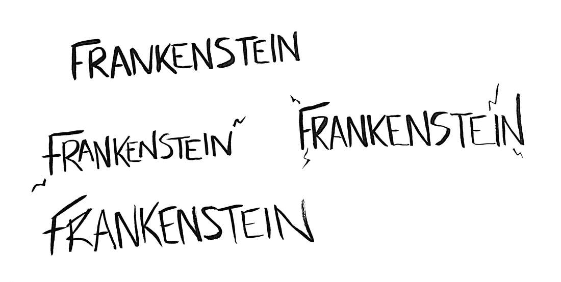
Frankenstein as a word was difficult to work with. It was a long word that couldn't be split up. I also didn't want to over complicate it as the image was busier than the other two. I decided to use the advice Sarah had given and use traditional ink work to create my type.
|
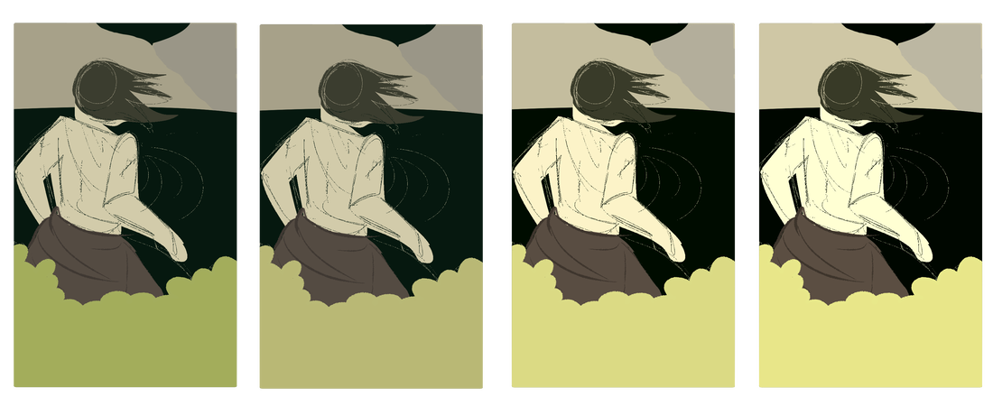
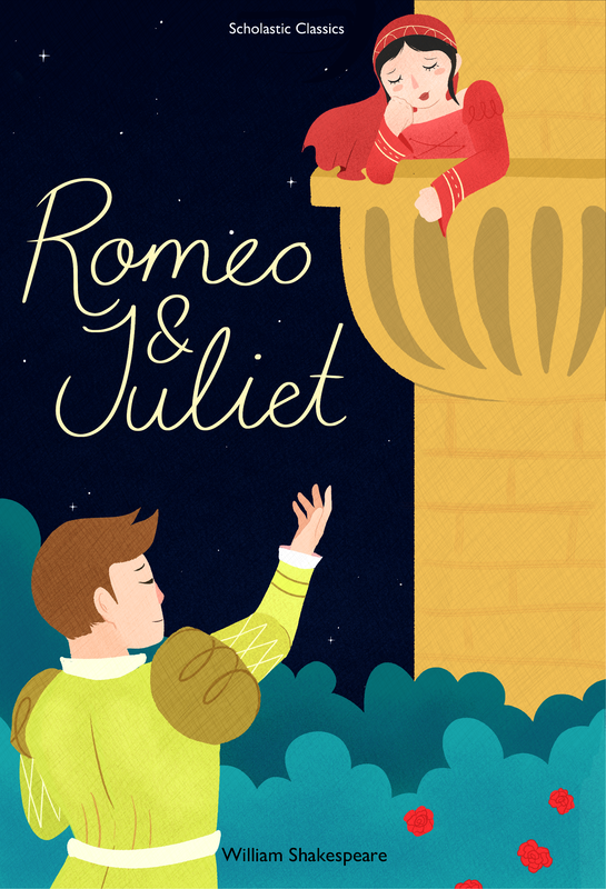
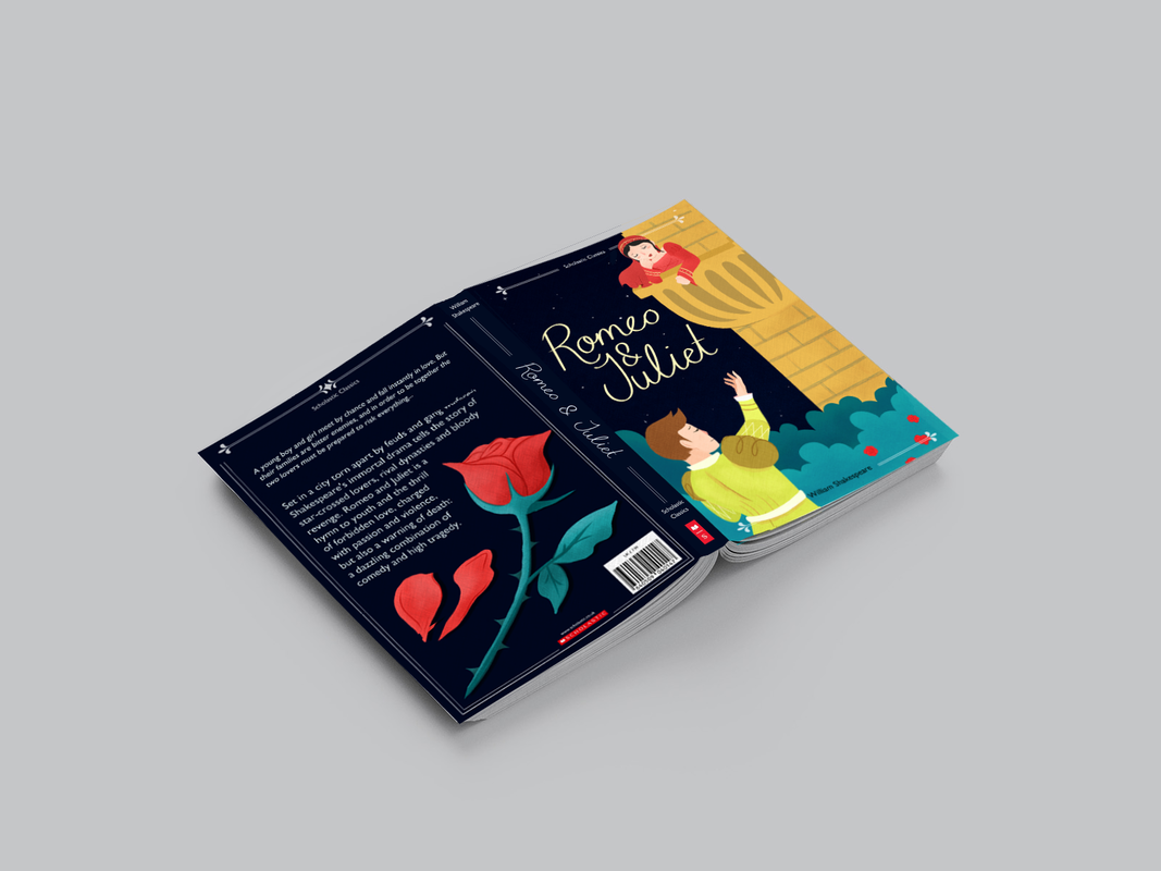
Beginning to refine the book cover for Romeo and Juliet, I first focused on making the body language stronger as this was going to be the key part to the composition. Going through the process I made a few tweaks, as having Juliet over hang the balcony a little was visually more interesting and drew the eye to the title. I also made the background darker for a better contrast.
For all my back covers I wanted a simpler illustration as to not take too much from the text. I also wanted the illustration to sit diagonally for all three. For Romeo and Juliet I chose a rose to work with the red of Juliet and the roses on the front cover.
For all my back covers I wanted a simpler illustration as to not take too much from the text. I also wanted the illustration to sit diagonally for all three. For Romeo and Juliet I chose a rose to work with the red of Juliet and the roses on the front cover.

|

|

|

|

|
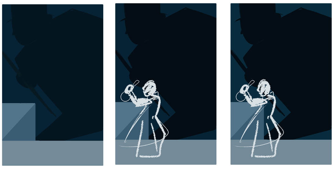
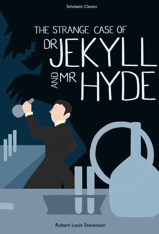
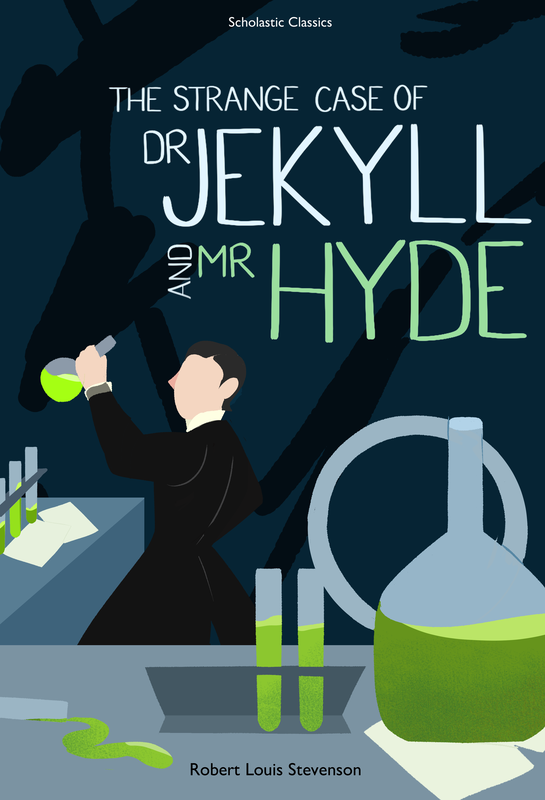
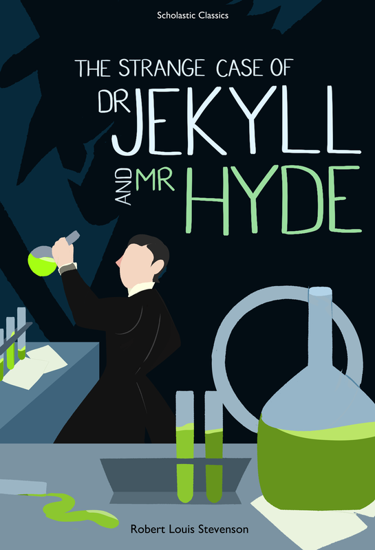
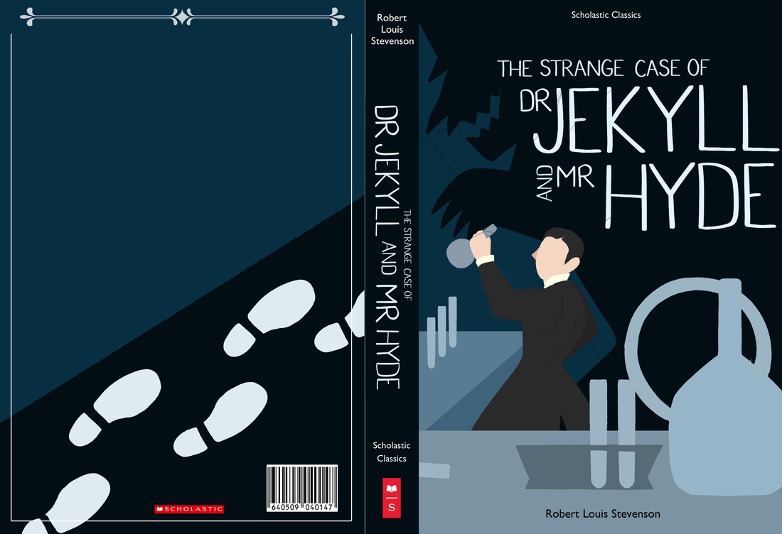
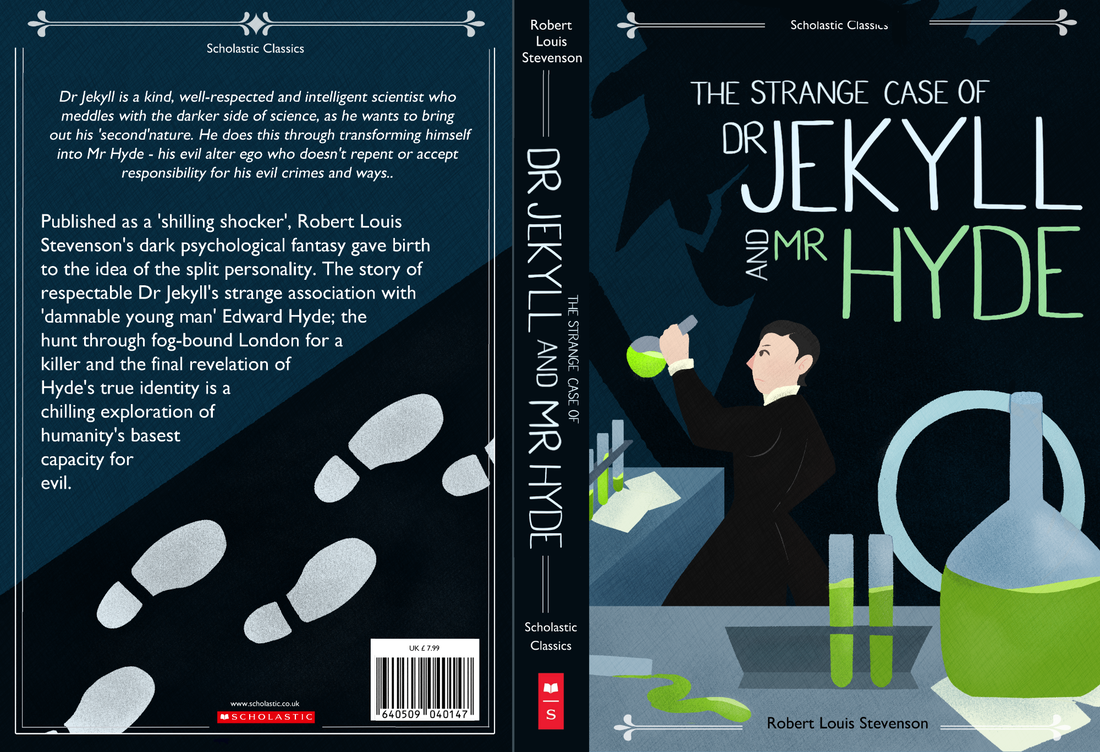
When developing my Jekyll and Hyde cover, it was more limited in colour palette compared to Romeo and Juliet. When it was time to add the liquid to the flasks, I decided to keep them one colour. That way I could use the green to make certain elements pop. I experimented with the shadow of Hyde in the background quickly, but decided a closer up view of him fit the composition and title better overall.
Similarly to Romeo and Juliet, I kept the back cover simple and kept the diagonal. I decided to keep it simple with footprints for the tracking down of who Hyde was.
Similarly to Romeo and Juliet, I kept the back cover simple and kept the diagonal. I decided to keep it simple with footprints for the tracking down of who Hyde was.

|
|
|
|

|
|

|
Out of all the covers, Frankenstein gave me the most trouble. From the start I didn't know what to do with the composition. But once I had fixed the body language and view point it became easier to work with. I now had room for Frankenstein's home and the alps - moving the eye backwards. For my type I kept it more organic, using a brush pen to make my strokes and scanning them in. Given the image was more complex than the other two, I kept type simpler.
For the back cover I kept the alps, but made them far simpler as to not clash with the information on the page.
For the back cover I kept the alps, but made them far simpler as to not clash with the information on the page.

|

|

|

|

|
|
|
|

|

|

|

Book Mockups

|

|

|
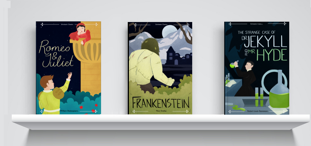
Overall I was happy with the way the trio turned out, as a set they looked coherent but each with their own personality and identity.
|
After Feedback
After my feedback session I was given a few pointers on how to make my outcomes stronger. This consisted of weaving some colour through the illustrations so they weren't just locally coloured. For each of the back pages I also aligned the text on the back covers to the left as opposed to the center.
After my feedback session I was given a few pointers on how to make my outcomes stronger. This consisted of weaving some colour through the illustrations so they weren't just locally coloured. For each of the back pages I also aligned the text on the back covers to the left as opposed to the center.


|


|