Weeks 3 -5
Illustration In Response To Written Words - Literal Illustration
Moving on from last weeks conceptual illustration task, we instead looked at literal illustration for this project. We each were given a different short story by M.R James. I was given 'The Tactrate Middoth', published in 1911.
The story is centered around Dr. Rant, a wealthy and unpleasant clergyman who had left two wills - one leaving everything to his nephew John Eldred, and the other informing he had left everything to his niece Mary Simpson. The wills are inside The Tactrate Middoth, whom John is still seeking to find. But while searching for the book, Eldred finds that the book is haunted by his uncle, who is now nothing more than a shell, with 'eyes deep sunk, and face covered with thick cobwebs. Instead, Mr. Eldred tasks Mr Garrett, a library employee to find the book for him. But Mr Garrett is also scared by the ghost of Dr Rant, causing him to faint and take time off work. While on his time off, Mr Garrett comes across Mrs Simpson and her daughter Miss Simpson, who inform him about their own search for The Tactrate Middoth - whom he vows to find the book for. His journey ends with him finding Mr Eldred, who is in possession of the book and watches as he rips a page out of it - all before he is killed at the hands of Dr. Rant's dark, cobweb coated ghost. The story ends with Mr Garrett finding the will for Mrs Simpson, and he marries her daughter Miss Simpson.
After reading through my text, I decided to look at other artists' work for inspiration - looking at both literal illustration, and how atmosphere is created. Admittedly, the majority of what I looked at were either black and white illustrations, or very dark in colours to create the horror or unsettling atmosphere. But in all examples, they had a full tonal range; from dark blacks to bright whites.
The requirements for this project was to create two illustrations; a full page illustration and a vignette - as well as a front cover.
For the full page illustration, the requirements were;
One illustration is a full-page, full bleed image which should be presented as follows: CMYK - image size 160mm wide X 226mm high at a resolution of 300 dpi. Note: this dimension includes a 3mm bleed around all four sides.
For the vignette the requirements were:
A black and white chapter heading that is aligned to the body of the justified text. As such it must occupy an area of 105mm wide X 50mm high. Note: there is no requirement that it has to have a crisp, rectangular edge so you may treat it as a vignette (see image below for an example). The final artwork should be presented as a 300 dpi, grayscale image.
And finally the front cover requirements were:
A front cover (and spine) design for the book 'Collected Ghost Stories of M R James'. The cover will be printed with two spot colours on a cloth binding (you may specify the colours). The cover will be 165mm wide X 231mm high. The spine will be 30mm wide X 231mm high.
|
Description of ghostly Dr. Rant

Mr Eldred's death

|
Before I began making thumbnails for ideas that I had, I narrowed parts of the text down - to what was most relevant, and made the most sense to illustrate, especially given the majority of the text is not significant to the plot and instead are just descriptions.
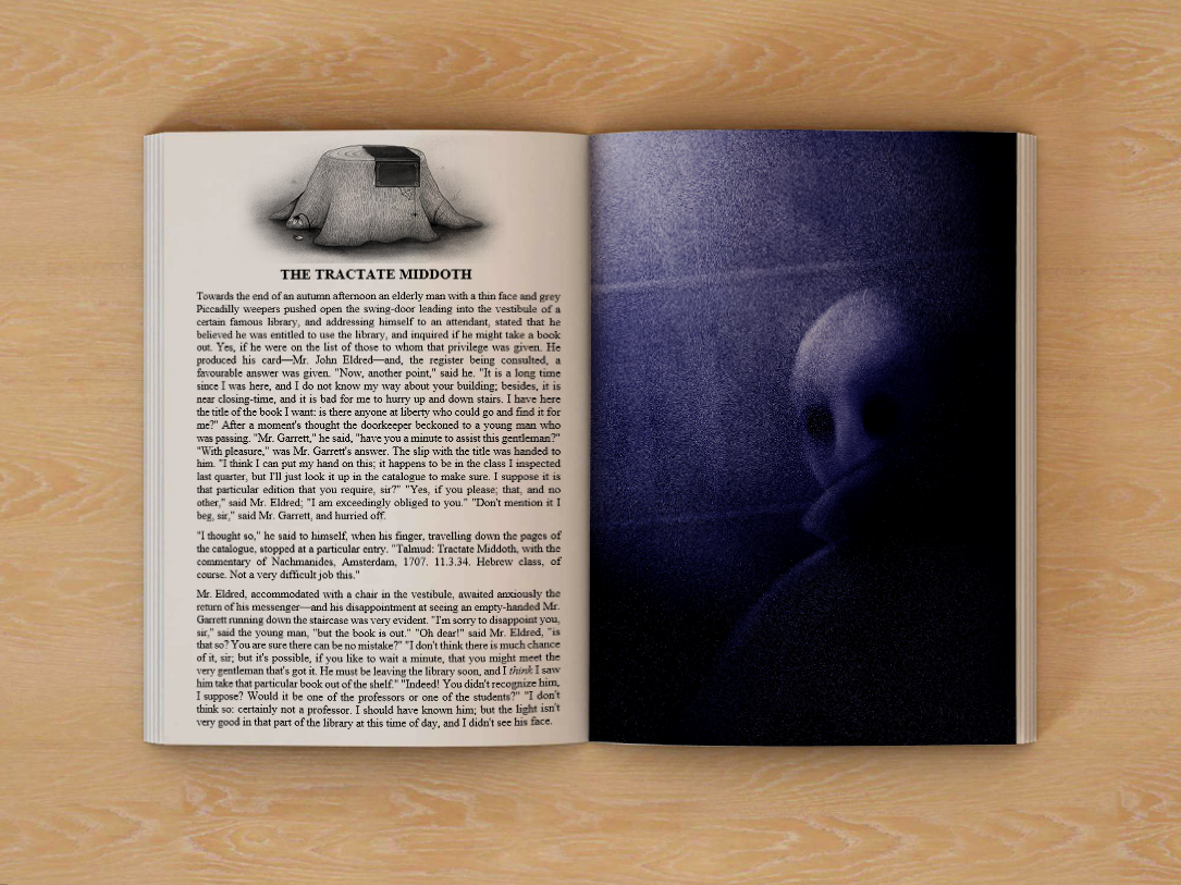
I decided to go with the description of Dr. Rant in the library - and think this would make more sense to be the main illustration. And then Mr. Eldred's death as the second piece of text chosen - making more sense for it to be the vignette at the beginning to the chapter to hint, but not tell, at what is upcoming. Both of these pieces of the text were things that stood out to me upon my first reading as major events, and upon reading the text again, made the most sense to illustrate. |
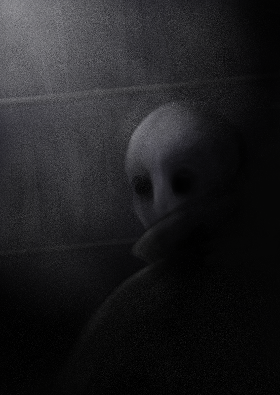
Main Illustration - 60 mm x 226 mm
|

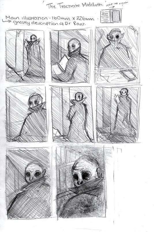
When coming up with thumbnail ideas for my main illustration, I quickly figured out that having the ghostly figure of Dr. Rant be closer to the foreground worked best. This would help in keeping things vague and up to the reader to fill in the gaps.
Following my feedback session, it was suggested that I don't fully illustrate the figure, as this would show the reader what Dr. Rant should look like - as opposed to letting them fill in the gaps; leaving their mind to create something scarier than I could illustrate. I decided to make some new thumbnails to show how I wanted the figure to be lit - having more of a dramatic lighting. |

|

|
|

|

|
When I began making the full illustration, I decided that it would be better to work in black and white, and then add colour to the piece. This worked well as it allowed me to create the image of the figure, whilst not worrying about colour - this way I was able to work on building up the different textures.
Once I had completed the black and white piece I played about with different colour overlays; from hues, to colour and then changing the levels of the piece. I was happiest with the one on the below as the blue tint really added to the atmosphere of the illustration, and the tweaking of the levels gave me a greater tonal range.
Once I had completed the black and white piece I played about with different colour overlays; from hues, to colour and then changing the levels of the piece. I was happiest with the one on the below as the blue tint really added to the atmosphere of the illustration, and the tweaking of the levels gave me a greater tonal range.

Vignette - 105 mm x 50 mm

|
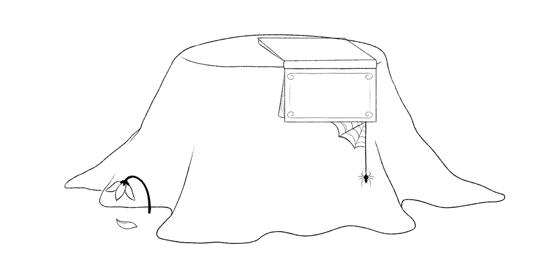
For the vignette, I decided to go with the death of Mr. Eldred as the subject matter. as I would be able to create a chapter heading that hinted at the events of the climax of the story, all without giving too much away. When making my thumbnails, having the book lay next to the tree stump as it was in the story didn't look right. It made things look disjointed and so I decided to move the book onto the stump.
As I wanted to hint at the events, and not tell, I decided to add the wilting flower to the composition instead of blood or anything as obvious. This balanced out to left side of the piece, Once I had decided on the layout of the vignette, I decided to sketch it out, before scanning it into Clip Studio to work onto it. I decided to use rough brushes to replicate the feel of ink and pencil to make my final vignette. I also decided to not give it a frame, as it would sit more naturally on a page without it - blending illustration with the text. 
|
|

|
When making my final vignette, I decided to use different brushes that had a grainy feel to them, adding to the horror element while not drawing anything too scary. I liked the way this turned out, as the different textures worked well together, especially in black and white. Following my feedback, I decided to thicken up the lines of the bark - as the original would be hard to read when shrunk down to such a small size as a chapter header.

|

|
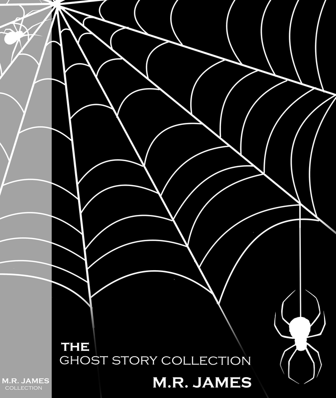
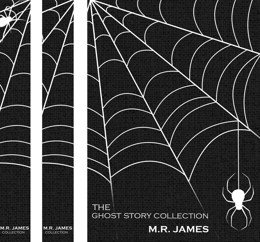
Book cover - 165mm x 231mm
For the front cover and spine, I decided to opt for a simpler design as I didn't want to overcomplicate things - especially when only using two colours. I decided to follow the idea of spiders and cobwebs as this was something that was present in my story, and over other M.R. James stories. It also tied in nicely to using black and white for the colour scheme - all adding to the gothic horror genre.


|
|
|
When starting to piece together my final cover, I was unsure if I wanted to include the spider on the spine. Yet when I placed them side by side, I thought it looked better with, and so I decided to keep it on as if the design would wrap around the whole book. Once I had finished my cover and was happy with how it looked, I decided to add some overlays - firstly a cloth bound texture to give it more of a real feel. I also decided to make a mock up of the book and spine to see how it would look like as a real object. Working out the different overlays was a little bit difficult, but I was able to create something that is able to communicate what the final outcome would look like if it was to be produced as a real book. |

After Feeback - Final Outcomes
Overall, I was happy with my outcomes. I particularly like how the main illustration and chapter heading look alongside the text - making a mock up of the book layout made my work look significantly stronger, and coherent despite the different styles that were used for each outcome. I was particularly happy with the outcomes as I had never illustrated something so dark, nor so loosely; and this allowed me to experiment with different digital brushes to build up different textures.