
Weeks 6 - 8
Illustration In Response To Written Words - Children's Book Illustration
Illustration In Response To Written Words - Children's Book Illustration
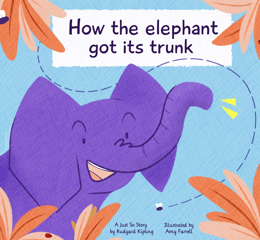
Continuing on with illustration in response to the written word, I decided to chose to create some illustrations for a children's book out of the four projects we could chose from. I also decided to go with Rudyard Kipling's 'How the Elephant Got it's Trunk' for the base text. We were required to make three different illustrations; a double page spread, a single page, and a front cover design for the book.
Text link and book reading
Text link and book reading
|
|
To begin with, I got familiar with the story - reading through the version of the story we were given, and then looking at a reading of the story for children - this version Illustrated by John Joven. This helped me get an understanding of how the story was paced,
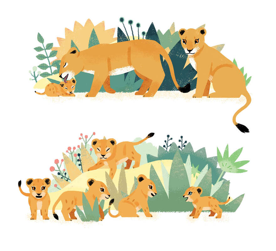
Once I had read through the story, I could establish the setting and main characters; in this case the setting was going to the plains of Africa, and main characters were the little elephant, and crocodile. Depending on what parts of the story I was going to do, secondary characters included the elephant family, and the snake. |
|
Nile Crocodile
- Sharp features
- Angular - Rough look/texturing |
Looking at the different animals; particularly the difference between the Bush Elephant and Nile Crocodile, textures would help significantly in distinguishing the different feel between the two animals. I decided to look at how different illustrator illustrate their own children's books - but particularly using at the techniques they use in building up textures.
Research
Helen Borten
Borten's use of colours was the thing that drew me to her work. It's vibrant and simple, but very effective. I particularly like the second piece and her use of a vibrant colour for the background - this is something I wish to replicate in my own pieces; straying away from softer colours I usually use for something more vibrant.
Marta Altes

|

|

|
Looking at Altes' work made me realise that keeping things simple with shapes and simple shading was probably the best way to go as I didn't want to over complicate things. This was something that was seen across a wide range of children's books - as seen in the other examples below.
Spring Showcase - Flying Eye Books 2019
While looking at how different illustrators use textures int heir work, I came across this Issu catalogue from 2019 showcasing all the new releases of books that spring. Seeing different books laid out side by side really helped in distinguishing what made children's books similar, but also different at the same time.
For the majority of the books, the style in which they were illustrated in were very simple. However, it was the use of textures and textured brushes that set them apart from one another.
Ella Bailey

|

|
|
Ben Newman

|

|

|
Katie Harnett

|

|

|
Stephanie Fizer Coleman


|
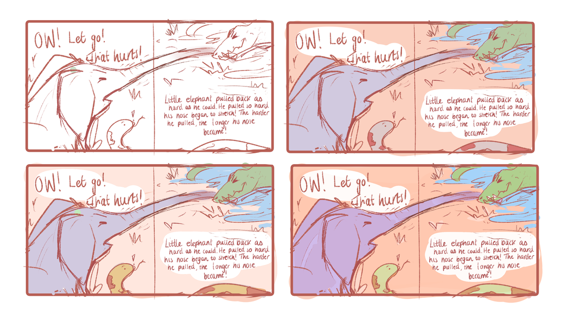
For my double page, I decided to go with the part where the crocodile is stretching the elephant's trunk as I could make the most of the double page spread and have the trunk spread across them both. This would make the double page spread more interesting rather than choosing two consecutive pieces of speech. For my single page I decided that it would be best to chose one line from the story towards the end, as that would be where the pacing could slow down a bit, to list all the things the elephant can do with his new trunk in detail. I decided to chose the line about the fly on the elephant's shoulder. For my front cover, I decided that it would be best to figure out the way I was drawing the elephant and colour schemes for the inside pages, and then work backwards to make the whole three pieces more coherent. |
Week 2
|
After watching Stephanie Fizer Coleman's video on how she produced her children's book, I followed her process of deciding what the characters would look like. The feedback that I was given was that the elephant looked too cute and generic with the big eyes. So I tried to find a way around it, instead opting for smaller eyes, which would allow my to make it look recognisable more easily. It would also give a little more roughness to the book as is frequently found in children's books. |

|

|
|
Once I had planned out roughly what I wanted my characters to look like I sketched out some traditional thumbnails, for the front cover I was unsure which I liked out of three of them so I decided that I would narrow it down when I developed them digitally.
For my double page thumbnail I quickly decided that I wanted the elephant to be in the foreground and crocodile in the background - so that when it read left to right, it would make sense with the parts of the text I chose. Finally for my front page, I decided to focus on the elephant for this page. Although I had done thumbnails traditionally, I took them into Clip Studio to develop them further, as I could manipulate and move them easier than I could on paper. 
|

|

|
I chose my second to last thumbnail for the double page spread as I liked the use of the diagonal when the crocodile was pulling the trunk. When I scanned them in, I drew over them digitally, and began to play around with the scale of the elephant and the crocodile. I also decided to add some colour to the developed thumbnail to get a feel for the colour scheme. I prefer the lighter background as I know I'll have to work into the characters quite a bit - so keeping the background light and simple may work in my favour.
|

|
For my single page illustration, I decided that I actually preferred the composition when it was flipped, and so developed my traditional thumbnails and tweaked what I wanted to change. I decided to add the same colour scheme to my single page just to see how it would look, and I think that I would need to make the background colours a little bit lighter just to ensure that the elephant - being a darker colour stood out. |

I was unsure which front cover I wanted to go with, but when applying colour and seeing them side by side, I preferred the first of these outcomes. But I was still unsure about the colours I wanted to use, especially on the front cover. I played around with lightening and darkening the colours, but didn't like the look of the darkest ones as it was hard to read.
|

|


Week 3

|
Before I developed my ideas and began to make piece together my final pieces, I decided how I wanted to do my type. I initially wanted handwritten type for my front cover, but I found that difficult to do when I attempted to do it.
But narrowing down ideas, I decided that some fonts would be too pointy and harsh for the feel of the book; whilst others were too complicated and decorative. I looked at different typed fonts to try and narrow down which ones would work for a children's book. When developing my ideas I tried out fonts 'Lily' and 'Playtime'. Lily was rounder and more playful, and so I decided to use that for my main type up of the story. Playtime would eventually become the front cover typeface. |
|
Double page
For my double page, I began by correcting the parts of my thumbnails that were off; such as the curve in the elephant's trunk, and the proportion of the crocodile. I was unsure if I wanted to line the page but decided against it. Instead I opted for using techniques that were present in children's books - where lines are few and far between, and when they are used, they are used to separate or distinguish key parts. I found this article explaining how to achieve that effect in illustrator, and tried to replicate the key parts in my own software, using similar brushes to add the lines and give them some more texture. |

|


|


|
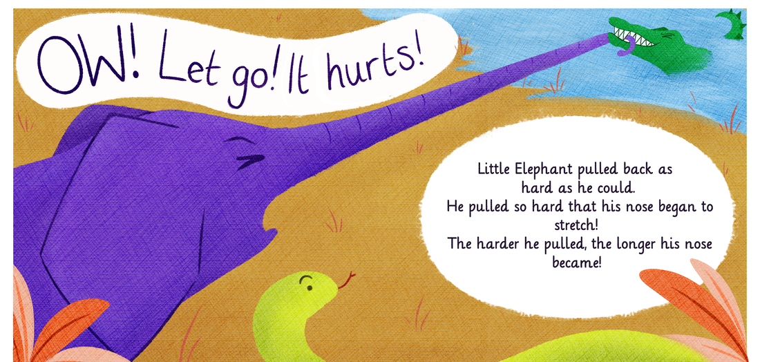
I was going to switch out the hand written speech bubble for some text, however I didn't like the way that looked as it felt too static, and so decided to keep the handwritten version. I was fairly happy with this outcome, especially when looking at my initial thumbnails. Rotating the crocodile and making it significantly smaller worked well in the end as I was able to play around with the perspective of the elephants trunk.
|
When putting together my double page, I added I added a canvas overlay - setting the layer properties to colour burn to get a more vibrant colour palette.

|

I was still unhappy with how flat everything looked, and so went through the textures that I had from the first semester. I tried overlaying a variety of different textures, but most made the page too busy. I opted for a simple pencil texture and overlaid it on different segments of the page - colour burning it again. This gave a subtle texture to the page overall.
|
Single page
For my single page, I followed the process of the double page for the most part - to keep things consistent with the double page. I had to experiment with the colours a little more, especially the background. Initially, I didn't have the clouds in the background, but that made the piece as a whole look very empty.
My initial idea for the text was to have it going more across the page, but when i attempted to piece it together, I was unhappy with the way it turned out, and so moved it to be slimmer down the side. This worked well when adding in the fly's flight lines, as I could integrate them onto the text box, making it feel whole.

|

|

|

|
I decided to add the leaves to the bottom of this page to as it felt very top heavy, and would carry things over from the double page nicely. I decided to add the lady bug on the right to counter everything that was going on on the top left with the fly; especially considering the leaves on the left were bigger. This just helped balance things out.
Over all I was happy with how this turned out, again, especially given the initial thumbnails I had made. They didn't flow as nicely as this did, and moving the text around was a wise choice. Here I also began to realise that having the same textures overlaid helped keep things coherent over the double and single page.
Over all I was happy with how this turned out, again, especially given the initial thumbnails I had made. They didn't flow as nicely as this did, and moving the text around was a wise choice. Here I also began to realise that having the same textures overlaid helped keep things coherent over the double and single page.
Front cover and spine
My front cover, although being the simplest of the three, was the one that I struggled with the most. Initially, I was using a sandy coloured background for it, but changed it for a blue to see the plants a little better. I also was unsure what type I wanted to go for, but decided to go for a typeface instead of handwritten as I was struggling with making it look coherent. I also opted for changing out the curved title to avoid having too many curved elements in the fly and plants - just so it didn't clash.
I repeated the process for the textures and shading as I had done for both my double page spread and my single page.

|

|


|
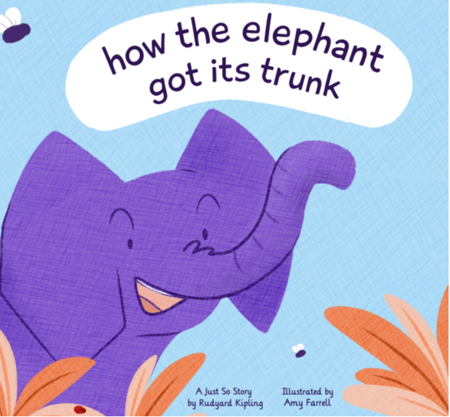

In the end I decided to stick with the blue colour, and added little things to balance out the composition. Again, adding little things like the ladybirds ensured that things looked visually interesting. When putting the two books side by side, the blue stood out more, as the tan was far too similar to the likes of the leaves, as well as the white framing where the text was to go. Overall I'm pleased with the three final outcomes as they look coherent, but stand as individual pieces on their own. I'm especially happy with the colours that were used as it pushed me to use more vibrant colours as opposed to my usual muted or pastels. If I were to do this again, having understood where I went wrong in developing ideas, I would have liked to have played around with textures a little more. |


After Feedback - Final Outcomes
Following the feedback sessions, I tweaked my final pieces to make them stronger. This included adding colour to the double page spread to ensure that colour wasn't just locational. Adding the small butterfly to the bottom left of the double page made the whole page pop that little big more and balanced out colour and composition. Additionally I rounded off the corners to the text box on the single page, ensuring it worked better along side the soft shapes of the clouds.
Overall I was very pleased with my outcomes and enjoyed doing this project. The route I ended up taking wasn't the rout I had initially expected to take, but worked out well in the end. I also enjoyed experimenting with different textures and minimal line work.
|
|

|

