
Artist Research
For this module, we have been tasked at looking at the world around and create observational drawings. To begin this task, looking at artists was key to get inspiration and a feel for the type of sketchbook work to be produced. One thing that I want to come out of these types of tasks is to allow sketches to feel more alive and free flowing instead of stiff.
Stirling Clinton Hundley
|
|
Hundley's work focuses on 'observations of time through documented daily routines.' The free feel of the images creates a sense of movement and passage of time to create collages of sketches that feel surreal. With that said, the base of the figures or things are still able to be made out where they do overlap.
The way Hundley is able to give his work depth and exaggeration in certain aspects of the work is what makes his work so unique and life like even if the images themselves do not always replicate something real to life and instead show pieces of people and things as time has passed. |
Drawing on 2020 - Tim King
|
In contrast to Hundley's work, Tim King's 'Drawing on 2020' represents something much more real and mundane. Drawing each day of the year, throughout lockdown and pandemic, King draws from the everyday and makes them into illustrations that are far more interesting than the events themselves.
With this said it is clear that King's illustrations have been drawn from life, whether it be full scenes or more simple figures within his illustrations. Yet again the free nature of brush strokes and lines - as well as the addition of colour make these pieces stand out and reflect their real life inspiration. |
|
Chris Ware
|
|
Best known for is comics, Chris Ware has also shared some of his observational work, and although vastly different from his comic book work, the skill and basis for the comics is seen in this work. Ware uses a combination of black and white, and colour to complete his drawings with both being effective in black and white and in colour.
Ware has particularly been able to convey light and shadows well in his black and white drawings, with the use of dark black to show darkest areas, and leaving the page white to convey the lightest of areas. Yet again, this is another instance of the everyday being turned into something more interesting through the additions made in the drawing. |
Lucinda Rogers
|
Rogers is a traditional street artist that draws from life, reporting of the world around her as she records from eye to paper. Her work varies in line weight and is very spontaneous in nature. With her little use of colour it allows her to create lively pieces, exaggerating certain areas of the piece.
The spontaneous nature of recording from eye to paper is reflected in Rogers' work, through the imperfect lines, to the overlapping linework. This has allowed her to replicate the bustling feeling of these settings. |
|
Finchwing - Chloe Peters
|
|
Chloe Peters is an illustrator and animator who usually focuses on character art. However, she too frequently draws from life, whether it be animals or settings. The combination of mediums; ink and pencils have allowed her to create depth in her work, as well as give the different animals texture. Incomplete line strokes make the sketches more life like, building up textures and colours through the use of different shading techniques. Doing observational work has also pushed Peters' work forwards which is reflected within her animation and illustration pieces. |
Drawing from life
One of the things I noticed when first attempting to draw from life, is that pencil had its pros and cons. I was able to redo areas of the drawings that I wouldn't have been able to redo in ink; but that meant that they turned out a little more lifeless than I had hoped for.

|

|

|

For smaller objects, pencil seemed to work as they weren't so much alive in the first place, unlike streets and people. For this reason I attempted to draw parts of the studio with dip pen and ink. I found this difficult to work with as I hadn't used a dip pen in a while. With that said, I do like the effect a dip pen can give with the varied line width.
|
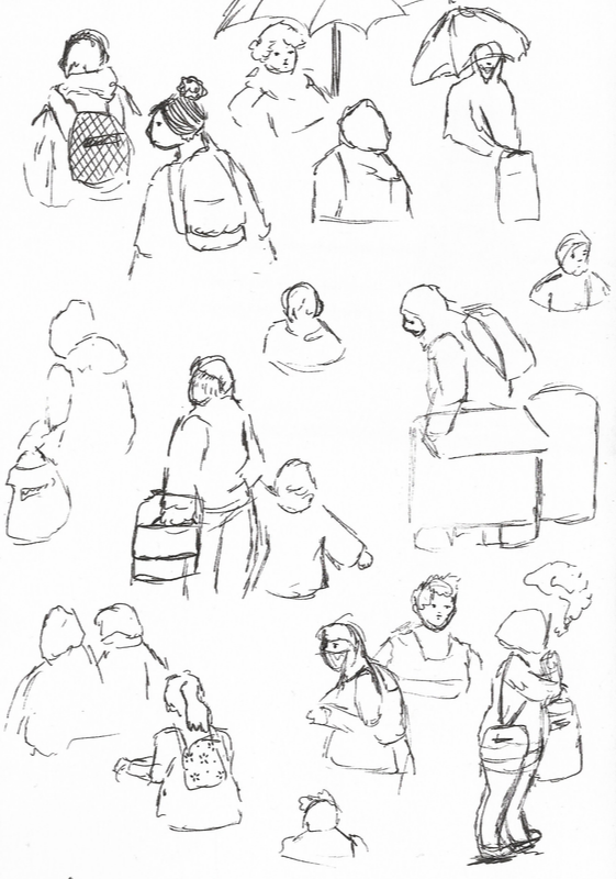
Over the past few days it has been raining pretty heavily, and although I wasn't able to go out with ink to draw in location, I was able to draw people walking past my window. This was a challenge in itself as although there was a variety of different people walking up and down from college or to get the bus, trying to capture them in such a short time proved difficult.
Some of my attempts turned out much better than others too. This task helped me significantly as I am usually a slow worker but had to pick up the pace here as I didn't have a long time to get pen to paper. Although I used fine liners for most of this task, using the brush marker for the bus stop gave a nice contrast to the liner detailed people.
Some of my attempts turned out much better than others too. This task helped me significantly as I am usually a slow worker but had to pick up the pace here as I didn't have a long time to get pen to paper. Although I used fine liners for most of this task, using the brush marker for the bus stop gave a nice contrast to the liner detailed people.
|

|
|
I also used fine liners to draw an observational view from my window. This was good practice for both the first semester one modules, as developed my observational skills, as well as cross hatching and shading practise. In doing all these tasks I have come to realise that my weaknesses are in ink and dip pen, as I find it difficult to control the pen and line width effectively. Fine liners on the other hand are far easier to control. and still allow a variety of line widths. |

|
Wild-Life Drawing
Going into this part of the module, working quickly to capture people living their lives was going to be hard- and when combined with the accuracy- or lack of- that came with drawing in ink, I knew I was going to struggle. With that said, I learnt a lot when doing this task. Although some of the drawings were more successful than others, I learnt how to approach this task better with each attempt.

|

|
Initially, I had been using pencil, and that was the first mistake. I found that using pencil made it easier to try and fix things, making them look less life like in the long run and begin to become stiff and ill proportioned. It was for this reason I decided to change over to ink, even if it was just with a fine liner; it turned out better than the pencil drawings.

|

|

|

|

|
|
Some attempts turned out much better than others, for example, drawing people in the studio was far easier than drawing people passing by in town as they never really stayed in place for too long. Most of these attempts of people walking past or standing still momentarily are rough and lack detail the studio attempts had - but did help me work quicker and work with more consistent set of line.
With each drawing my consistency in line quality got better and better, becoming more confident in making marks. 


|


For some of the drawings, I decided to add some colour to give them depth and to communicate what was going on in each drawing. Even if the colour was simple and a small addition, it was overall effective.
|
Life Drawing
|
|
My first attempt was something I struggled with, not knowing where to start. As the session went on my mark making got stronger and more expressive. Having being taught how to measure out proportions, I initially struggled with how to go about it, finding myself getting caught up in details as opposed to getting things down on paper quickly first.
I found that using the conté crayon was far easier than pencil as it allowed me to make stronger marks instead of being so tentative about it. It also made things easier when adding light and dark to the form. When looking at my first attempt and my last from this session, I was happy with the progress made in the first session. |
|
Going into the second week of lifedrawing, I left behind the pencil to ensure I wasn't colouring things in with the conté crayon. This was more effective than l using a combination of pencil and conté crayon. Although my work was stronger than the first week, I still struggled with things such as the placement of the head and the angle it sat at.
With that said, I was growing more confident with mark making, even if it was still a little tentative. My sense of lighting was getting better, and was slowly beginning to fight the drawings to get things in the placements I wanted them to be in. However quick they were, imagining the body as cylinders and solid shapes helped in understanding how the body worked when in different positions. |
|
|
|
For week three, we moved on to using only black and white paint to create the form - using dramatic lighting to light the figure. I enjoyed this far much more than with pencil and conté crayon as I was able to build and edit the paint as I went along. It meant that I was able to edit, but unable to completely erase marks, meaning I had to be more bold and confident in what I was doing. Even though it was a little bit of challenge, I enjoyed working on a larger scale, allowing me to take a step back and work on my piece as a whole as opposed to being bunched up over a small piece. |
|
For the final week of life drawing, we continued to work with paint, and I felt more comfortable with it this week, using thicker paint to try and get a bolder sense of light and dark.
Using only white on black paper was surprisingly effective, and is one of my favourite outcomes of the whole four weeks. It was more challenging to work out, but in the end the effect made up that. Looking back at my first week of drawings, these final ones look much stronger than the earlier ones - but with that said, I still struggled with the positioning of the head but had improved from my very first attempt. |
|
Lockdown Comic
For this project, we were tasked with creating a comic reflecting on our experiences of coming out of lockdown. To begin with, I began by looking at pre-existing comics for inspiration.
Comic research
|
|
|
'Anywhere but here' - Tori Miki 'Grandville' - Bryan Talbot
Admittedly, I'm not that big of a comic fan, so found it hard to find comics that I was interested in - with many being dark in art style of plot it isn't something I am drawn towards. With that said, I took a look at 'Anywhere but here' but Tori Miki; a wordless comic strip series. Although not the typical comic book, the use of frames, and breaking those frames to convey ideas across to the audience was something I found interesting and useful for my own comic, especially when it comes to conveying the quick passing of time.
'Grandville' by Bryan Talbot is a steampunk graphic novel, focusing on giving animals human attributes to create a detective comic series. This comic however is far more detailed and graphic, as well as being darker in tone. Although this more than likely isn't going to be what I end up doing for my own comic, it helped to look at the different types of shots and styles when comparing the two comics.
'Grandville' by Bryan Talbot is a steampunk graphic novel, focusing on giving animals human attributes to create a detective comic series. This comic however is far more detailed and graphic, as well as being darker in tone. Although this more than likely isn't going to be what I end up doing for my own comic, it helped to look at the different types of shots and styles when comparing the two comics.
Children's book research
|
|
|
'Fairy Tales and Fantasies in Illustration' 'Everest' - Sangma Francis, Lisk Feng
Although we were tasked with creating a comic, looking at children's book illustrations was far more inspiring than looking at comics. For my own lockdown comic, I would rather work with something softer and happier looking as I don't want to focus on the heavy struggles of coming out of lockdown. Instead I would rather look at the smaller, insignificant struggles. It was for this reason I looked at 'Fairy Tales and Fantasies in Illustration' - a compilation of Japanese artists creating whimsical illustrations with a soft, airy feel to them. I particularly like the use of textures in their works, such as the pencil marks and other soft textures.
Additionally, I also looked at 'Everest' by Sangma Francis and Lisk Feng. Much like the first book, I really like the use of colour and texture in this book, making something that at first thought a boring subject, into something engaging and interesting for kids. I also like the use of view points in the book, making the mountain look large as is it is meant to be by making the figures small.
Additionally, I also looked at 'Everest' by Sangma Francis and Lisk Feng. Much like the first book, I really like the use of colour and texture in this book, making something that at first thought a boring subject, into something engaging and interesting for kids. I also like the use of view points in the book, making the mountain look large as is it is meant to be by making the figures small.
Idea generating

|
When thinking about what I wanted my lockdown comic to be on, I decided that I didn't want to focus on the major issues I faced with coming out of lockdown. Time management, the shift from online to the real world, friends and family were all to heavy of subjects to tackle, and didn't want to dwell on the negatives too much. It was for this reason I decided to tackle the minor struggles I faced when coming out of lockdown.
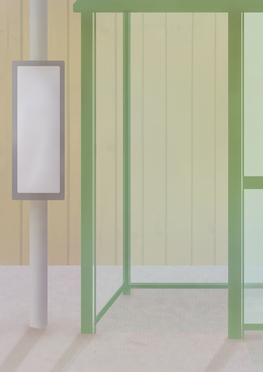
A lot of the problems with coming out of lockdown have been relearning and adapting to things all over again - and this was part of the reason why I wanted to do my comic in more of a children's book style; to reflect the child-like learning we have all had to do in the past few months. And thinking back on coming out of lockdown, one of the minor things I struggled with was getting back into the swings of things; especially when it came to getting public transport. From the stress of making sure I was there on time, to getting the right bus, having the right change, staying away from people etc, getting the bus was a major-minor insignificance after having not gotten one in the past year and a half. Thinking back it was a light hearted struggle - one that wasn't a big problem in hindsight, but sure felt like it at the time. I decided that this subject would be better for my comic as would have a defined start and end. |
Thumbnails and sketches
Once I had a basic idea of what I wanted my comic to be, I began by making small thumbnails to try and get a grasp of the layout of the comic. Initially, I wanted to have more pages, but decided to cut them down to keep the story short, and the workload manageable. Once I had the basic layout for the comic pages, I decided to begin by sketching out the different panels.
I found myself sketching the panels out as and when I wanted to, instead of making full comic pages as I knew I was going to take them digitally, and so wanted them to be rough for later refinement.
I found myself sketching the panels out as and when I wanted to, instead of making full comic pages as I knew I was going to take them digitally, and so wanted them to be rough for later refinement.
Digital mock-ups

|

|

|

|

|
I decided to do my comic digitally as it would allow me to change things as and when if they didn't work. I ended up doing this for some of the panels if they didn't work in size or shape.
I refined the rough sketches I had made traditionally, but made sure to keep the body language and expressions by ensuring they were loose and emotive. I feel like if I had refined by traditional sketches more than one I would have lost that feel. As for the mood of the comic, I plan on having the comic start with a cool overlay, and bit by bit for it to get warmer in tone as progress is made - ending with the empty bus stop in a warmer light. |
When it came to how I wanted to add colour to my comic, I decided to make it lineless, as feared that I would lose the body language if I lined it completely. This way I could work with shapes and block them in. As well as this, this would work better for my comic when looking at children's book illustrations. I really wanted to play around with different textures, and working on top of flat colour would allow me to do so.
Above is a link to one of the first drafts for the layout of the comic, when I had begun to apply colour and shading to it. Below is progress shots of one of the comic pages as it came together. I did the same process to build my comic for each of the other pages.
Above is a link to one of the first drafts for the layout of the comic, when I had begun to apply colour and shading to it. Below is progress shots of one of the comic pages as it came together. I did the same process to build my comic for each of the other pages.

|
|

|

|
|
Once I had completed shading the comic, I took pieced it back together neatly. I left more room around the panels as I didn't want them all to merge together. I also fixed things that needed fixing, such as creating depth and fixing light sources.
I decided to keep the shadow figures the same - leaving them blocky and large to show a contrast between the real world and the made up. I also decided to leave the bus driver as in the same style as I knew I would be placing words over it, and so I didn't want to waste too much time as by this point all the layers had been merged numerous times. From here I went on to adding text, having a basic idea of where I wanted it to go. |

|

|
Back Issuess BB
|
Manga Speaks 2
|

|

|
For the main body of my comic, I decided to go with the font Back Issues BB as it was a little softer in style and fit my comic better than Manga Speaks 2. When it came to where I wanted to place the text, I decided to play around with the positioning of text as and when I was applying it to the comic. I was unsure what to do when it came to the readability of the text, as when some parts were placed on the comic, it was harder to read. It was for this reason I made two versions of my final comic - one with white behind the text, and one without.
|
When it came to making my front cover, I decided to go for a font that was reminiscent of a children's book font - as well as something that could resemble a bus time table. If I had more time, I would have played around more with fonts, but as I wanted to but the majority of my time into the visuals of the comic, I was happy with the choices I made. In the end I decided to go for the comic that had the white underlay to the text, just to make sure that the text could easily be read and spotted from a distance. Overall, I'm fairly please with the way my comic turned out, and looking back at the similar project from last year, I can see how much I have improved in a short amount of time. I was also able to use what I had learnt over recent weeks and put them into this comic, which is more like my personal work. If I had more time, I would have liked to have worked into other areas a bit more, but given the time frame and not wanting to waste too much time on the smaller areas, I was happy with the outcome. |
Final Comic
|