
4D - GIFs
Spinning portrait
Moving on from 3D and into 4D, the first task we were given was to produce a moving portrait GIF to get used to the animation part of our softwares. I enjoyed doing this task for the most part as allowed me to experiment and figure out how parts of my software I hadn't used before worked. Going into this task I wanted to see how I could work with numerous layers and build up and image through different shapes as opposed to having a flat, lined image.


Quickly I realised that in order to make the GIF work on the timeline, I had to create each individual image in a separate canvas and then bring them onto the timeline to edit and line up at the end, as trying to do it all at the same time didn't work. I also wanted to work with contrasting colour palettes, as I tend to work in pastels, and for the following task colours will be brighter and in turn colours I don't usually use, and so I wanted to incorporate them in this test piece some way to ease into the next task.
I have never used Clip Studio Paint's animation tool, mainly for the fact that only 24 frames can be animated on a single timeline, however, it was easy enough to figure out the basics - especially when working with a moving illustration as opposed to a full animation. Having space outside the border of the GIF also helped to work out the sizing of the images easier.
I have never used Clip Studio Paint's animation tool, mainly for the fact that only 24 frames can be animated on a single timeline, however, it was easy enough to figure out the basics - especially when working with a moving illustration as opposed to a full animation. Having space outside the border of the GIF also helped to work out the sizing of the images easier.

Lockdown GIFs
From the first task this morning we had to pick out some words that had been/still are associated with the lockdown so far and create ten GIFs of varying lengths - from two frames all the way to twenty frames. I decided to start by making a note of the ones that jumped out to me straight away.
- TV - Lonely - Pets - Worry - Mask - Distance - Sleep - Deliveries - Time - Calls
But not only was thinking of initial ideas a challenge to begin with, the specific colour scheme we were given was also an obstacle to tackle. For this reason, I want to try and do each GIF a little different to make the most of the colours, whether that be building up colours in layers or using them as is.

Time - Two Frames
For my shortest GIF I wanted to go with an idea that was simple, as well as a simple colour palette and decided to go with a pendulum to convey the idea of time passing. Ideally I would have wanted to do this in three frames, but I already had that one covered, or work into it more, yet that would have worked against the two frames and harsh colours. However simple it is, and for that reason not my favourite, it still conveys the intended idea.

Worry - Three Frames
|
For my second GIF, I decided to go with the prompt Worry, as the idea I had I thought I could do in only two frames. Yet that didn't go to plan as looked too choppy, and thus became three frames overall. Unlike my first outcome, I wanted to focus more on using the colours given without overlaying them, to go with the more basic overlapping of illustrations. As well as this, I wanted to focus on using harsher lines to contrast the piece prior.
|

|

|

|
Deliveries - Five Frames
I decided to take images of myself to produce this GIF, using the colours to block in shapes so that when they were put together it showed a quick movement. For this one I didn't want it to be a loop as that would have taken up more frames than I would have needed, and so kept it simple.


Masks - Six Frames
*I was unsure if we could layer the colours to make new colours and tones.
This was my first GIF attempt, and unlike last project, there was no real methodical way of getting started, it was a case of seeing what worked and what didn't from the get go, and so, I decided to tackle one of the easier prompts; masks. For this idea having a front facing face was easy to work with, as were the interchangeable novelty face masks I planned on switching between.
The biggest challenge for this GIF hit me once I tried to start colouring, as unable to go for my usual colours, I was a little stuck. However, I decided to mess around with different layer properties and opacity to build up colours. However to stop things getting too complicated, I tried not to go too complex as things became fiddly when dealing with each mask's linework and shading in different folders.

All in all this GIF turned out to be six frames long, with five individual frames and a repeat of the final frame to prolong the time before it starts up again. I do like the way the colours have been broken down in the compressed file, keeping the definition particularly in the forehead area. Mixing colours did prove to be an issue when more masks were added as I quickly began to lose track of what colours were originally for which, hence why the colour on the smiley mask looks a little murkier than is meant to be.

|

|
Sleep - Eight Frames
*I was unsure if we could layer the colours to make new colours and tones.
For this GIF I went around things a different way, with the focus not necessarily being on the movement of an object, but rather the changing in colours to convey a passing of time and the messed up sleep schedules that have come as a result of lockdown. I was happy with the result of this GIF, as although it makes the most of large jumps in frames and time, works well with the intended idea, as well as smaller movements along with it.
For this GIF I went around things a different way, with the focus not necessarily being on the movement of an object, but rather the changing in colours to convey a passing of time and the messed up sleep schedules that have come as a result of lockdown. I was happy with the result of this GIF, as although it makes the most of large jumps in frames and time, works well with the intended idea, as well as smaller movements along with it.


Distance - Nine Frames
|
This GIF was one of the more simple ones, moving figures across the screen to make a loop. This was simple enough, as once the figures had been made, it was a case of figuring out how much I wanted to move them across the screen in each frame to make it look even throughout. In the end, I was able to work with the figures effectively, making the most of pieces below and above the main piece of animation outside of the animation folder - something that helped a lot and cut time when producing it.
Nine frames was enough, but ten frames would have completed a full loop. |

|

Nine Frames
|

Ten Frames
|
Calls - Ten Frames
Out of all the basic flat coloured, unlined outcomes, this was my favourite as well as being the easiest to work with as each component was simple enough to keep in its own layer. From there on it became a case of remembering which was where in the loop and how often I wanted things to move. Initially I had the ring light up every other frame, but quickly realised that once played back it was too quick and so drew it back to once every three frames.

|

|
Lonely - Twelve Frames
Despite the actual animation being basic, it proved to be effective. For this prompt I decided to keep the illustration simple, and outline it to keep the colours contained. Additionally, when I had done only the rain and looked at the final outcome, it wasn't enough, and so I added the simple blink to give it more of a variety. This only had to be used once as the twelve frames was short enough for one blink, but long enough to give the rain enough frames to keep moving continuously.

TV - Fifteen Frames
I went back to trying to work with only the solid colours we were given without layering them to play around with different outcomes, and for this one wanted to work with solid colours. For this prompt I went with TV, as throughout lockdown certain shows have made time pass quicker.
The solid colours worked in my favour for this piece, allowing Wanting a complete loop as opposed to a partial loop meant that more frames were taken up than I originally intended. However, I believe it worked well with the vibrant colours.
The solid colours worked in my favour for this piece, allowing Wanting a complete loop as opposed to a partial loop meant that more frames were taken up than I originally intended. However, I believe it worked well with the vibrant colours.

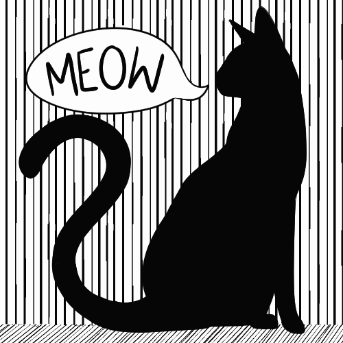
Pets - Twenty Frames
|
For this outcome I decided to work with solid shapes in specifically black and white given most of my other GIFs had been in some form of colour. Quickly, I overestimated how much work it was going to be, as I originally wanted this piece to be shorter, but realised that if the speech bubble was to be constantly moving, I needed more frames as I couldn't make one drawing run over two frames as that movement would stop.
I attempted a basic tail movement afterwards, producing two different outcomes. |

|

|
|
Title Sequence
Moving on from last week's task, the next task we were given was to create an opening title sequence for a movie/tv show. The final outcome was to be between 25 - 45 seconds long, including title and actors as well as set the tone for the movie/show.
I started by looking at examples of opening intros that have been animated, covering a wide variety of time periods as each film is different in the way they tackle the opening intro; some are more complex and have text work alongside the opening, while others focus on the text and image at separate intervals.
In some cases the opening sequence sets up the film with the same tone as the whole film, whilst others are more light-hearted than the movie/series to contrast expectations - something that has become more frequent in recent years. Despite this, they still carry the same tone as to not create such a sharp contrast between the opening and main body of film.
Examples
|
|
|
|
|
|
|
|
Adobe Examples
|
|
|
Idea Generating
When looking at the various prompts we were given to start our Title Sequence, I decided to go with the Sci-FI/Fantasy prompt:
YA SciFi TV series
Probably adapted from a popular book series where the world/galaxy/realm can only be saved by a seemingly normal teenager who is surprised to discover that they've got amazing powers & skills.
YA SciFi TV series
Probably adapted from a popular book series where the world/galaxy/realm can only be saved by a seemingly normal teenager who is surprised to discover that they've got amazing powers & skills.

|

|
When jotting down ideas for the theme of my opening, I preferred the idea of having a contrast between the main character and the Sci-Fi elements. I believe this would play well into the trope of a 'normal teenager' saving the world as opposed to overdoing the fantasy/Sci-Fi element.
Additionally, this would all for the opening to hint at supernatural elements and disguise the opening as a 'slice of life' opening. This would create subtlety and allow for the opening to show as opposed to tell.
|
Tropes
- Protagonist is an outsider. - Useless adults -Chosen one |

|
Storyboard and Animation Tests
|
For my storyboard, I planned it out so that the majority of the opening would be following the main character, despite other character's involvement, hammering in the trope of the 'outcast' being the 'chosen one'.
When I began thinking about things, and placing the rough digital sketches it became apparent that the opening shot I had planned came around way to early. For this reason I plan on having a basic walk cycle at the beginning too to set up things. |

|
For my opening sequence I decided to use a standard 16:9 ratio, allowing me to make the most of walk cycles and sliding doors.
|
No Keyframes

|
Keyframes

|
|
When I began on working on some of the animations, I began by splitting things up into chunks, to make things easier to deal with in smaller pieces. Keyframes were something I struggled with, as my software only allows me to animate 24 Frames at a time, as well as lacking some of the features of the more expensive version.
It shouldn't be too much of an issue for this task, as frames that move are either simple, or repeated in a way that would look unnatural with working with keyframes in such a tight space. |

|
Possible Music
Music was an issue I thought of at the beginning, as I didn't want to do a voiceover, as I feel it would take away from the animation and the smaller but faster elements. So, I looked at instrumentals, as would be the easiest to work with and cut down for the designated time needed - something I may struggle to do with lyrics given 20-40 seconds isn't long.
|
How to Devour Life Instrumental - Eve
|
June Gloom Instrumental - Allie X
|
Picon - Airhead
For my audio, I wanted something that was more instrumental based, and struggled to find something that fit a solemn, yet not too downbeat track. In the end I decided to go with Picon's Airhead, as finding an instrumental track was easier, and fit the tone better.
Refining Animations
For my loose concept I decided to go with the plot of a normal girl being able to contact those beyond our own world and set out to create an opening that was light-hearted, but reflected the oddities of the concept. Using black in contrast to brighter colours would help set this idea up,
Moving on from last week, I began by refining my sketches from last week and piecing together some of the animation. In the end I decided to only line, or only use flat colour to make a contrast, keep the opening simple, and ensure I would be able to do what I wanted in the time provided. For this test animation, I decided to work at 5 frames per second, as allowed the image to look like it was moving continuously whilst still giving time for text to be read.
Moving on from last week, I began by refining my sketches from last week and piecing together some of the animation. In the end I decided to only line, or only use flat colour to make a contrast, keep the opening simple, and ensure I would be able to do what I wanted in the time provided. For this test animation, I decided to work at 5 frames per second, as allowed the image to look like it was moving continuously whilst still giving time for text to be read.
|
4 Frames per Second

Main CharactersFor my opening I planned on having two characters, that could be introduced as the main roles, whilst also being more detailed then the rest of the opening. I liked the way the lineless colours worked with the two characters, and if I were to do this again, would try to carry that through the whole thing. For this outcome however, it gave a contrast to show what was the most important aspect of the opening, as when I had the character walk past the screen, names were more important. Although this was one of the more simple parts of the opening, it proved to be a little bit of an issue, as I needed 26 frames as opposed to the 24 I could go up to. For this reason I had to split this transition into two, and line them up afterwards. Additionally, the reason why I kept the white outline on the walking pages was to separate from the backgrounds, as it was difficult to make out darker details against the darker background. |
6 Frames Per Second


|

|

|
Transition Page
Working on the transition page, I decided to include names behind the wall to make it a little brighter and contrast the darkness of the sliding transition. This part of my opening proved to be a little difficult to work with, especially when it came to all the different layers, but in the end it worked out. Working with numerous different folders and layers helped me figure out what was the quickest and easiest route for my other segments.

|

|

|
|
In the end, I decided that all the colours were too vibrant for the tone I wanted, and to each segment, added an overlay to make things appear duller and more dreary and more in line with the overall tone; not too bright, not always so dark. The final product will be less compressed, as uploading parts in GIFs was the only way I could show development work. Either way, this outcome looks better than the vibrant one that came before it. |

|
Transition Page 2
|
Following on from the previous section, I followed it over into a TV glitch animation to convey the unusual- this transition was easy enough, as I was able to get everything in the 24 frames I had. The only real issue I had was folders got messy, as this was one of the more complex things to figure out. I decided to go with the part with the faded black overlay, as this also made way for a nice transition into the title.
|

|

|

|
Title
With the title being the main focus of the intro, leading up to it at the end, I decided that I didn't want to just use Ariel as a typeface on it's own as it was far too bland. Instead I decided to work onto the typeface to make the letters more interesting and unique to my opening. I believe this worked well as it played with the transition sequence that was seen before. Additionally, I decided to give it a glitch effect, making it more effective in comparison to the TV glitch as there was only the one colour to work with. Having the illustrative parts of the typeface worked in my favour when putting the glitch effect together, giving the text a more chaotic look.


Putting it together
|
As I was making the different parts, I kept experimenting with timing and the order I wanted things to go in. This was a little time consuming and overwhelming at the beginning, but as I got further and further along, things began to make sense and come together. Issues I ran into were mainly timing issues, which were fixed by having seconds or even half of seconds of transitions to slow the pace of the opening down a little. All in all that only added 4 seconds, but made a huge difference in terms of making things flow better.
|

|

Final Outcome
Overall, I am fairly pleased with the outcome for this project, as I learnt a lot along the way, such as how to make the most of a short amount of frames as 24 was all I could work with at a time. With that said, if I were to this project again, I would play around more with sound as that was one of the things I had an issue with, mainly at the beginning of the opening.