
3D - Poster Development
Attack of the Giant Leeches (1959)
Attack of the Giant Leeches, originally titles, The Giant Leeches, is an independently made black and white science fiction-horror film. The film was one of a separate 'creature features' created in the 1950s in response to the cold war fears, seen when characters speculate that the leeches may have been mutations caused by atomic radiation. The film was shot over eight days, where during filming, Gene Corman came down with pneumonia and wound up in hospital. Attack of the Giant Leeches is in the public domain, with copyright having not been renewed since 1986.

The plot of the movie is rather basic. Two pair of larger than human, intelligent leeches that live in an underwater cave. One by one the locals begin to get dragged into their cave, where they slowly feed and drain the blood from the victim's bodies. Two of the first victims are Liz Walker, who has been cheating on her husband with Cal Moulton, being their second victim. Game warden Steve Benton, sets out to investigate their disappearance, and with the aid of his girlfriend and her father, they discover the leeches cavern. The leeches meet their end when state troopers blow up their underwater cavern using dynamite.
Creative Ideas
Before beginning my thumbnailing process, I decided to make a note of all the possible roots I could go down when it comes to making my 3D piece, as I found it overwhelming when trying to think of a way of working that was so different to the 2D way of working I'm used to. I will continue to add to this visual mind map as new ideas spring to mind.
Paper Puppets
Building up on the Old School work we did last semester, one idea that I could follow is the use of puppets, as it is something that could be used in a variety of ways. This would allow for a 3D piece to be made by building up on different layers to give the 2D card more of a dimension.


Shadow Puppets
Similarly, using shadows could prove to be effective, especially when it comes to scale and making some things look larger than the main models/pieces in the poster. For this to be effective, I would have to think about the lighting of the piece to ensure the shadows would be able to be seen to the best of their ability.


Plasticine
Another idea, yet one that would be more difficult is using plasticine models, compared to clay, this would be easier to work with and mould, and although they wouldn't be as polished, giving them an unfinished quality, that may work well with the feel of the poster.


Clay
One of the materials I am most familiar with is that of polymer clay, as it is easy to work with once warmed up, and keeps its shape once baked. The only major downside to this material is that it would take extra time, as would need to be baked and then painted at the end as I don't want to keep them a bland white colour.


Ideas and Thumbnails
|
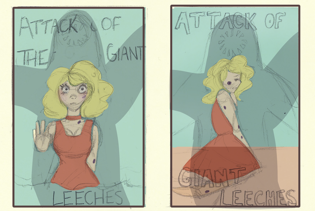
When beginning to come up with thumbnails and rough ideas, I initially struggled as there weren't that many main characters in the film, with it changing from time to time as characters died and the movie progressed. It was for this reason, I decided to firstly focus on the first victim and the last to be found, Liz Walker, with the leeches being more of a second part of my initial thumbnails to built up on the mystery surrounding them
Some of the ideas I had was to use materials such as paper, plasticine or shadows to try and convey scale in the work - whether this will work or not will be explored in the next steps where I intend to try and create, at the very least a face out of plasticine and paper to see if which works best as tackling the 3D aspect is something I am unsure on how to do just yet. It is for this reason I intend to experiment first with the materials, and then go back to refine and decide which ideas would be able to be carried out, and which would not. |

|
|

|

|
1950's Propaganda
Following my initial sketches. I decided to look into the production of propaganda posters from the 1950's due to the fears of radioactive weapons during the cold war. However amusing the idea is as a film, during this time, mutations caused by radioactive weapons was a genuine concern, and it would be a good step to convey this in the poster; whether it be subtle or more of a direct idea. This strong colour palette would work well too for my own poster, drawing attention to things that I want to be brought forwards, and allowing text to stand out against a softer background.

|

|

|

|
Following the feedback session, I went back to making thumbnails for the rough layout of the poster, however this time took the time to do them digitally to allow them to be clearer. Those that I preferred the look of were the ones where the scale could be played around with more, having the focus be more on expression and the scale between the leech and Liz.
Following my initial sketches. I decided to look into the production of propaganda posters from the 1950's due to the fears of radioactive weapons during the cold war. However amusing the idea is as a film, during this time, mutations caused by radioactive weapons was a genuine concern, and it would be a good step to convey this in the poster; whether it be subtle or more of a direct idea.
|
When looking at a handful of Propaganda posters from the 1950s, one of the things I noted was the use of the same select colours; vibrant yellows, reds and blues - each having connotations of danger. It was for this reason when playing about with colour I used those three colours as a basis; red for the danger, blue for the water and yellow to emphasis the American standard of beauty Liz holds as a blonde.
For the most part, I preferred the thumbnails that were more close up as well as had a softer background, as seen in the yellow one in the middle, it blended with Liz' hair and made it harder to see, it was for this reason I stuck with the blue background for the majority of the rest of the thumbnails. I much prefer the posters with a softer background, bringing out the more vibrant colours to the front, as it brought a focus to Liz, and conveying the fact that she was the one in danger. Additionally, the initial sketches I had of the leeches, I saw an opportunity to include a subtle reference to the radioactive concern of the time by changing the mouth into something more reminiscent of the warning for radiation, as seen below in two of my thumbnail ideas that I preferred the look of more than the rest. |

|
Text
|
When it came to deciding on what I wanted the text to look like, I went back to the 1950's propaganda photos, as I believe the chunkier, more expressive kind of text would work well for my piece, linking it back to the time period in which it was made.
As for how I wanted the text to be laid out, I initially wanted it to be overlaid, over the girl - however decided against it as would look messy and be difficult to scale and difficult to read. Instead I decided to look at using something to hold the lettering up, and this was where I got the idea of using signs, hanging down to ensure the text was legible, as well as able to stand on it own - or in this case hang. 
|

|
Using a red and yellowish colour scheme made sense as the lettering had to stand out, and the sign did too against the darker background, as quickly I began to realise that having a lighter background may not be such a good idea to convey the feeling I wanted to convey. Ideas of what I could use had already sprung to mind, as I could use matchsticks or lollypop sticks for the signs, and plasticine, cardboard or foam for my lettering.
However, I was happy with the text, liking the older feel of it, as well as the emphasis on some of the words and not others. I believe that this will work well with the feel of the poster and give it some of that older, rougher fell that have been lacking in my thumbnail sketches.
However, I was happy with the text, liking the older feel of it, as well as the emphasis on some of the words and not others. I believe that this will work well with the feel of the poster and give it some of that older, rougher fell that have been lacking in my thumbnail sketches.

|

|

|
Experimenting - Paper Puppets

For my first line of enquiry, I decided it would be best, and easier to work with paper to make a piece that can be layered up and moved around with varying layers of paper and different settings to make up a 3D piece out of typically 2D objects. I decided this as I enjoyed making my pop-up book last semester and enjoyed tackling the task of using with nothing other than card
Each part of the piece is made out of card, with details being shaded in by using chalk and pastel to tint the skin and roots of the hair.
If I were to do this again, I could make the light shading on the skin darker as the pastel areas didn't photograph as good as I hope they would. In addition to this, I would work on a larger scale, making it easier when cutting out the individual pieces. When making this face as an experiment, I quickly realised that I had made it too small and fiddly, as it became pretty time consuming to work on. With that said, the materials worked well and I was happy with the way it came out for an experimental piece, meaning that, this way of working could be used to produce my final outcome.

|

|

|
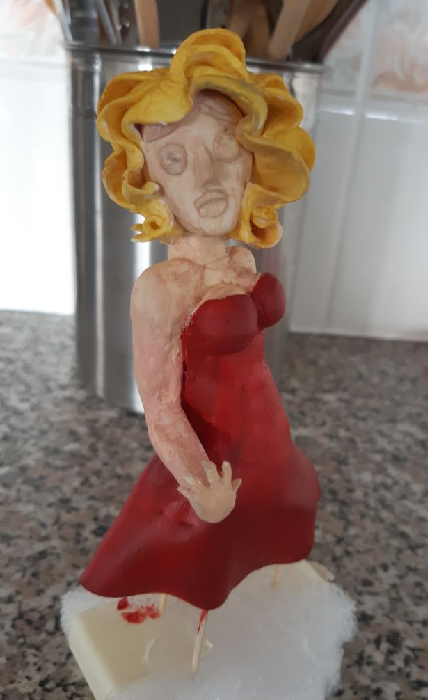
Experimenting - Plasticine
With a figure being the main focus of my poster, I decided to try and begin got experiment with plasticine. Up to yet, I have been able to make a base out of masking tape, allowing me to build up the plasticine and features around it. This was time consuming, yet, would help in the long run, as would mean I have a solid base under the plasticine, and end up wasting less in the long run.
When working on the plasticine test piece, I found that it was an easy material to work with, but a hard one to keep in the right place due to the softness of it. It was for this reason that my final outcome appeared rounder than I intended, with the hair lacking any real volume. It was for this reason that I don't think I will be going ahead to use this as the medium for my final result.
When working on the plasticine test piece, I found that it was an easy material to work with, but a hard one to keep in the right place due to the softness of it. It was for this reason that my final outcome appeared rounder than I intended, with the hair lacking any real volume. It was for this reason that I don't think I will be going ahead to use this as the medium for my final result.

|

|

|
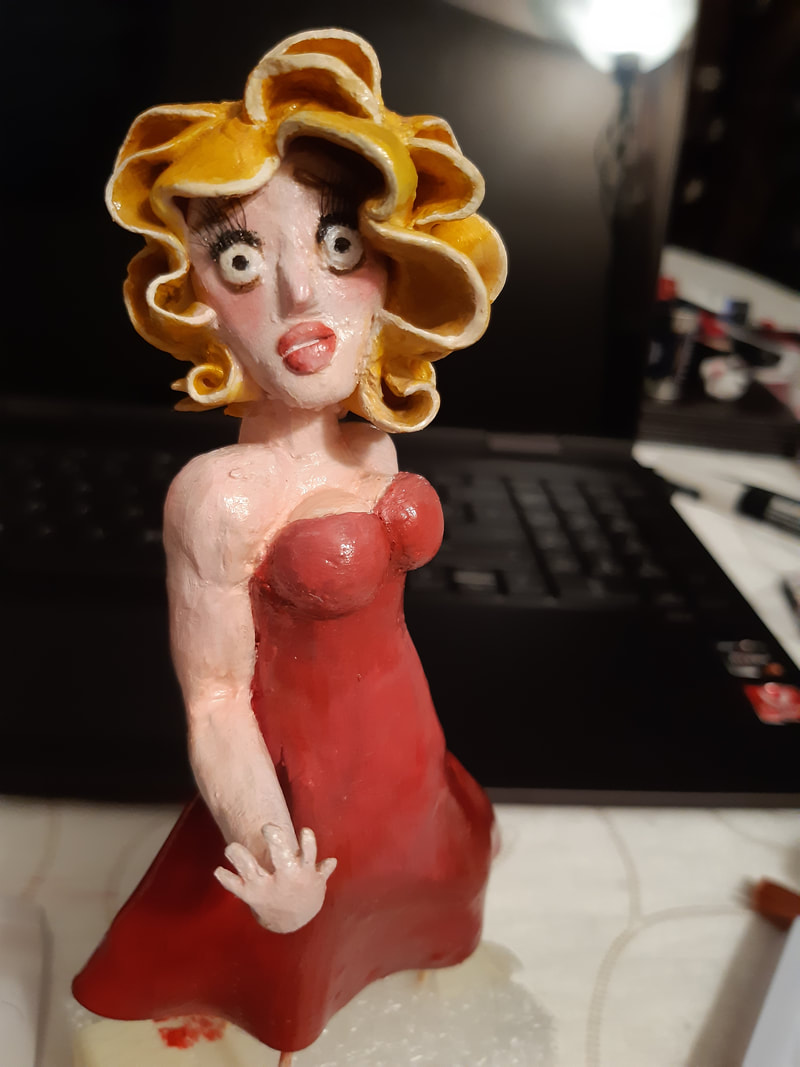
Experimenting - Clay
Following my plasticine experimentation, I decided to use clay instead as was easier to mould, and would give me more versatility in creating shapes and do so without having the model squish. When beginning my experimentation, I found it significantly easier to mould the clay, as I didn't have to worry about mixing the right colour as was something that could be painted later on.
However, upon baking the clay for the first time, the dress collapsed on the right side due to laying it down. It was for this reason that I stood the dress up. However, this wouldn't fix the issues that have already been caused, and it when looking at the dress from the back, the damage was clear. With that said, this was by far the easiest material to work with and decided that I would do some further work on my clay to create a full sculpture.
However, upon baking the clay for the first time, the dress collapsed on the right side due to laying it down. It was for this reason that I stood the dress up. However, this wouldn't fix the issues that have already been caused, and it when looking at the dress from the back, the damage was clear. With that said, this was by far the easiest material to work with and decided that I would do some further work on my clay to create a full sculpture.

|

|

|
Further Experimentation - Clay
For the most part, the clay worked well, allowing me to add onto my initial sculpt and add a better bottom part of the dress. However time consuming this way, it paid off, adding pieces bit by bit to ensure that they remained secure. That didn't mean I didn't run into some problems however, as some parts were more fiddly to create than others.

|

|

|

|
The first big issue I ran into was the overbaking of the clay for smaller features such as the hand and the hair. This bent back the fingers on the hand, however, from the angle I want to position her on the set, worked in my favour, giving her a more animated feel, despite the unrealistic curve of the fingers. The discolouring was something I was worried about initially, however, once they had cooled, the dress and hair weren't too much of an issue as it followed the curves of the fabric and hair. By far my biggest concern is the discolouring of her hand, as it will take a few coats of paint to patch up. With that said, I hope I will be able to work around it, and hope that it will be secure enough to go back in the oven at least one more time as I have yet to finish the left side of her hair and attach her head to her body. I don't plan on giving her legs as that will be the part that will be cut out of the frame, and I only wanted the curve and ripples in the bottom of the dress as they would effect the form further up. |
Despite the issues, I kept going, and decided to complete the head first before tackling the issues caused to the hand. Things worked out well in the end, despite the clay getting more breakable with each baking due to that overbaking. But things held up. I then glued the head to the body and despite the awkward angle, worked out well with my vision and the revisited thumbnails. It was for this reason that I didn't add a second arm, as the clay was already growing weak, and it wouldn't been seen when the final photo was taken.

|

|

|
Painting Process
When I began painting my model, I began grow a little fearful of how well this was going to work. Having burnt some of the clay, it already was going to take a few layers of paint to cover that up, and only took more as I worked on details - struggling to get in between some of the crevices of the sculpture. The thing that made things easier was Posca pens, particularly the white that allowed me to build up on details and highlights on the figure. It was for this reason and not wanting to overcomplicate it, that I kept the colouring to a few tones, not over shading to make it more effective.
Another thing that worked well and gave it that finishing touch was sealing the sculpt with a shine, highlighting the different curves and highlights of the sculpt. The final touch I gave her was the addition of eyelashes, making her expression more fearful and serving as the final touch.
Another thing that worked well and gave it that finishing touch was sealing the sculpt with a shine, highlighting the different curves and highlights of the sculpt. The final touch I gave her was the addition of eyelashes, making her expression more fearful and serving as the final touch.
|

|
|
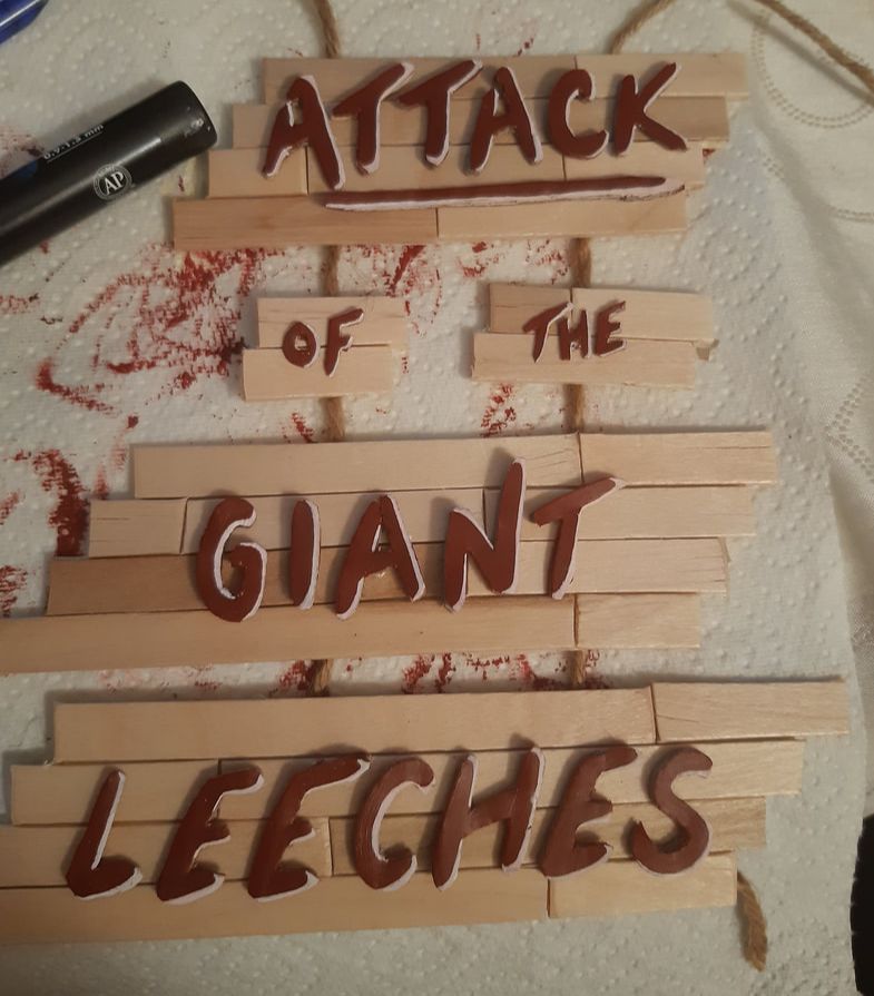
Lettering
|
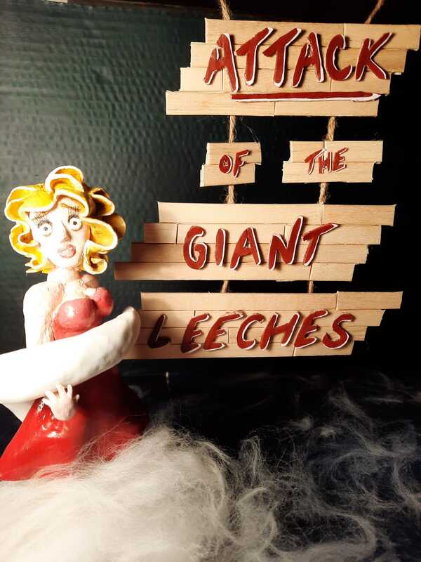
I decided to go with using ice pop sticks to make my backdrop for my lettering, as cutting off the curved end and cutting up the straight pieces gave little panels that could be put together to create more of spontaneous feel to the signs. I did go with using my lettering from before, as found that it was chunky enough to turn into a 3D piece.
When it came to my lettering I tried numerous things; firstly I tried plasticine, and that quickly turned out to be a bad idea as I recalled how soft it remained from my previous test pieces. Additionally, it wouldn't have kept it's shape, risking damage as it lay around, and was also too fiddly. Secondly I tried foam, and too turned out to the a bad idea, as it only came in one shade of red, and cutting it down proved difficult as I accidentally kept shaving away some of the layers, in turn ruining the letter. Cardboard was the best option for the lettering, as it was easier to cut out and was something that could be tacked down and repainted. I printed out my letters and stuck them down, then cut them out, with my next step being repainting and tidying them up. |

|
Having tidied up my text, I was happy with the way it came out, as it looked polished enough, but still had a little bit of edge too it, with sharper edges and imperfect qualities. Given this is going to be working alongside other pieces, it didn't need to be perfect, and so, I was proud of the way it worked as an individual piece.
Leeches
Although the woman was the main focus of my piece, the leeches were just as important, for obvious reasons. I followed the same techniques as I did for my Liz sculpt and worked on wrapping one of the arms around her frame, and the other to be smaller to sit more in the background. Although Leeches are one armed creatures, in the film they are described as being 'human-like' in intelligence and physique- due to the cheap suits human actors would wear. It was for this reason I decided to give my leeches arms - intending to create the final head at a later date.

|

|

|

|

|
Photo test - One
One of the things I was most worried about was how things would look as a whole, on a set, and so I began testing out some of my ideas. However much my thumbnails had changed with the 3D pieces, I did want to keep the general idea of placements.

|
Upon putting things together, it became apparent that there was a few issues. Firstly, the base was too small, as the counter below was seen to the right; this was an easy fix, as I just made an additional bottom panel. Secondly, the text proved to be more of an issue that I had thought as getting it all in a shot was an issue. With that said, moving the text backwards solved some of the issue as made it fit in, but found it to be unfocused in comparison to the woman. Alternatively, rearranging the composition of the text could help.
Hiding the base was another issue as I didn't want it to be visible on the set, and so decided to use felting wool to cover it and play part of the water in the background. I decided to use felting wool as it was softer and wispier than both cotton pads and cotton wool. When it came to lighting the set, I decided that I wanted to go against the idea of including shadows as it proved difficult to work with as the set grew more and more complicated. Thus lighting carefully from the left or the right was my safer bet - and given the lack of space when setting up the set, I was unhappy with how harsh the warm light was. It is for this reason going forwards, I will have to set things up where I have more space and access to playing around with the lighting more. |

|

|

|
Although my leeches arms were far from finished by this point, I at least wanted to include one of them in this photo shoot to get an idea of it's placement. And due to the shape, it was the one that would wrap around Liz. In doing this shoot, despite the unfinished elements, it helped me to figure out what was needed and where it needed to go. Namely I needed to fill in the empty space; an arm to the right of Liz and space above her made way for the leeches head rather nicely.
Out of all the test photos below, in terms of lighting I much prefer the third, as ensures the text stands out, as well as, more importantly, not making the light reflect on the figures. Due to the figures having a coat of varnish, the light would harshly be reflected off the different pieces - and though I do prefer the fourth in terms of the text, there to too much clashing to make a good piece as a whole.
Out of all the test photos below, in terms of lighting I much prefer the third, as ensures the text stands out, as well as, more importantly, not making the light reflect on the figures. Due to the figures having a coat of varnish, the light would harshly be reflected off the different pieces - and though I do prefer the fourth in terms of the text, there to too much clashing to make a good piece as a whole.

|

|

|
|
Final photos
|
After the test pieces I had done the day prior, I now had and understanding of how to light the piece, as well as where to position things. Having completed each piece of the set, I began to put them together, covering the bases with wool to make it look like mist on top of the water, fraying it out into the background and other parts of the set. Finding a way to set up the cardboard and other parts was a problem, and I had to get creative with how to prop things up using the wall to hold the roof up, but in the end it worked out despite the issues I faced along the way. |

|

|

|

|
I decided to go with the final photo on he right after some messing about with the head of the leech in the background, as this left more space to put some of the text that would be seen in the film poster. As for the lighting, I did like how the right hand side was lit up as opposed to the left as ensured text was easier to incorporate as well as read.
Having finished my poster and adding text, using a condensed font as it is usually seen on film posters, particularly the Univers Condensed font. I decided to use a combination of this font and a bolder Bahnschrift font to create contrast and direct the eye to the two different parts of the text. However, having the two fonts side by side with my own title, I prefer the poster with Univers being the focus as opposed to two fonts.
Additionally one of the things I decided to test out afterwards was the scale of the right hand arm as that was something that felt off in the original photo. I do prefer the way this poster looks and makes the poster feel more full and proportioned, and it is for this reason and the reasoning with the fonts that I chose the top right as my final piece.


|


|
All in all, I am happy with the result, and with what I made given the time frame. I believe if I was to do this task again, I would begin making a little earlier on as I ran out of time to do all the lighting tests I had wanted to do. With that said, I learnt a lot doing this project, and it allowed me to experiment more with sculpting, as this was something I hadn't done in a while. Additionally, I learnt what was effective and what wasn't, as well as what materials work for me. Going forwards, I may begin to experiment with clay again, as I did enjoy the process no matter how repetitive it got.
Final Piece
