
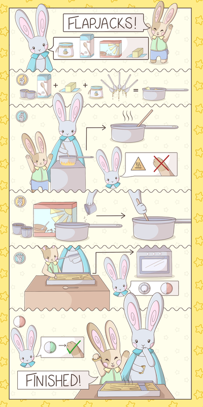
Colouring
Background colour was something else I tackled early on, for the utensils were going to be almost the same colour as the two rabbits; with pans being cooler toned, and spoons being warmer toned. With the similar colours of the rabbits going to be present throughout the recipe, I decided to try and find a colour that would make them stand out. Not wanting to chose red or blue due to them tones being present in the rabbit's designs as well as the connotations of gender with the colours, I decided to go with either a yellow or green background as to keep things neutral. It became clear that I preferred the yellow tone due to the green clashing with the younger rabbit. Instead I thought the yellow worked well with the smaller details of each rabbit, and keeping it a softer colour would work well for the main background, and a darker border would make the whole piece stand out, framing it nicely. Flat colour ShadingDue to the more childish and simple feel I wanted for my recipe, I decided to go for a simple style of shading, using one shadow and one highlight to make the individual aspects feel childish and as clean as the linework. This also worked well when looking at all the pieces together, feeling like a whole set as opposed to different elements, as this was something I wanted to replicate when looking at the varying set of sprites from my initial research and inspiration.    Once I had decided on a shading style, it was again a case of repeating the process to cover all the different components of the recipe which did become rather time consuming - but again, proved effective in having everything feel like a group. Finalising the piece
Final pieceAll in all I am proud of my final outcome, and the way I went about it. Although it was time consuming and repetitive at times, it looks coherent and part of a parcel - working well together. Given the time and being unsure on how to tacking this project in the beginning, I am happy with the outcome, and if I were to do it again, wish I could have had more time to put some more shading into the piece to make it a little more complex.
0 Comments
 Lining Process
 When it came to lining the initial characters, it was simple enough, especially once I had figured out a line width that worked well for both the main lining and the details. For the initial part of the recipe, the text boxes being bolder to indicate the importance of the information was the best move, as should be the highlight of the starter of the recipe. The ingredients however was something that I had to take time with, as I wanted to ensure that they looked somewhat realistic, whilst keeping the simple appearance to communicate what it was whilst having them look simple, but too a part of the same group.  
Baking - FlapjacksFor our first Semester Two project we were tasked with illustrating a recipe without the use of words or numbers. But first we had to bake, following the recipe and taking notes as we went along, documenting the journey, leading up to the drawing and the development of the task following. Although the recipe was easy to follow, variables effected the outcome, and in hindsight the way in which the ingredients were photographed served as little held when words and numbers couldn't be used to indicate how much of each thing was needed - this was something I had to think about when developing my drawing ideas to overcome that problem. But in terms of the outcome of the flapjacks, they turned out fairly well, a little on the sticky side but edible. This task wasn't as difficult as I expected, but was as stressful as I expected, but, I was able to cope with the company of a little helper. Development Work - IdeasMoving onto the development of ideas, this was something I was much more comfortable with. To begin with a began by jotting down quick ideas on how I wanted to go about this, and within my development work was quick to realise the simpler, the better as it would be easier to follow, and for this reason my work was targeted towards a younger audience, with the help of parents. Appealing to this audience made the line of enquiry far more colourful, simple and friendly as I progressed, leading towards having a friendly face among the instructions to guide those following along, something that was prominent in games and interactive instructions of my own childhood.  From there forth, I explored ways in which steps could be communicated as to not get too confusing with the more free flowing step by step that I may end up using. For this, I explored the use of hand signs, counting the various steps as this was something that is universal regardless of location, age etc. Not having all my supplies that I would usually have given the circumstances proved to be an issue, particularly when it came to getting quick colour down for my ideas. Thus once I had explored the ways in which the various ingredients could be designed to strongly communicate what they were meant to be, I turned to digital ways to colour and begin to refine by giving them more life than the monotone sketches,   One of my main concerns regarding this project is getting everything to fit into the designated space without it going on for too long - as the more steps and the longer the recipe is, the more confusing it is surely going to become. For this problem, I came up with the idea of having the ingredients appear larger at the top or the bottom of the recipe, allowing them to be seen clearer, as well as saving space in the long run as I would be able to cut down on the size of them in the actual steps of the recipe. Playing on the idea of having some form of friendly face, I was drawn to the possible idea of having what was listed in the form of a 'speech bubble', replacing the need for words. I was particularly drawn to this idea as it reminded me of the older 'Cooking Mama' games I used to play when I was younger; something that made the most of visuals as opposed to words due to the varying languages it would appear in over its lifespan - meaning very little was needed to be changed. Although I have components I would like to include in my recipe, the main line of enquiry from here on out is the way it is presented; will it be more linear, or free flowing? One continuous piece, or something more blocked off? I intend to try and find a style that is neither too free flowing as it may get confusing, but nor too formal and blocked off as would work against the childish style I am intending to follow.  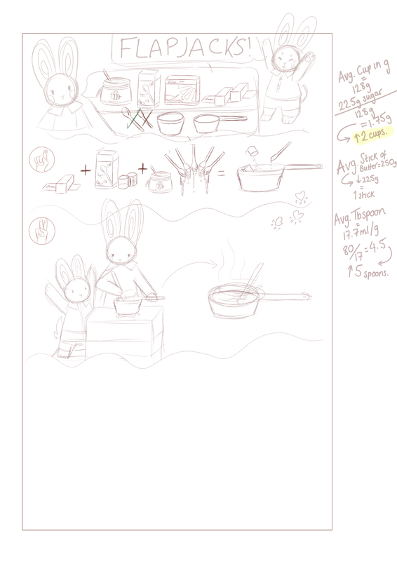 |
AuthorWrite something about yourself. No need to be fancy, just an overview. ArchivesCategories |


 RSS Feed